css中hover时改变input中placeholder的颜色
时间: 2023-08-10 12:09:47 浏览: 407
可以使用CSS伪类选择器 `::placeholder` 来改变输入框的占位符文本的样式。同时,使用 `:hover` 伪类选择器来指定当鼠标悬停在输入框上时的样式。
下面是一个例子,当鼠标悬停在输入框上时,输入框中的占位符文本颜色将变为红色:
```css
input:hover::placeholder {
color: red;
}
```
相关问题
.A8 input:focus::-webkit-input-placeholder, input:hover::-webkit-input-placeholder { : #c2c2c2; -webkit-transition: color .5s; }
这是一个 CSS 样式表的代码,用于设置文本输入框的占位符文本(placeholder)的样式。其中,-webkit-input-placeholder 是一个伪类,表示选中输入框中的占位符文本,后面的 { } 中的代码则是对其进行样式设置。具体来说,这段代码会在输入框被聚焦(focus)或者鼠标悬停(hover)在其上时,将占位符文本的颜色设置为 #c2c2c2(即浅灰色),并且在颜色变化时添加 0.5 秒的渐变效果。
<label>ID</label> <input name="text" type="text" value="ID" placeholder="ID"><br> <label>类型</label> <input name="text" type="text" value="类型" placeholder="类别"><br> <input type="submit" value="修改">为以上代码设计css样式
, int *count) {
char id[20];
printf("请输入要删除的学生学号:");
scanf("%s可以使用以下 CSS 样式来为此代码设计样式:
```css
label {
display: inline-block;
width: ", id);
for (int i = 0; i < *count; i++) {
if (strcmp(students[i].id60px;
text-align: right;
margin-right: 10px;
}
input[type="text"] {
display: inline-block;
width: 200px;
padding: 5px;
border: 1px solid #ccc;
border-radius:, id) == 0) {
for (int j = i + 1; j < *count; j++) {
students 3px;
box-sizing: border-box;
margin-bottom: 10px;
}
input[type="submit"] {
display:[j - 1] = students[j];
}
(*count)--;
printf("删除成功!\n");
return;
block;
width: 100px;
margin: 0 auto;
padding: 8px 16px;
background-color }
}
printf("没有找到该学生信息!\n");
}
```
修改学生信息:
```c
void: #007bff;
color: #fff;
border: none;
border-radius: 3px;
cursor: pointer;
modifyStudent(struct student *students, int count) {
char id[20];
printf("请输入要修改的学生学号:}
input[type="submit"]:hover {
background-color: #0069d9;
}
```
效果如下:

阅读全文
相关推荐
大家在看
最新推荐
基于OpenCV的人脸识别小程序.zip
【项目资源】: 包含前端、后端、移动开发、操作系统、人工智能、物联网、信息化管理、数据库、硬件开发、大数据、课程资源、音视频、网站开发等各种技术项目的源码。 包括STM32、ESP8266、PHP、QT、Linux、iOS、C++、Java、python、web、C#、EDA、proteus、RTOS等项目的源码。 【项目质量】: 所有源码都经过严格测试,可以直接运行。 功能在确认正常工作后才上传。 【适用人群】: 适用于希望学习不同技术领域的小白或进阶学习者。 可作为毕设项目、课程设计、大作业、工程实训或初期项目立项。 【附加价值】: 项目具有较高的学习借鉴价值,也可直接拿来修改复刻。 对于有一定基础或热衷于研究的人来说,可以在这些基础代码上进行修改和扩展,实现其他功能。 【沟通交流】: 有任何使用上的问题,欢迎随时与博主沟通,博主会及时解答。 鼓励下载和使用,并欢迎大家互相学习,共同进步。。内容来源于网络分享,如有侵权请联系我删除。另外如果没有积分的同学需要下载,请私信我。
免安装JDK 1.8.0_241:即刻配置环境运行
资源摘要信息:"JDK 1.8.0_241 是Java开发工具包(Java Development Kit)的版本号,代表了Java软件开发环境的一个特定发布。它由甲骨文公司(Oracle Corporation)维护,是Java SE(Java Platform, Standard Edition)的一部分,主要用于开发和部署桌面、服务器以及嵌入式环境中的Java应用程序。本版本是JDK 1.8的更新版本,其中的241代表在该版本系列中的具体更新编号。此版本附带了Java源码,方便开发者查看和学习Java内部实现机制。由于是免安装版本,因此不需要复杂的安装过程,解压缩即可使用。用户配置好环境变量之后,即可以开始运行和开发Java程序。"
知识点详细说明:
1. JDK(Java Development Kit):JDK是进行Java编程和开发时所必需的一组工具集合。它包含了Java运行时环境(JRE)、编译器(javac)、调试器以及其他工具,如Java文档生成器(javadoc)和打包工具(jar)。JDK允许开发者创建Java应用程序、小程序以及可以部署在任何平台上的Java组件。
2. Java SE(Java Platform, Standard Edition):Java SE是Java平台的标准版本,它定义了Java编程语言的核心功能和库。Java SE是构建Java EE(企业版)和Java ME(微型版)的基础。Java SE提供了多种Java类库和API,包括集合框架、Java虚拟机(JVM)、网络编程、多线程、IO、数据库连接(JDBC)等。
3. 免安装版:通常情况下,JDK需要进行安装才能使用。但免安装版JDK仅需要解压缩到磁盘上的某个目录,不需要进行安装程序中的任何步骤。用户只需要配置好环境变量(主要是PATH、JAVA_HOME等),就可以直接使用命令行工具来运行Java程序或编译代码。
4. 源码:在软件开发领域,源码指的是程序的原始代码,它是由程序员编写的可读文本,通常是高级编程语言如Java、C++等的代码。本压缩包附带的源码允许开发者阅读和研究Java类库是如何实现的,有助于深入理解Java语言的内部工作原理。源码对于学习、调试和扩展Java平台是非常有价值的资源。
5. 环境变量配置:环境变量是操作系统中用于控制程序执行环境的参数。在JDK中,常见的环境变量包括JAVA_HOME和PATH。JAVA_HOME是JDK安装目录的路径,配置此变量可以让操作系统识别到JDK的位置。PATH变量则用于指定系统命令查找的路径,将JDK的bin目录添加到PATH后,就可以在命令行中的任何目录下执行JDK中的命令,如javac和java。
在实际开发中,了解并正确配置JDK对于Java开发者来说是一个基础且重要的环节。掌握如何安装和配置JDK,以及如何理解JDK中的源码和各种工具,对于进行Java编程和解决问题至关重要。
管理建模和仿真的文件
管理Boualem Benatallah引用此版本:布阿利姆·贝纳塔拉。管理建模和仿真。约瑟夫-傅立叶大学-格勒诺布尔第一大学,1996年。法语。NNT:电话:00345357HAL ID:电话:00345357https://theses.hal.science/tel-003453572008年12月9日提交HAL是一个多学科的开放存取档案馆,用于存放和传播科学研究论文,无论它们是否被公开。论文可以来自法国或国外的教学和研究机构,也可以来自公共或私人研究中心。L’archive ouverte pluridisciplinaire
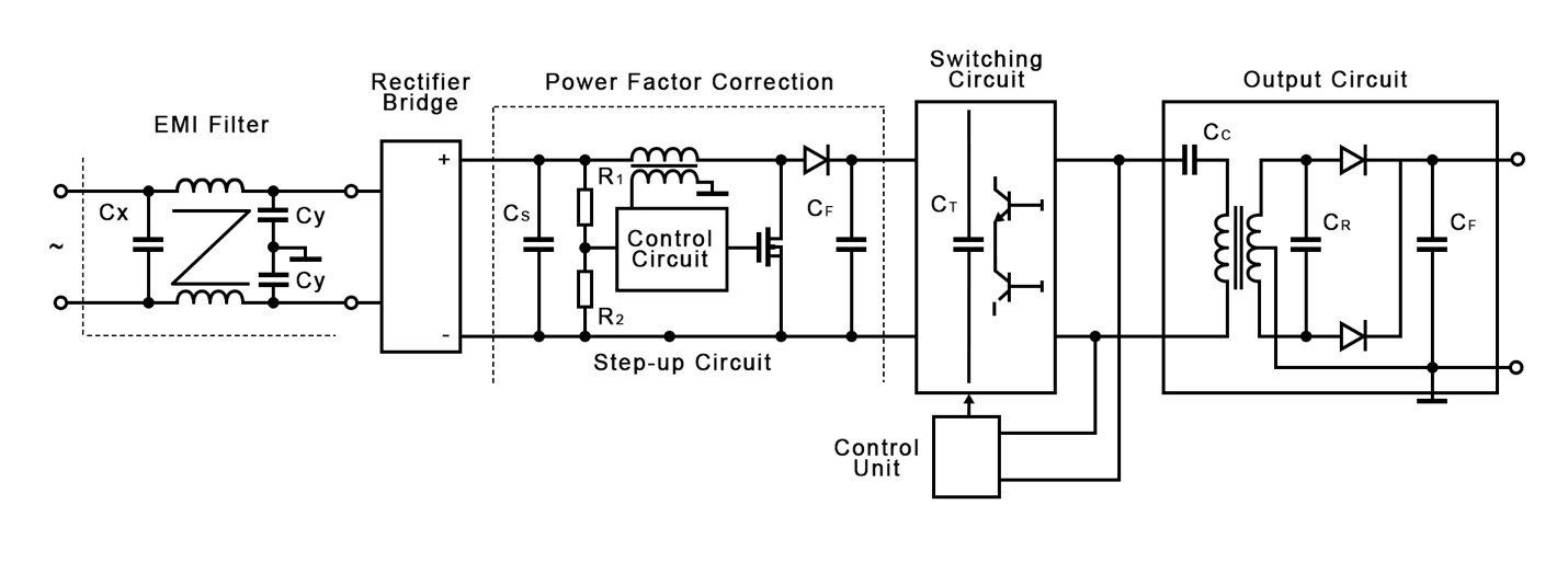
【提升效率与稳定性】:深入掌握单相整流器的控制策略
# 摘要
单相整流器作为电力电子技术的基础设备,广泛应用于电力系统和工业自动化领域。本文首先概述了单相整流器的基本概念,详细分析了其工作原理,包括电力电子器件的角色、数学模型以及控制策略。随后,针对控制技术进行了深入探讨,包括传统控制技术如PID控制和高级控制策略如模糊逻辑控制及自适应控制的应用。进一步地,本文提出了一系列提升单相整流器性能的方法,如效率提升策略、系统稳定性措施,以及性能评估与优化方案。最后,文章探讨了单相整流器在不同领域的应用案例,并对新兴技术与市场趋势进行了展望。
# 关键字
单相整流器;电力电子器件;数学模型;控制策略;性能提升;应用案例
参考资源链接:[单相PWM整
你看这是ashx映射的cs文件初始代码,你看这里边根本就没有写对action参数进行任何操作但你.ashx?action=submit这样去做他就能返回出数据这是为什么
在ASP.NET中,.ashx文件(也称为HTTP处理程序)用于处理HTTP请求并返回响应。即使在初始代码中没有对action参数进行任何操作,系统仍然可以通过默认的ProcessRequest方法处理请求并返回数据。
当你在URL中传递参数(如?action=submit)时,这些参数会被包含在请求的查询字符串中。虽然你的代码没有显式地处理这些参数,但默认的ProcessRequest方法会接收这些参数并执行一些默认操作。
以下是一个简单的.ashx文件示例:
```csharp
<%@ WebHandler Language="C#" Class="MyHandler" %>
us
机器学习预测葡萄酒评分:二值化品尝笔记的应用
资源摘要信息:"wine_reviewer:使用机器学习基于二值化的品尝笔记来预测葡萄酒评论分数"
在当今这个信息爆炸的时代,机器学习技术已经被广泛地应用于各个领域,其中包括食品和饮料行业的质量评估。在本案例中,将探讨一个名为wine_reviewer的项目,该项目的目标是利用机器学习模型,基于二值化的品尝笔记数据来预测葡萄酒评论的分数。这个项目不仅对于葡萄酒爱好者具有极大的吸引力,同时也为数据分析和机器学习的研究人员提供了实践案例。
首先,要理解的关键词是“机器学习”。机器学习是人工智能的一个分支,它让计算机系统能够通过经验自动地改进性能,而无需人类进行明确的编程。在葡萄酒评分预测的场景中,机器学习算法将从大量的葡萄酒品尝笔记数据中学习,发现笔记与葡萄酒最终评分之间的相关性,并利用这种相关性对新的品尝笔记进行评分预测。
接下来是“二值化”处理。在机器学习中,数据预处理是一个重要的步骤,它直接影响模型的性能。二值化是指将数值型数据转换为二进制形式(0和1)的过程,这通常用于简化模型的计算复杂度,或者是数据分类问题中的一种技术。在葡萄酒品尝笔记的上下文中,二值化可能涉及将每种口感、香气和外观等属性的存在与否标记为1(存在)或0(不存在)。这种方法有利于将文本数据转换为机器学习模型可以处理的格式。
葡萄酒评论分数是葡萄酒评估的量化指标,通常由品酒师根据酒的品质、口感、香气、外观等进行评分。在这个项目中,葡萄酒的品尝笔记将被用作特征,而品酒师给出的分数则是目标变量,模型的任务是找出两者之间的关系,并对新的品尝笔记进行分数预测。
在机器学习中,通常会使用多种算法来构建预测模型,如线性回归、决策树、随机森林、梯度提升机等。在wine_reviewer项目中,可能会尝试多种算法,并通过交叉验证等技术来评估模型的性能,最终选择最适合这个任务的模型。
对于这个项目来说,数据集的质量和特征工程将直接影响模型的准确性和可靠性。在准备数据时,可能需要进行数据清洗、缺失值处理、文本规范化、特征选择等步骤。数据集中的标签(目标变量)即为葡萄酒的评分,而特征则来自于品酒师的品尝笔记。
项目还提到了“kaggle”和“R”,这两个都是数据分析和机器学习领域中常见的元素。Kaggle是一个全球性的数据科学竞赛平台,提供各种机器学习挑战和数据集,吸引了来自全球的数据科学家和机器学习专家。通过参与Kaggle竞赛,可以提升个人技能,并有机会接触到最新的机器学习技术和数据处理方法。R是一种用于统计计算和图形的编程语言和软件环境,它在统计分析、数据挖掘、机器学习等领域有广泛的应用。使用R语言可以帮助研究人员进行数据处理、统计分析和模型建立。
至于“压缩包子文件的文件名称列表”,这里可能存在误解或打字错误。通常,这类名称应该表示存储项目相关文件的压缩包,例如“wine_reviewer-master.zip”。这个压缩包可能包含了项目的源代码、数据集、文档和其它相关资源。在开始项目前,研究人员需要解压这个文件包,并且仔细阅读项目文档,以便了解项目的具体要求和数据格式。
总之,wine_reviewer项目是一个结合了机器学习、数据处理和葡萄酒品鉴的有趣尝试,它不仅展示了机器学习在实际生活中的应用潜力,也为研究者提供了丰富的学习资源和实践机会。通过这种跨领域的合作,可以为葡萄酒行业带来更客观、一致的评价标准,并帮助消费者做出更加明智的选择。
"互动学习:行动中的多样性与论文攻读经历"
多样性她- 事实上SCI NCES你的时间表ECOLEDO C Tora SC和NCESPOUR l’Ingén学习互动,互动学习以行动为中心的强化学习学会互动,互动学习,以行动为中心的强化学习计算机科学博士论文于2021年9月28日在Villeneuve d'Asq公开支持马修·瑟林评审团主席法布里斯·勒菲弗尔阿维尼翁大学教授论文指导奥利维尔·皮耶昆谷歌研究教授:智囊团论文联合主任菲利普·普雷教授,大学。里尔/CRISTAL/因里亚报告员奥利维耶·西格德索邦大学报告员卢多维奇·德诺耶教授,Facebook /索邦大学审查员越南圣迈IMT Atlantic高级讲师邀请弗洛里安·斯特鲁布博士,Deepmind对于那些及时看到自己错误的人...3谢谢你首先,我要感谢我的两位博士生导师Olivier和Philippe。奥利维尔,"站在巨人的肩膀上"这句话对你来说完全有意义了。从科学上讲,你知道在这篇论文的(许多)错误中,你是我可以依
【单相整流器终极指南】:电气工程师的20年实用技巧大揭秘
# 摘要
单相整流器是电力电子技术中应用广泛的设备,用于将交流电转换为直流电。本文首先介绍了单相整流器的基础知识和工作原理,分析了其设计要点,性能评估方法以及在电力系统和电子设备中的应用。接着,探讨了单相整流器的进阶应用和优化策略,包括提高效率和数字化改造。文章还通过具体案例分析,展示了单
OxyPlot CategoryAxis
在OxyPlot中,CategoryAxis用于创建一个基于类别标签的轴,通常用于折线图或柱状图,其中每个轴的值代表不同的类别。以下是如何在XAML中设置和使用CategoryAxis的一个简单示例:
```xml
<!-- 在你的XAML文件中 -->
<oxy:CartesianChart x:Name="chart">
<oxy:CartesianChart.Axes>
<oxy:CategoryAxis Title="Category" Position="Bottom">
<!-- 可以在这里添加类别标签 -->
STM32-F0/F1/F2电子库函数UCOS开发指南
资源摘要信息:"本资源专注于提供STM32单片机系列F0、F1、F2等型号的电子库函数信息。STM32系列微控制器是由STMicroelectronics(意法半导体)公司生产,广泛应用于嵌入式系统中,其F0、F1、F2系列主要面向不同的性能和成本需求。本资源中提供的库函数UCOS是一个用于STM32单片机的软件开发包,支持操作系统编程,可以用于创建多任务应用程序,提高软件的模块化和效率。UCOS代表了μC/OS,即微控制器上的操作系统,是一个实时操作系统(RTOS)内核,常用于教学和工业应用中。"
1. STM32单片机概述
STM32是STMicroelectronics公司生产的一系列基于ARM Cortex-M微控制器的32位处理器。这些微控制器具有高性能、低功耗的特点,适用于各种嵌入式应用,如工业控制、医疗设备、消费电子等。STM32系列的产品线非常广泛,包括从低功耗的STM32L系列到高性能的STM32F系列,满足不同场合的需求。
2. STM32F0、F1、F2系列特点
STM32F0系列是入门级产品,具有成本效益和低功耗的特点,适合需要简单功能和对成本敏感的应用。
STM32F1系列提供中等性能,具有更多的外设和接口,适用于更复杂的应用需求。
STM32F2系列则定位于高性能市场,具备丰富的高级特性,如图形显示支持、高级加密等。
3. 电子库函数UCOS介绍
UCOS(μC/OS)是一个实时操作系统内核,它支持多任务管理、任务调度、时间管理等实时操作系统的常见功能。开发者可以利用UCOS库函数来简化多任务程序的开发。μC/OS是为嵌入式系统设计的操作系统,因其源代码开放、可裁剪性好、可靠性高等特点,被广泛应用于教学和商业产品中。
4. STM32与UCOS结合的优势
将UCOS与STM32单片机结合使用,可以充分利用STM32的处理能力和资源,同时通过UCOS的多任务管理能力,开发人员可以更加高效地组织程序,实现复杂的功能。它有助于提高系统的稳定性和可靠性,同时通过任务调度,可以优化资源的使用,提高系统的响应速度和处理能力。
5. 开发环境与工具
开发STM32单片机和UCOS应用程序通常需要一套合适的开发环境,如Keil uVision、IAR Embedded Workbench等集成开发环境(IDE),以及相应的编译器和调试工具。此外,开发人员还需要具备对STM32硬件和UCOS内核的理解,以正确地配置和优化程序。
6. 文件名称列表分析
根据给出的文件名称列表“库函数 UCOS”,我们可以推断该资源可能包括了实现UCOS功能的源代码文件、头文件、编译脚本、示例程序、API文档等。这些文件是开发人员在实际编程过程中直接使用的材料,帮助他们理解如何调用UCOS提供的接口函数,如何在STM32单片机上实现具体的功能。
7. 开发资源和社区支持
由于STM32和UCOS都是非常流行和成熟的技术,因此围绕它们的开发资源和社区支持非常丰富。开发者可以找到大量的在线教程、论坛讨论、官方文档和第三方教程,这些资源可以大大降低学习难度,提高开发效率。对于使用STM32单片机和UCOS的开发者来说,加入这些社区,与其他开发者交流经验,是一个非常有价值的步骤。
综上所述,资源“电子-库函数UCOS.rar”提供了STM32单片机特别是F0、F1、F2系列的UCOS实时操作系统库函数,这些资源对于嵌入式系统开发人员来说,是提高开发效率和实现复杂功能的重要工具。通过理解和运用这些库函数,开发者能够更有效地开发出稳定、高效的嵌入式应用。