移动端h5页面软键盘打开时改变页面高度
时间: 2023-12-31 10:05:49 浏览: 194

基于Vue框架的演出购票移动端H5页面设计源码
在移动端H5页面中,当软键盘打开时,页面高度会发生改变。为了适应软键盘的高度,可以通过以下方式改变页面高度:
1. 使用CSS3的vh单位
在CSS中使用vh单位可以将页面高度设置为视口高度的百分比。当软键盘弹出时,视口高度会减小,页面高度也会随之减小,从而达到适应软键盘高度的效果。例如:
```css
html, body {
height: 100vh;
}
```
2. 监听resize事件
可以通过监听resize事件来获取窗口高度,并根据窗口高度计算页面高度。当软键盘弹出时,窗口高度会减小,可以根据窗口高度计算出适应软键盘高度的页面高度。例如:
```javascript
window.addEventListener('resize', function() {
var windowHeight = window.innerHeight;
var pageHeight = windowHeight + 'px';
document.body.style.height = pageHeight;
});
```
需要注意的是,这种方式需要在样式中设置height为100%或者其他百分比值,否则无法达到适应软键盘高度的效果。
阅读全文
相关推荐
最新推荐
解决Android软键盘弹出覆盖h5页面输入框问题
解决Android软键盘弹出覆盖h5页面输入框问题 知识点一:Android软键盘弹出机理 Android软键盘弹出是Android系统中的一种输入方式,当用户触发输入框焦点时,软键盘会弹出以便用户输入内容。在h5页面中,软键盘弹出...
vue写h5页面的方法总结
在使用Vue.js编写H5页面时,我们需要考虑的首要任务是布局、样式和不同设备的适配。Vue.js作为一个强大的渐进式JavaScript框架,能够帮助我们构建高效、可维护的前端应用,同样适用于H5页面的开发。以下是一些关键...
JS移动端/H5同时选择多张图片上传并使用canvas压缩图片
在JS移动端和H5开发中,常常需要处理用户选择的图片上传,特别是在移动设备上,这一需求更加普遍。本文将详细介绍如何实现同时选择多张图片并利用canvas进行压缩上传的流程。 首先,HTML5提供了`...
Vue实现移动端页面切换效果【推荐】
在移动端应用开发中,页面切换效果是提升用户体验的关键因素之一。Vue.js,作为一个流行的前端框架,提供了丰富的功能来实现这种效果。本篇文章将详细介绍如何利用Vue实现移动端页面切换,通过实例代码来展示具体...
Android WebView无法弹出软键盘的原因及解决办法
主要介绍了Android WebView无法弹出软键盘的原因及解决办法的相关资料,非常不错,具有参考借鉴价值,需要的朋友可以参考下
Angular程序高效加载与展示海量Excel数据技巧
资源摘要信息: "本文将讨论如何在Angular项目中加载和显示Excel海量数据,具体包括使用xlsx.js库读取Excel文件以及采用批量展示方法来处理大量数据。为了更好地理解本文内容,建议参阅关联介绍文章,以获取更多背景信息和详细步骤。"
知识点:
1. Angular框架: Angular是一个由谷歌开发和维护的开源前端框架,它使用TypeScript语言编写,适用于构建动态Web应用。在处理复杂单页面应用(SPA)时,Angular通过其依赖注入、组件和服务的概念提供了一种模块化的方式来组织代码。
2. Excel文件处理: 在Web应用中处理Excel文件通常需要借助第三方库来实现,比如本文提到的xlsx.js库。xlsx.js是一个纯JavaScript编写的库,能够读取和写入Excel文件(包括.xlsx和.xls格式),非常适合在前端应用中处理Excel数据。
3. xlsx.core.min.js: 这是xlsx.js库的一个缩小版本,主要用于生产环境。它包含了读取Excel文件核心功能,适合在对性能和文件大小有要求的项目中使用。通过使用这个库,开发者可以在客户端对Excel文件进行解析并以数据格式暴露给Angular应用。
4. 海量数据展示: 当处理成千上万条数据记录时,传统的方式可能会导致性能问题,比如页面卡顿或加载缓慢。因此,需要采用特定的技术来优化数据展示,例如虚拟滚动(virtual scrolling),分页(pagination)或懒加载(lazy loading)等。
5. 批量展示方法: 为了高效显示海量数据,本文提到的批量展示方法可能涉及将数据分组或分批次加载到视图中。这样可以减少一次性渲染的数据量,从而提升应用的响应速度和用户体验。在Angular中,可以利用指令(directives)和管道(pipes)来实现数据的分批处理和显示。
6. 关联介绍文章: 提供的文章链接为读者提供了更深入的理解和实操步骤。这可能是关于如何配置xlsx.js在Angular项目中使用、如何读取Excel文件中的数据、如何优化和展示这些数据的详细指南。读者应根据该文章所提供的知识和示例代码,来实现上述功能。
7. 文件名称列表: "excel"这一词汇表明,压缩包可能包含一些与Excel文件处理相关的文件或示例代码。这可能包括与xlsx.js集成的Angular组件代码、服务代码或者用于展示数据的模板代码。在实际开发过程中,开发者需要将这些文件或代码片段正确地集成到自己的Angular项目中。
总结而言,本文将指导开发者如何在Angular项目中集成xlsx.js来处理Excel文件的读取,以及如何优化显示大量数据的技术。通过阅读关联介绍文章和实际操作示例代码,开发者可以掌握从后端加载数据、通过xlsx.js解析数据以及在前端高效展示数据的技术要点。这对于开发涉及复杂数据交互的Web应用尤为重要,特别是在需要处理大量数据时。
管理建模和仿真的文件
管理Boualem Benatallah引用此版本:布阿利姆·贝纳塔拉。管理建模和仿真。约瑟夫-傅立叶大学-格勒诺布尔第一大学,1996年。法语。NNT:电话:00345357HAL ID:电话:00345357https://theses.hal.science/tel-003453572008年12月9日提交HAL是一个多学科的开放存取档案馆,用于存放和传播科学研究论文,无论它们是否被公开。论文可以来自法国或国外的教学和研究机构,也可以来自公共或私人研究中心。L’archive ouverte pluridisciplinaire
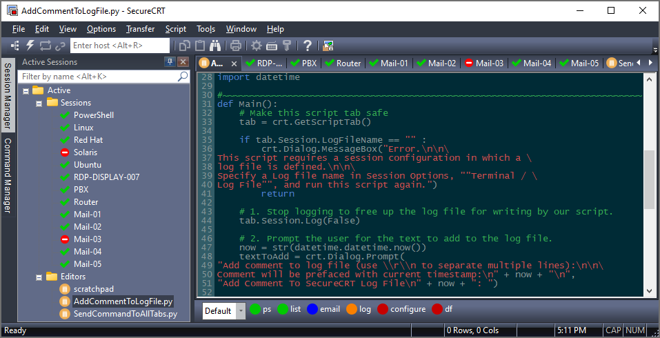
【SecureCRT高亮技巧】:20年经验技术大佬的个性化设置指南
参考资源链接:[SecureCRT设置代码关键字高亮教程](https://wenku.csdn.net/doc/6412b5eabe7fbd1778d44db0?spm=1055.2635.3001.10343)
# 1. SecureCRT简介与高亮功能概述
SecureCRT是一款广泛应用于IT行业的远程终端仿真程序,支持
如何设计一个基于FPGA的多功能数字钟,实现24小时计时、手动校时和定时闹钟功能?
设计一个基于FPGA的多功能数字钟涉及数字电路设计、时序控制和模块化编程。首先,你需要理解计时器、定时器和计数器的概念以及如何在FPGA平台上实现它们。《大连理工数字钟设计:模24计时器与闹钟功能》这份资料详细介绍了实验报告的撰写过程,包括设计思路和实现方法,对于理解如何构建数字钟的各个部分将有很大帮助。
参考资源链接:[大连理工数字钟设计:模24计时器与闹钟功能](https://wenku.csdn.net/doc/5y7s3r19rz?spm=1055.2569.3001.10343)
在硬件设计方面,你需要准备FPGA开发板、时钟信号源、数码管显示器、手动校时按钮以及定时闹钟按钮等
Argos客户端开发流程及Vue配置指南
资源摘要信息:"argos-client:客户端"
1. Vue项目基础操作
在"argos-client:客户端"项目中,首先需要进行项目设置,通过运行"yarn install"命令来安装项目所需的依赖。"yarn"是一个流行的JavaScript包管理工具,它能够管理项目的依赖关系,并将它们存储在"package.json"文件中。
2. 开发环境下的编译和热重装
在开发阶段,为了实时查看代码更改后的效果,可以使用"yarn serve"命令来编译项目并开启热重装功能。热重装(HMR, Hot Module Replacement)是指在应用运行时,替换、添加或删除模块,而无需完全重新加载页面。
3. 生产环境的编译和最小化
项目开发完成后,需要将项目代码编译并打包成可在生产环境中部署的版本。运行"yarn build"命令可以将源代码编译为最小化的静态文件,这些文件通常包含在"dist/"目录下,可以部署到服务器上。
4. 单元测试和端到端测试
为了确保项目的质量和可靠性,单元测试和端到端测试是必不可少的。"yarn test:unit"用于运行单元测试,这是测试单个组件或函数的测试方法。"yarn test:e2e"用于运行端到端测试,这是模拟用户操作流程,确保应用程序的各个部分能够协同工作。
5. 代码规范与自动化修复
"yarn lint"命令用于代码的检查和风格修复。它通过运行ESLint等代码风格检查工具,帮助开发者遵守预定义的编码规范,从而保持代码风格的一致性。此外,它也能自动修复一些可修复的问题。
6. 自定义配置与Vue框架
由于"argos-client:客户端"项目中提到的Vue标签,可以推断该项目使用了Vue.js框架。Vue是一个用于构建用户界面的渐进式JavaScript框架,它允许开发者通过组件化的方式构建复杂的单页应用程序。在项目的自定义配置中,可能需要根据项目需求进行路由配置、状态管理(如Vuex)、以及与后端API的集成等。
7. 压缩包子文件的使用场景
"argos-client-master"作为压缩包子文件的名称,表明该项目可能还涉及打包发布或模块化开发。在项目开发中,压缩包子文件通常用于快速分发和部署代码,或者是在模块化开发中作为依赖进行引用。使用压缩包子文件可以确保项目的依赖关系清晰,并且方便其他开发者快速安装和使用。
通过上述内容的阐述,我们可以了解到在进行"argos-client:客户端"项目的开发时,需要熟悉的一系列操作,包括项目设置、编译和热重装、生产环境编译、单元测试和端到端测试、代码风格检查和修复,以及与Vue框架相关的各种配置。同时,了解压缩包子文件在项目中的作用,能够帮助开发者高效地管理和部署代码。