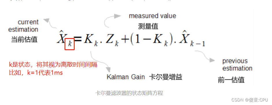
媒体查询 响应式 练习
时间: 2023-08-20 16:06:03 浏览: 53
好的,您可以尝试以下练习:
1. 创建一个响应式布局,当屏幕宽度小于等于 768px 时,导航栏变为折叠式菜单。
```html
<!DOCTYPE html>
<html>
<head>
<meta charset="UTF-8" />
<title>响应式布局练习</title>
<style>
/* 默认样式 */
ul {
list-style: none;
margin: 0;
padding: 0;
}
li {
display: inline-block;
}
a {
display: block;
padding: 10px;
text-decoration: none;
color: #333;
}
/* 媒体查询 */
@media screen and (max-width: 768px) {
/* 折叠式菜单 */
ul {
display: none;
position: absolute;
top: 50px;
left: 0;
width: 100%;
background-color: #f9f9f9;
z-index: 1;
}
li {
display: block;
text-align: center;
margin-bottom: 5px;
}
a {
border-bottom: 1px solid #ccc;
}
/* 显示折叠式菜单 */
.menu-toggle:checked ~ ul {
display: block;
}
}
</style>
</head>
<body>
<input type="checkbox" id="menu-toggle" />
<label for="menu-toggle">菜单</label>
<ul>
<li><a href="#">首页</a></li>
<li><a href="#">产品</a></li>
<li><a href="#">服务</a></li>
<li><a href="#">关于我们</a></li>
<li><a href="#">联系我们</a></li>
</ul>
</body>
</html>
```
2. 创建一个响应式布局,当屏幕宽度小于等于 480px 时,图片和文字改为垂直排列。
```html
<!DOCTYPE html>
<html>
<head>
<meta charset="UTF-8" />
<title>响应式布局练习</title>
<style>
/* 默认样式 */
.container {
display: flex;
justify-content: center;
}
.item {
margin: 20px;
text-align: center;
}
img {
width: 200px;
height: 200px;
object-fit: cover;
border-radius: 50%;
}
h2 {
margin-top: 10px;
font-size: 24px;
}
p {
margin-top: 5px;
font-size: 16px;
color: #999;
}
/* 媒体查询 */
@media screen and (max-width: 480px) {
/* 垂直排列 */
.container {
flex-direction: column;
}
h2 {
font-size: 20px;
}
p {
font-size: 14px;
}
}
</style>
</head>
<body>
<div class="container">
<div class="item">
<img src="https://picsum.photos/id/237/200/200" alt="图片" />
<h2>标题</h2>
<p>描述</p>
</div>
<div class="item">
<img src="https://picsum.photos/id/238/200/200" alt="图片" />
<h2>标题</h2>
<p>描述</p>
</div>
<div class="item">
<img src="https://picsum.photos/id/239/200/200" alt="图片" />
<h2>标题</h2>
<p>描述</p>
</div>
</div>
</body>
</html>
```
相关推荐
最新推荐
linux聊天系统,采用微信小程序与PC端双端开发。
后台采用apache服务器下的cgi处理c语言做微信小程序后台逻辑的脚本映射。PC端的服务器和客户端都是基于c语言写的。采用mysql数据库进行用户数据和聊天记录的存储。.zip
C语言是一种广泛使用的编程语言,它具有高效、灵活、可移植性强等特点,被广泛应用于操作系统、嵌入式系统、数据库、编译器等领域的开发。C语言的基本语法包括变量、数据类型、运算符、控制结构(如if语句、循环语句等)、函数、指针等。下面详细介绍C语言的基本概念和语法。
1. 变量和数据类型
在C语言中,变量用于存储数据,数据类型用于定义变量的类型和范围。C语言支持多种数据类型,包括基本数据类型(如int、float、char等)和复合数据类型(如结构体、联合等)。
2. 运算符
C语言中常用的运算符包括算术运算符(如+、、、/等)、关系运算符(如==、!=、、=、<、<=等)、逻辑运算符(如&&、||、!等)。此外,还有位运算符(如&、|、^等)和指针运算符(如、等)。
3. 控制结构
C语言中常用的控制结构包括if语句、循环语句(如for、while等)和switch语句。通过这些控制结构,可以实现程序的分支、循环和多路选择等功能。
4. 函数
函数是C语言中用于封装代码的单元,可以实现代码的复用和模块化。C语言中定义函数使用关键字“void”或返回值类型(如int、float等),并通过“{”和“}”括起来的代码块来实现函数的功能。
5. 指针
指针是C语言中用于存储变量地址的变量。通过指针,可以实现对内存的间接访问和修改。C语言中定义指针使用星号()符号,指向数组、字符串和结构体等数据结构时,还需要注意数组名和字符串常量的特殊性质。
6. 数组和字符串
数组是C语言中用于存储同类型数据的结构,可以通过索引访问和修改数组中的元素。字符串是C语言中用于存储文本数据的特殊类型,通常以字符串常量的形式出现,用双引号("...")括起来,末尾自动添加'\0'字符。
7. 结构体和联合
结构体和联合是C语言中用于存储不同类型数据的复合数据类型。结构体由多个成员组成,每个成员可以是不同的数据类型;联合由多个变量组成,它们共用同一块内存空间。通过结构体和联合,可以实现数据的封装和抽象。
8. 文件操作
C语言中通过文件操作函数(如fopen、fclose、fread、fwrite等)实现对文件的读写操作。文件操作函数通常返回文件指针,用于表示打开的文件。通过文件指针,可以进行文件的定位、读写等操作。
总之,C语言是一种功能强大、灵活高效的编程语言,广泛应用于各种领域。掌握C语言的基本语法和数据结构,可以为编程学习和实践打下坚实的基础。
基于Cartographer的室内SLAM系统研究与实现
本文研究了谷歌的Cartographer室内SLAM算法,为了提高其建图和定位的精确度对算法进行了改进。
保险服务门店新年工作计划PPT.pptx
在保险服务门店新年工作计划PPT中,包含了五个核心模块:市场调研与目标设定、服务策略制定、营销与推广策略、门店形象与环境优化以及服务质量监控与提升。以下是每个模块的关键知识点:
1. **市场调研与目标设定**
- **了解市场**:通过收集和分析当地保险市场的数据,包括产品种类、价格、市场需求趋势等,以便准确把握市场动态。
- **竞争对手分析**:研究竞争对手的产品特性、优势和劣势,以及市场份额,以进行精准定位和制定有针对性的竞争策略。
- **目标客户群体定义**:根据市场需求和竞争情况,明确服务对象,设定明确的服务目标,如销售额和客户满意度指标。
2. **服务策略制定**
- **服务计划制定**:基于市场需求定制服务内容,如咨询、报价、理赔协助等,并规划服务时间表,保证服务流程的有序执行。
- **员工素质提升**:通过专业培训提升员工业务能力和服务意识,优化服务流程,提高服务效率。
- **服务环节管理**:细化服务流程,明确责任,确保服务质量和效率,强化各环节之间的衔接。
3. **营销与推广策略**
- **节日营销活动**:根据节庆制定吸引人的活动方案,如新春送福、夏日促销,增加销售机会。
- **会员营销**:针对会员客户实施积分兑换、优惠券等策略,增强客户忠诚度。
4. **门店形象与环境优化**
- **环境设计**:优化门店外观和内部布局,营造舒适、专业的服务氛围。
- **客户服务便利性**:简化服务手续和所需材料,提升客户的体验感。
5. **服务质量监控与提升**
- **定期评估**:持续监控服务质量,发现问题后及时调整和改进,确保服务质量的持续提升。
- **流程改进**:根据评估结果不断优化服务流程,减少等待时间,提高客户满意度。
这份PPT旨在帮助保险服务门店在新的一年里制定出有针对性的工作计划,通过科学的策略和细致的执行,实现业绩增长和客户满意度的双重提升。
管理建模和仿真的文件
管理Boualem Benatallah引用此版本:布阿利姆·贝纳塔拉。管理建模和仿真。约瑟夫-傅立叶大学-格勒诺布尔第一大学,1996年。法语。NNT:电话:00345357HAL ID:电话:00345357https://theses.hal.science/tel-003453572008年12月9日提交HAL是一个多学科的开放存取档案馆,用于存放和传播科学研究论文,无论它们是否被公开。论文可以来自法国或国外的教学和研究机构,也可以来自公共或私人研究中心。L’archive ouverte pluridisciplinaire
MATLAB图像去噪最佳实践总结:经验分享与实用建议,提升去噪效果
# 1. 图像去噪基础
图像去噪旨在从图像中去除噪声,提升图像质量。图像噪声通常由传感器、传输或处理过程中的干扰引起。了解图像噪声的类型和特性对于选择合适的去噪算法至关重要。
**1.1 噪声类型**
* **高斯噪声:**具有正态分布的加性噪声,通常由传感器热噪声引起。
* **椒盐噪声:**随机分布的孤立像素,值要么为最大值(白色噪声),要么为最小值(黑色噪声)。
* **脉冲噪声
InputStream in = Resources.getResourceAsStream
`Resources.getResourceAsStream`是MyBatis框架中的一个方法,用于获取资源文件的输入流。它通常用于加载MyBatis配置文件或映射文件。
以下是一个示例代码,演示如何使用`Resources.getResourceAsStream`方法获取资源文件的输入流:
```java
import org.apache.ibatis.io.Resources;
import java.io.InputStream;
public class Example {
public static void main(String[] args) {
车辆安全工作计划PPT.pptx
"车辆安全工作计划PPT.pptx"
这篇文档主要围绕车辆安全工作计划展开,涵盖了多个关键领域,旨在提升车辆安全性能,降低交通事故发生率,以及加强驾驶员的安全教育和交通设施的完善。
首先,工作目标是确保车辆结构安全。这涉及到车辆设计和材料选择,以增强车辆的结构强度和耐久性,从而减少因结构问题导致的损坏和事故。同时,通过采用先进的电子控制和安全技术,提升车辆的主动和被动安全性能,例如防抱死刹车系统(ABS)、电子稳定程序(ESP)等,可以显著提高行驶安全性。
其次,工作内容强调了建立和完善车辆安全管理体系。这包括制定车辆安全管理制度,明确各级安全管理责任,以及确立安全管理的指导思想和基本原则。同时,需要建立安全管理体系,涵盖安全组织、安全制度、安全培训和安全检查等,确保安全管理工作的系统性和规范性。
再者,加强驾驶员安全培训是另一项重要任务。通过培训提高驾驶员的安全意识和技能水平,使他们更加重视安全行车,了解并遵守交通规则。培训内容不仅包括交通法规,还涉及安全驾驶技能和应急处置能力,以应对可能发生的突发情况。
此外,文档还提到了严格遵守交通规则的重要性。这需要通过宣传和执法来强化,以降低由于违反交通规则造成的交通事故。同时,优化道路交通设施,如改善交通标志、标线和信号灯,可以提高道路通行效率,进一步增强道路安全性。
在实际操作层面,工作计划中提到了车辆定期检查的必要性,包括对刹车、转向、悬挂、灯光、燃油和电器系统的检查,以及根据车辆使用情况制定检查计划。每次检查后应记录问题并及时处理,以确保车辆始终处于良好状态。
最后,建立车辆安全信息管理系统也是关键。通过对车辆事故和故障情况进行记录和分析,可以为安全管理提供数据支持,以便及时发现问题,预防潜在风险,并对事故进行有效处理和责任追究。
这份车辆安全工作计划全面覆盖了从车辆本身到驾驶员行为,再到道路环境的诸多方面,旨在构建一个全方位、多层次的车辆安全管理体系,以降低交通事故风险,保障道路交通安全。
"互动学习:行动中的多样性与论文攻读经历"
多样性她- 事实上SCI NCES你的时间表ECOLEDO C Tora SC和NCESPOUR l’Ingén学习互动,互动学习以行动为中心的强化学习学会互动,互动学习,以行动为中心的强化学习计算机科学博士论文于2021年9月28日在Villeneuve d'Asq公开支持马修·瑟林评审团主席法布里斯·勒菲弗尔阿维尼翁大学教授论文指导奥利维尔·皮耶昆谷歌研究教授:智囊团论文联合主任菲利普·普雷教授,大学。里尔/CRISTAL/因里亚报告员奥利维耶·西格德索邦大学报告员卢多维奇·德诺耶教授,Facebook /索邦大学审查员越南圣迈IMT Atlantic高级讲师邀请弗洛里安·斯特鲁布博士,Deepmind对于那些及时看到自己错误的人...3谢谢你首先,我要感谢我的两位博士生导师Olivier和Philippe。奥利维尔,"站在巨人的肩膀上"这句话对你来说完全有意义了。从科学上讲,你知道在这篇论文的(许多)错误中,你是我可以依
MATLAB图像去噪行业应用:从医疗到遥感,解锁图像去噪的无限潜力
# 1. MATLAB图像去噪概述
**1.1 图像去噪的重要性**
图像去噪是图像处理中一项至关重要的任务,它旨在从图像中去除不需要的噪声,从而提高图像的质量和可理解性。图像噪声可能来自各种来源,如传感器缺陷、环境干扰和数据传输错误。
**1.2 MATLAB图像去噪的优势**
MATLAB是一个强大的技术计算环境,提供了一系列图像去噪算法和工具。MATLA
使用pyrhon编写mapreduce
MapReduce是一种用于处理大规模数据集的编程模型和算法。它通常用于分布式计算环境中,可以高效地处理大量数据并实现并行计算。在Python中,我们可以使用Hadoop Streaming来编写MapReduce程序。
下面是使用Python编写MapReduce的基本步骤:
1. Map阶段:
- 编写一个mapper函数,该函数接收输入数据并将其转换为键值对的形式。
- 使用标准输入(sys.stdin)读取输入数据,并使用标准输出(sys.stdout)输出键值对。
2. Reduce阶段:
- 编写一个reducer函数,该函数接收来自mapper函数输出的键