帮我写一个html背景是圆形的ui代码
时间: 2023-08-28 12:29:05 浏览: 50
以下是一个使用CSS实现圆形背景的UI代码:
```html
<div class="circle-bg-ui">
<p>Hello, World!</p>
</div>
```
```css
.circle-bg-ui {
background-color: #f0f0f0;
border-radius: 50%;
width: 200px;
height: 200px;
display: flex;
justify-content: center;
align-items: center;
}
```
这段代码会创建一个背景是圆形的UI元素,并在其中居中放置一个段落元素。你可以将其中的背景颜色和文本内容等进行修改以符合自己的需求。
相关问题
前端可以自己写一个和element ui单选按钮样式一样的单选按钮吗
是的,前端开发者可以通过CSS自定义样式来实现一个和Element UI单选按钮样式一样的单选按钮。以下是一个简单的示例:
HTML代码:
```
<label class="radio">
<input type="radio" name="radio" />
<span class="radio__text">选项1</span>
</label>
<label class="radio">
<input type="radio" name="radio" />
<span class="radio__text">选项2</span>
</label>
```
CSS代码:
```
.radio {
display: inline-block;
position: relative;
padding-left: 28px;
margin-right: 20px;
cursor: pointer;
font-size: 14px;
user-select: none;
line-height: 1.5;
}
.radio input {
position: absolute;
opacity: 0;
cursor: pointer;
}
.radio__text {
position: relative;
margin-left: 8px;
}
.radio:before {
content: "";
position: absolute;
left: 0;
top: 50%;
transform: translateY(-50%);
width: 16px;
height: 16px;
border: 1px solid #dcdfe6;
border-radius: 50%;
background-color: #fff;
}
.radio input:checked + .radio__text:before {
content: "";
position: absolute;
left: 0;
top: 50%;
transform: translateY(-50%);
width: 10px;
height: 10px;
border-radius: 50%;
background-color: #409EFF;
}
```
通过这段代码,我们创建了一个样式类为`radio`的单选按钮。我们使用伪元素`before`来模拟一个圆形的按钮,使用`input`标签的`checked`属性来确定按钮是否被选中。当按钮被选中时,我们会改变`before`元素的背景颜色来模拟选中状态。
你可以根据自己的需求调整CSS样式,来实现更多样式的单选按钮。
用vue2和elementui写一个健身房用户登录界面,有一张好看的背景图
由于我是AI语言模型,并没有办法直接提供一个完整的vue2和elementui写的健身房用户登录界面,但是我可以提供一些基本的代码示例,希望能帮到你。
首先,需要安装Vue和ElementUI:
```bash
npm install vue
npm install element-ui
```
然后,可以在Vue实例中引入ElementUI,并在template中使用ElementUI的组件来构建登录界面,例如:
```html
<template>
<div class="login-container">
<el-form ref="form" :model="loginForm" :rules="rules" class="login-form">
<h1 class="title">健身房用户登录</h1>
<<!-- 表单项 -->
<el-form-item label="用户名" prop="username">
<el-input v-model="loginForm.username" autocomplete="off"></el-input>
</el-form-item>
<el-form-item label="密码" prop="password">
<el-input type="password" v-model="loginForm.password" autocomplete="off"></el-input>
</el-form-item>
<el-form-item>
<el-button type="primary" @click="submitForm">登录</el-button>
</el-form-item>
</el-form>
</div>
</template>
<script>
import { ElForm, ElFormItem, ElInput, ElButton } from 'element-ui'
export default {
name: 'Login',
components: {
ElForm,
ElFormItem,
ElInput,
ElButton,
},
data() {
return {
loginForm: {
username: '',
password: '',
},
rules: {
username: [
{ required: true, message: '请输入用户名', trigger: 'blur' },
],
password: [
{ required: true, message: '请输入密码', trigger: 'blur' },
],
},
}
},
methods: {
submitForm() {
this.$refs.form.validate(valid => {
if (valid) {
// TODO: 登录逻辑
}
})
},
},
}
</script>
<style scoped>
.login-container {
background-image: url('./bg.jpg');
background-size: cover;
background-position: center;
height: 100vh;
display: flex;
align-items: center;
justify-content: center;
}
.login-form {
width: 400px;
background-color: rgba(255, 255, 255, 0.8);
padding: 30px;
border-radius: 10px;
box-shadow: 0 0 10px rgba(0, 0, 0, 0.2);
}
.title {
font-size: 24px;
text-align: center;
margin-bottom: 30px;
}
</style>
```
其中,`ElForm`、`ElFormItem`、`ElInput`和`ElButton`是ElementUI提供的组件,在`components`属性中引入。`loginForm`是表单数据对象,`rules`定义了表单项的校验规则。`submitForm`方法用于提交表单,这里只是简单的校验表单,可以根据实际情况进行修改。
样式部分使用了`scoped`来限定作用域,`.login-container`设置了背景图片和高度,并将子元素垂直居中对齐。`.login-form`设置了表单的样式,包括背景颜色、内边距、圆角和阴影。`.title`用于设置标题的样式。
最后,需要在`src`目录下创建一个名为`bg.jpg`的图片文件,作为背景图的来源。
以上只是一个简单的示例,实际项目中可能需要更复杂的逻辑和样式,需要根据实际情况进行修改和完善。
相关推荐
最新推荐
Bootstrap超大屏幕的实现代码
上述HTML代码中,我们首先引入了Bootstrap框架的CSS文件,然后定义了一个超大屏幕的容器(`<div class="jumbotron">`),在容器中添加了一个容器(`<div class="container">`),用于容纳超大屏幕的内容。...
微信小程序vant弹窗组件的实现方式
Popup通常用于在不离开当前页面的情况下展示详细信息,它有一个背景遮罩层和内容展示区。而Dialog则更为复杂,除了内容展示外,还常常包含用户需要确认的操作,如按钮和标题。 2. ** 注册小程序组件 ** 在使用Vant...
protobuf-3.7.0-py2.7.egg
Python库是一组预先编写的代码模块,旨在帮助开发者实现特定的编程任务,无需从零开始编写代码。这些库可以包括各种功能,如数学运算、文件操作、数据分析和网络编程等。Python社区提供了大量的第三方库,如NumPy、Pandas和Requests,极大地丰富了Python的应用领域,从数据科学到Web开发。Python库的丰富性是Python成为最受欢迎的编程语言之一的关键原因之一。这些库不仅为初学者提供了快速入门的途径,而且为经验丰富的开发者提供了强大的工具,以高效率、高质量地完成复杂任务。例如,Matplotlib和Seaborn库在数据可视化领域内非常受欢迎,它们提供了广泛的工具和技术,可以创建高度定制化的图表和图形,帮助数据科学家和分析师在数据探索和结果展示中更有效地传达信息。
小程序版python语言pytorch框架训练识别是否疲劳-不含数据集图片-含逐行注释和说明文档.zip
本代码是基于python pytorch环境安装的。
总共是3个py文件,十分的简便
且代码里面的每一行都是含有中文注释的,小白也能看懂代码
然后是关于数据集的介绍。
本代码是不含数据集图片的,下载本代码后需要自行搜集图片放到对应的文件夹下即可
在数据集文件夹下是我们的各个类别,这个类别不是固定的,可自行创建文件夹增加分类数据集
需要我们往每个文件夹下搜集来图片放到对应文件夹下,每个对应的文件夹里面也有一张提示图,提示图片放的位置
然后我们需要将搜集来的图片,直接放到对应的文件夹下,就可以对代码进行训练了。
运行01数据集文本生成制作.py,是将数据集文件夹下的图片路径和对应的标签生成txt格式,划分了训练集和验证集。
运行02深度学习模型训练.py就会将txt文本中记录的训练集和验证集进行读取训练,训练好后会保存模型在本地。训练完成之后会有log日志保存本地,里面记录了每个epoch的验证集损失值和准确率。
运行03flask_服务端.py就可以生成与小程序交互的url了
然后需要我们运行微信开发者工具,如果之前没有下载过,则需要在电脑网页上,搜微信开发者工具进行下载。
导入我们的小
nbconvert-7.4.0.tar.gz
Python库是一组预先编写的代码模块,旨在帮助开发者实现特定的编程任务,无需从零开始编写代码。这些库可以包括各种功能,如数学运算、文件操作、数据分析和网络编程等。Python社区提供了大量的第三方库,如NumPy、Pandas和Requests,极大地丰富了Python的应用领域,从数据科学到Web开发。Python库的丰富性是Python成为最受欢迎的编程语言之一的关键原因之一。这些库不仅为初学者提供了快速入门的途径,而且为经验丰富的开发者提供了强大的工具,以高效率、高质量地完成复杂任务。例如,Matplotlib和Seaborn库在数据可视化领域内非常受欢迎,它们提供了广泛的工具和技术,可以创建高度定制化的图表和图形,帮助数据科学家和分析师在数据探索和结果展示中更有效地传达信息。
新皇冠假日酒店互动系统的的软件测试论文.docx
该文档是一篇关于新皇冠假日酒店互动系统的软件测试的学术论文。作者深入探讨了在开发和实施一个交互系统的过程中,如何确保其质量与稳定性。论文首先从软件测试的基础理论出发,介绍了技术背景,特别是对软件测试的基本概念和常用方法进行了详细的阐述。
1. 软件测试基础知识:
- 技术分析部分,着重讲解了软件测试的全面理解,包括软件测试的定义,即检查软件产品以发现错误和缺陷的过程,确保其功能、性能和安全性符合预期。此外,还提到了几种常见的软件测试方法,如黑盒测试(关注用户接口)、白盒测试(基于代码内部结构)、灰盒测试(结合了两者)等,这些都是测试策略选择的重要依据。
2. 测试需求及测试计划:
- 在这个阶段,作者详细分析了新皇冠假日酒店互动系统的需求,包括功能需求、性能需求、安全需求等,这是测试设计的基石。根据这些需求,作者制定了一份详尽的测试计划,明确了测试的目标、范围、时间表和预期结果。
3. 测试实践:
- 采用的手动测试方法表明,作者重视对系统功能的直接操作验证,这可能涉及到用户界面的易用性、响应时间、数据一致性等多个方面。使用的工具和技术包括Sunniwell-android配置工具,用于Android应用的配置管理;MySQL,作为数据库管理系统,用于存储和处理交互系统的数据;JDK(Java Development Kit),是开发Java应用程序的基础;Tomcat服务器,一个轻量级的Web应用服务器,对于处理Web交互至关重要;TestDirector,这是一个功能强大的测试管理工具,帮助管理和监控整个测试过程,确保测试流程的规范性和效率。
4. 关键词:
论文的关键词“酒店互动系统”突出了研究的应用场景,而“Tomcat”和“TestDirector”则代表了论文的核心技术手段和测试工具,反映了作者对现代酒店业信息化和自动化测试趋势的理解和应用。
5. 目录:
前言部分可能概述了研究的目的、意义和论文结构,接下来的内容可能会依次深入到软件测试的理论、需求分析、测试策略和方法、测试结果与分析、以及结论和未来工作方向等章节。
这篇论文详细探讨了新皇冠假日酒店互动系统的软件测试过程,从理论到实践,展示了如何通过科学的测试方法和工具确保系统的质量,为酒店行业的软件开发和维护提供了有价值的参考。
管理建模和仿真的文件
管理Boualem Benatallah引用此版本:布阿利姆·贝纳塔拉。管理建模和仿真。约瑟夫-傅立叶大学-格勒诺布尔第一大学,1996年。法语。NNT:电话:00345357HAL ID:电话:00345357https://theses.hal.science/tel-003453572008年12月9日提交HAL是一个多学科的开放存取档案馆,用于存放和传播科学研究论文,无论它们是否被公开。论文可以来自法国或国外的教学和研究机构,也可以来自公共或私人研究中心。L’archive ouverte pluridisciplinaire
Python Shell命令执行:管道与重定向,实现数据流控制,提升脚本灵活性
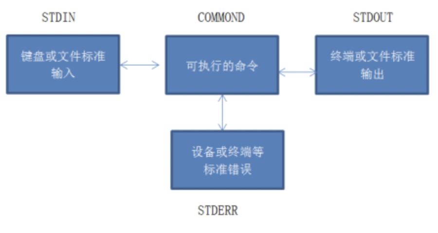
# 1. Python Shell命令执行基础**
Python Shell 提供了一种交互式环境,允许用户直接在命令行中执行 Python 代码。它提供了一系列命令,用于执行各种任务,包括:
* **交互式代码执行:**在 Shell 中输入 Python 代码并立即获得结果。
* **脚本执行:**使用 `python` 命令执行外部 Python 脚本。
* **模
jlink解锁S32K
J-Link是一款通用的仿真器,可用于解锁NXP S32K系列微控制器。J-Link支持各种调试接口,包括JTAG、SWD和cJTAG。以下是使用J-Link解锁S32K的步骤:
1. 准备好J-Link仿真器和S32K微控制器。
2. 将J-Link仿真器与计算机连接,并将其与S32K微控制器连接。
3. 打开S32K的调试工具,如S32 Design Studio或者IAR Embedded Workbench。
4. 在调试工具中配置J-Link仿真器,并连接到S32K微控制器。
5. 如果需要解锁S32K的保护,需要在调试工具中设置访问级别为unrestricted。
6. 点击下载
上海空中营业厅系统的软件测试论文.doc
"上海空中营业厅系统的软件测试论文主要探讨了对上海空中营业厅系统进行全面功能测试的过程和技术。本文深入分析了该系统的核心功能,包括系统用户管理、代理商管理、资源管理、日志管理和OTA(Over-The-Air)管理系统。通过制定测试需求、设计测试用例和构建测试环境,论文详述了测试执行的步骤,并记录了测试结果。测试方法以手工测试为主,辅以CPTT工具实现部分自动化测试,同时运用ClearQuest软件进行测试缺陷的全程管理。测试策略采用了黑盒测试方法,重点关注系统的外部行为和功能表现。
在功能测试阶段,首先对每个功能模块进行了详尽的需求分析,明确了测试目标。系统用户管理涉及用户注册、登录、权限分配等方面,测试目的是确保用户操作的安全性和便捷性。代理商管理则关注代理的增删改查、权限设置及业务处理流程。资源管理部分测试了资源的上传、下载、更新等操作,确保资源的有效性和一致性。日志管理侧重于记录系统活动,便于故障排查和审计。OTA管理系统则关注软件的远程升级和更新,确保更新过程的稳定性和兼容性。
测试用例的设计覆盖了所有功能模块,旨在发现潜在的软件缺陷。每个用例都包含了预期输入、预期输出和执行步骤,以保证测试的全面性。测试环境的搭建模拟了实际运行环境,包括硬件配置、操作系统、数据库版本等,以确保测试结果的准确性。
在测试执行过程中,手动测试部分主要由测试人员根据用例进行操作,观察系统反应并记录结果。而自动化测试部分,CPTT工具的应用减轻了重复劳动,提高了测试效率。ClearQuest软件用于跟踪和管理测试过程中发现的缺陷,包括缺陷报告、分类、优先级设定、状态更新和关闭,确保了缺陷处理的流程化和规范化。
最后,测试总结分析了测试结果,评估了系统的功能完善程度和稳定性,提出了改进意见和未来测试工作的方向。通过黑盒测试方法,重点考察了用户在实际操作中可能遇到的问题,确保了上海空中营业厅系统能够提供稳定、可靠的服务。
关键词:上海空中营业厅系统;功能测试;缺陷管理;测试用例;自动化测试;黑盒测试;CPTT;ClearQuest"