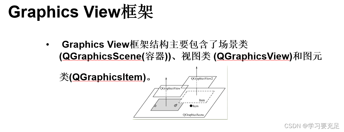
border-left: 3px solid #fff;边框加圆角
时间: 2024-02-17 12:59:47 浏览: 132
若要将左边框加上圆角,可以使用 `border-radius` 和 `border-left` 属性来实现。具体实现方法如下:
```css
border-left: 3px solid #fff;
border-radius: 0 10px 10px 0;
```
其中,`border-left` 用于设置左边框的样式,宽度为3px,颜色为白色。`border-radius` 用于设置圆角,共有四个值,分别对应四个角,值的顺序为上左、上右、下右、下左。上左和下右的值设为0,表示不进行圆角处理,而上右和下左的值设为10px,则表示将左下角和左上角进行圆角处理,半径为10px。
这样设置后,左边框将会变成3px宽的白色直线,并且左下角和左上角会被设置成10px的圆角。
相关问题
翻译.dropdown-menu { position: absolute; top: 100%; left: 0; z-index: 1000; display: none; float: left; min-width: 10rem; padding: 0.5rem 0; margin: 0.125rem 0 0; font-size: 1rem; color: #212529; text-align: left; list-style: none; background-color: #fff; background-clip: padding-box; border: 1px solid rgba(0, 0, 0, 0.15); border-radius: 0.25rem; }
这段代码定义了一个下拉菜单的样式:
- `position: absolute;` 将菜单定位到页面上的绝对位置。
- `top: 100%;` 将菜单的顶部与其父元素底部对齐。
- `left: 0;` 将菜单的左侧与其父元素左侧对齐。
- `z-index: 1000;` 将菜单的堆叠顺序置于其他元素之上。
- `display: none;` 初始时不显示菜单。
- `float: left;` 让菜单左浮动。
- `min-width: 10rem;` 设置菜单的最小宽度为 10 个字号单位
- `padding: 0.5rem 0;` 设置菜单内部的上下内边距为 0.5 个字号单位。
- `margin: 0.125rem 0 0;` 设置菜单外部的上边距为 0.125 个字号单位,下边距和左右边距为 0。
- `font-size: 1rem;` 设置菜单中的字体大小为 1 个字号单位。
- `color: #212529;` 设置菜单中的字体颜色为 #212529。
- `text-align: left;` 设置菜单中的文本左对齐。
- `list-style: none;` 取消菜单项的列表标记。
- `background-color: #fff;` 设置菜单的背景颜色为 #fff。
- `background-clip: padding-box;` 设置背景的绘制区域为内边距盒子。
- `border: 1px solid rgba(0, 0, 0, 0.15);` 设置菜单的边框为 1 个像素宽的、透明度为 0.15 的黑色实线。
- `border-radius: 0.25rem;` 设置菜单的圆角半径为 0.25 个字号单位。
css3 实现一个邮票贴纸效果的div容器,锯齿带圆角,并且border为灰色,padding为5px
要实现CSS3邮票贴纸的效果,你可以使用`box-shadow`, `border-radius`, 和 `background-color` 属性。这里是一个示例代码:
```html
<!DOCTYPE html>
<html lang="en">
<head>
<meta charset="UTF-8">
<style>
.sticker {
position: relative; /* 布局容器定位 */
width: 100px;
height: 75px; /* 邮票大小可以根据需求调整 */
background-color: #f0eae6; /* 基础颜色,模拟旧纸张 */
border: 2px solid #ccc; /* 边框,灰色 */
padding: 5px; /* 内边距 */
box-shadow:
2px 2px 5px rgba(0, 0, 0, 0.2), /* 锯齿状阴影,增强效果 */
inset 2px 2px 5px #fff; /* 内凹白色阴影,模拟切割痕迹 */
border-radius: 10px; /* 圆角 */
}
.sticker:before {
content: ""; /* 用于创建遮罩层 */
position: absolute;
top: -10px; /* 创造锯齿边缘,根据圆角调整值 */
left: -10px;
right: -10px;
bottom: -10px;
border-top-left-radius: 10px;
border-top-right-radius: 10px;
border-bottom-right-radius: 10px;
border-bottom-left-radius: 10px;
background-color: #fff;
opacity: 0.8; /* 略透明度,增加层次感 */
}
</style>
</head>
<body>
<div class="sticker"></div>
</body>
</html>
```
这个例子中的`.sticker` 类定义了一个具有邮票效果的div,包含了背景色、灰色边框、内边距、锯齿状阴影和圆角。`.sticker:before` 创建了一个遮罩层,使得四周呈现锯齿边缘。
阅读全文
相关推荐
大家在看
PCIE2.0总线规范,用于PCIE开发参考.zip
PCIE2.0总线规范,用于PCIE开发参考.zip
基于自适应权重稀疏典范相关分析的人脸表情识别
为解决当变量个数离散时,典型的相关分析方法不能称为一个稳定模型的问题,提出了一种基于自适应权值的稀疏典型相关分析的人脸表情识别方法。系数收敛的约束,使基向量中的某些系数收敛为0,因此,可以去掉一些对表情识别没有用处的变量。同时,通常由稀疏类别相关分析得出,稀疏权值的选择是固定的在Jaffe和Cohn-Kanade人脸表情数据库上的实验结果,进一步验证了该方法的正确性和有效性。
微电子实验器件课件21
1. 肖特基势垒二极管工艺流程及器件结构
2. 编写该器件的 Athena 程序,以得到器件精确的结构图
3. 定义初始衬底
5. 沉积 Pt 薄膜并剥离
6.
计算机网络_自顶向下方法_第四版_课后习题答案
Chapter 1 Review Questions
1. There is no difference. Throughout this text, the words “host” and “end system” are used interchangeably. End systems include PCs, workstations, Web servers, mail servers, Internet-connected PDAs, WebTVs, etc.
2. Suppose Alice, an ambassador of country A wants to invite Bob, an ambassador of country B, over for dinner. Alice doesn’t simply just call Bob on the phone and say, “come to our dinner table now”. Instead, she calls Bob and suggests a date and time. Bob may respond by saying he’s not available that particular date, but he is available another date. Alice and Bob continue to send “messages” back and forth until they agree on a date and time. Bob then shows up at the embassy on the agreed date, hopefully not more than 15 minutes before or after the agreed time. Diplomatic protocols also allow for either Alice or Bob to politely cancel the engagement if they have reasonable excuses.
3. A networking program usually has two programs, each running on a different host, communicating with each other. The program that initiates the communication is the client. Typically, the client program requests and receives services from the server program.
香港地铁的安全风险管理 (2007年)
概述地铁有限公司在香港建立和实践安全风险管理体系的经验、运营铁路安全管理组织架构、工程项目各阶段的安全风险管理规划、主要安全风险管理任务及分析方法等。
最新推荐
基于html和CSS3制作酷炫的导航栏
在这里,我们看到`border-right:1px solid #000`用于创建一个1像素宽的黑色实线边框。 5. **使用HTML + CSS3 渐变画图 制作背景图片**: `background-image`属性可以设置渐变背景。这里使用了`-webkit-linear-...
Ripr0-v5曰主题8.3开心版适用于知识付费资源素材博客
RiPr0主题的全新V5版本(原RiPr0-V2的升级版)是一款功能卓越、性能优越且速度极快的WordPress虚拟资源商城主题。它具备首页模块化布局和WP原生小工具的自由拖拽设置,以提高网站设计便捷性。此外,该主题还支持高级筛选、内置会员生态系统和多种支付接口,使网站无需依赖任何附加插件即可实现众多功能。同时,主题也支持卡密、充值和站内币等多种功能,为您的网站提供全面而有效的解决方案。
探索zinoucha-master中的0101000101奥秘
资源摘要信息:"zinoucha:101000101"
根据提供的文件信息,我们可以推断出以下几个知识点:
1. 文件标题 "zinoucha:101000101" 中的 "zinoucha" 可能是某种特定内容的标识符或是某个项目的名称。"101000101" 则可能是该项目或内容的特定代码、版本号、序列号或其他重要标识。鉴于标题的特殊性,"zinoucha" 可能是一个与数字序列相关联的术语或项目代号。
2. 描述中提供的 "日诺扎 101000101" 可能是标题的注释或者补充说明。"日诺扎" 的含义并不清晰,可能是人名、地名、特殊术语或是一种加密/编码信息。然而,由于描述与标题几乎一致,这可能表明 "日诺扎" 和 "101000101" 是紧密相关联的。如果 "日诺扎" 是一个密码或者编码,那么 "101000101" 可能是其二进制编码形式或经过某种特定算法转换的结果。
3. 标签部分为空,意味着没有提供额外的分类或关键词信息,这使得我们无法通过标签来获取更多关于该文件或项目的信息。
4. 文件名称列表中只有一个文件名 "zinoucha-master"。从这个文件名我们可以推测出一些信息。首先,它表明了这个项目或文件属于一个更大的项目体系。在软件开发中,通常会将主分支或主线版本命名为 "master"。所以,"zinoucha-master" 可能指的是这个项目或文件的主版本或主分支。此外,由于文件名中同样包含了 "zinoucha",这进一步确认了 "zinoucha" 对该项目的重要性。
结合以上信息,我们可以构建以下几个可能的假设场景:
- 假设 "zinoucha" 是一个项目名称,那么 "101000101" 可能是该项目的某种特定标识,例如版本号或代码。"zinoucha-master" 作为主分支,意味着它包含了项目的最稳定版本,或者是开发的主干代码。
- 假设 "101000101" 是某种加密或编码,"zinoucha" 和 "日诺扎" 都可能是对其进行解码或解密的钥匙。在这种情况下,"zinoucha-master" 可能包含了用于解码或解密的主算法或主程序。
- 假设 "zinoucha" 和 "101000101" 代表了某种特定的数据格式或标准。"zinoucha-master" 作为文件名,可能意味着这是遵循该标准或格式的最核心文件或参考实现。
由于文件信息非常有限,我们无法确定具体的领域或背景。"zinoucha" 和 "日诺扎" 可能是任意领域的术语,而 "101000101" 作为二进制编码,可能在通信、加密、数据存储等多种IT应用场景中出现。为了获得更精确的知识点,我们需要更多的上下文信息和具体的领域知识。
【Qt与OpenGL集成】:提升框选功能图形性能,OpenGL的高效应用案例
# 摘要
本文旨在探讨Qt与OpenGL集成的实现细节及其在图形性能优化方面的重要性。文章首先介绍了Qt与OpenGL集成的基础知识,然后深入探讨了在Qt环境中实现OpenGL高效渲染的技术,如优化渲染管线、图形数据处理和渲染性能提升策略。接着,文章着重分析了框选功能的图形性能优化,包括图形学原理、高效算法实现以及交互设计。第四章通过高级案例分析,比较了不同的框选技术,并探讨了构
ffmpeg 指定屏幕输出
ffmpeg 是一个强大的多媒体处理工具,可以用来处理视频、音频和字幕等。要使用 ffmpeg 指定屏幕输出,可以使用以下命令:
```sh
ffmpeg -f x11grab -s <width>x<height> -r <fps> -i :<display>.<screen>+<x_offset>,<y_offset> output_file
```
其中:
- `-f x11grab` 指定使用 X11 屏幕抓取输入。
- `-s <width>x<height>` 指定抓取屏幕的分辨率,例如 `1920x1080`。
- `-r <fps>` 指定帧率,例如 `25`。
- `-i
个人网站技术深度解析:Haskell构建、黑暗主题、并行化等
资源摘要信息:"个人网站构建与开发"
### 网站构建与部署工具
1. **Nix-shell**
- Nix-shell 是 Nix 包管理器的一个功能,允许用户在一个隔离的环境中安装和运行特定版本的软件。这在需要特定库版本或者不同开发环境的场景下非常有用。
- 使用示例:`nix-shell --attr env release.nix` 指定了一个 Nix 环境配置文件 `release.nix`,从而启动一个专门的 shell 环境来构建项目。
2. **Nix-env**
- Nix-env 是 Nix 包管理器中的一个命令,用于环境管理和软件包安装。它可以用来安装、更新、删除和切换软件包的环境。
- 使用示例:`nix-env -if release.nix` 表示根据 `release.nix` 文件中定义的环境和依赖,安装或更新环境。
3. **Haskell**
- Haskell 是一种纯函数式编程语言,以其强大的类型系统和懒惰求值机制而著称。它支持高级抽象,并且广泛应用于领域如研究、教育和金融行业。
- 标签信息表明该项目可能使用了 Haskell 语言进行开发。
### 网站功能与技术实现
1. **黑暗主题(Dark Theme)**
- 黑暗主题是一种界面设计,使用较暗的颜色作为背景,以减少对用户眼睛的压力,特别在夜间或低光环境下使用。
- 实现黑暗主题通常涉及CSS中深色背景和浅色文字的设计。
2. **使用openCV生成缩略图**
- openCV 是一个开源的计算机视觉和机器学习软件库,它提供了许多常用的图像处理功能。
- 使用 openCV 可以更快地生成缩略图,通过调用库中的图像处理功能,比如缩放和颜色转换。
3. **通用提要生成(Syndication Feed)**
- 通用提要是 RSS、Atom 等格式的集合,用于发布网站内容更新,以便用户可以通过订阅的方式获取最新动态。
- 实现提要生成通常需要根据网站内容的更新来动态生成相应的 XML 文件。
4. **IndieWeb 互动**
- IndieWeb 是一个鼓励人们使用自己的个人网站来发布内容,而不是使用第三方平台的运动。
- 网络提及(Webmentions)是 IndieWeb 的一部分,它允许网站之间相互提及,类似于社交媒体中的评论和提及功能。
5. **垃圾箱包装/网格系统**
- 垃圾箱包装可能指的是一个用于暂存草稿或未发布内容的功能,类似于垃圾箱回收站。
- 网格系统是一种布局方式,常用于网页设计中,以更灵活的方式组织内容。
6. **画廊/相册/媒体类型/布局**
- 这些关键词可能指向网站上的图片展示功能,包括但不限于相册、网络杂志、不同的媒体展示类型和布局设计。
7. **标签/类别/搜索引擎**
- 这表明网站具有内容分类功能,用户可以通过标签和类别来筛选内容,并且可能内置了简易的搜索引擎来帮助用户快速找到相关内容。
8. **并行化(Parallelization)**
- 并行化在网站开发中通常涉及将任务分散到多个处理单元或线程中执行,以提高效率和性能。
- 这可能意味着网站的某些功能被设计成可以同时处理多个请求,比如后台任务、数据处理等。
9. **草稿版本+实时服务器**
- 草稿版本功能允许用户保存草稿并能在需要时编辑和发布。
- 实时服务器可能是指网站采用了实时数据同步的技术,如 WebSockets,使用户能够看到内容的实时更新。
### 总结
上述信息展示了一个人在个人网站开发过程中所涉及到的技术和功能实现,包括了环境配置、主题设计、内容管理和用户体验优化。从使用Nix-shell进行环境隔离和依赖管理到实现一个具有高级功能和良好用户体验的个人网站,每个技术点都是现代Web开发中的关键组成部分。
Qt框选功能的国际化实践:支持多语言界面的核心技术解析

# 摘要
本文系统地探讨了Qt框架下多语言界面设计与国际化的实现原理和技术细节。首先介绍了Qt国际化框架的基础知识和多语言界面设计的基本原理,包括文本处理、资源文件管理、核心API的应用等。随后,文章详细阐述了设计可翻译用户界面、动态语言切换和界面更新以及测试和调试多语言界面的实践技巧。深入理解
内网如何运行docker pull mysql:5.7
要在内网中运行Docker的pull命令来获取MySQL 5.7镜像,可以按照以下步骤进行操作:
1. 确保在内网中的计算机上安装了Docker。
2. 打开终端或命令提示符,并使用以下命令登录到Docker镜像仓库:
```shell
docker login <repository>
```
将`<repository>`替换为MySQL镜像仓库的地址,例如`mysql`或`docker.io/mysql`。
3. 输入用户名和密码以登录到镜像仓库。
4. 使用以下命令从镜像仓库拉取MySQL 5.7镜像:
```shell
docker pull <repository>/my
ImgToString开源工具:图像转字符串轻松实现
资源摘要信息:"ImgToString是一款开源软件,其主要功能是将图像文件转换为字符串。这种转换方式使得图像文件可以被复制并粘贴到任何支持文本输入的地方,比如文本编辑器、聊天窗口或者网页代码中。通过这种方式,用户无需附加文件即可分享图像信息,尤其适用于在文本模式的通信环境中传输图像数据。"
在技术实现层面,ImgToString可能采用了一种特定的编码算法,将图像文件的二进制数据转换为Base64编码或其他编码格式的字符串。Base64是一种基于64个可打印字符来表示二进制数据的编码方法。由于ASCII字符集只有128个字符,而Base64使用64个字符,因此可以确保转换后的字符串在大多数文本处理环境中能够安全传输,不会因为特殊字符而被破坏。
对于jpg或png等常见的图像文件格式,ImgToString软件需要能够解析这些格式的文件结构,提取图像数据,并进行相应的编码处理。这个过程通常包括读取文件头信息、确定图像尺寸、颜色深度、压缩方式等关键参数,然后根据这些参数将图像的像素数据转换为字符串形式。对于jpg文件,可能还需要处理压缩算法(如JPEG算法)对图像数据的处理。
使用开源软件的好处在于其源代码的开放性,允许开发者查看、修改和分发软件。这为社区提供了改进和定制软件的机会,同时也使得软件更加透明,用户可以对软件的工作方式更加放心。对于ImgToString这样的工具而言,开放源代码意味着可以由社区进行扩展,比如增加对其他图像格式的支持、优化转换速度、提高编码效率或者增加用户界面等。
在使用ImgToString或类似的工具时,需要注意的一点是编码后的字符串可能会变得非常长,尤其是对于高分辨率的图像。这可能会导致在某些场合下使用不便,例如在社交媒体或者限制字符数的平台上分享。此外,由于字符串中的数据是图像的直接表示,它们可能会包含非打印字符或特定格式的字符串,这在某些情况下可能会导致兼容性问题。
对于开发者而言,ImgToString这类工具在自动化测试、数据备份、跨平台共享图像资源等多种场景中非常有用。在Web开发中,可以利用此类工具将图像数据嵌入到HTML或CSS文件中,或者通过RESTful API传输图像数据时使用字符串形式。在自动化测试中,可以将预期的图像输出以字符串形式保存在测试脚本中,用于比对生成的图像字符串,以此验证图像内容的正确性。
综上所述,ImgToString作为一款开源软件,提供了一种将图像文件转换为字符串的实用方法。这不仅为图像的传输和分享提供了便利,也为开发者提供了在不同应用场景中集成图像数据的新思路。同时,其开源的特性也为社区贡献和软件改进提供了可能,使得软件本身能够更加完善,满足更多的需求。
Qt框选功能安全性增强指南:防止恶意操作的有效策略
# 摘要
本文聚焦于Qt框架中框选功能的安全性问题。首先介绍了Qt框选功能的基础概念和安全性基础,包括Qt的安全架构、安全编码标准和安全设计原则。接着,分析了框选功能中权限管理的必要性和实现方法。随后,探讨了如何通过多种防御策略,如输入验证、事件监听和安全审计,来识别和防御恶意操作。文章进一步详述了进行安全测试与验证的重要性,以及如何模拟攻击以修复安全漏洞。最后,通过案例研究,本