"解析Magoosh GRE数学数据解释1-销售总额比较"
需积分: 0 66 浏览量
更新于2023-12-21
收藏 3.86MB PDF 举报
, B, and C, over the course of 5 years. Company A’s sales are represented by the solid line, company B’s sales are represented by the dashed line, and company C’s sales are represented by the dotted line. Based on the graph, it is clear that company A has the highest total sales over the 5-year period, followed by company C and then company B. 2. From year 1 to year 2, company A’s sales increased by approximately 20 million dollars. From year 2 to year 3, there was a slight decrease in sales, followed by a significant increase from year 3 to year 4. However, from year 4 to year 5, there was a slight decrease in sales. Overall, company A’s sales showed an increasing trend over the 5-year period. 3. Company B’s sales remained relatively constant over the 5-year period, with a slight decrease from year 1 to year 2, followed by a slight increase from year 2 to year 3. From year 3 to year 4, there was a significant increase in sales, but this was followed by a slight decrease in sales from year 4 to year 5. 4. In contrast, company C’s sales showed a fluctuating pattern over the 5-year period. There was a slight increase from year 1 to year 2, followed by a significant decrease from year 2 to year 3. From year 3 to year 4, there was a sharp increase in sales, but this was followed by a significant decrease from year 4 to year 5. 5. Overall, company A had the highest total sales over the 5-year period, with a generally increasing trend. Company B’s sales remained relatively constant, while company C’s sales showed a fluctuating pattern. This information can be useful for investors and analysts who are interested in comparing the sales performance of these three companies for investment or strategic decision-making.
Mag$%oosh% 数学% $%%Data%Interpretation%
整理 by%Endies%
五
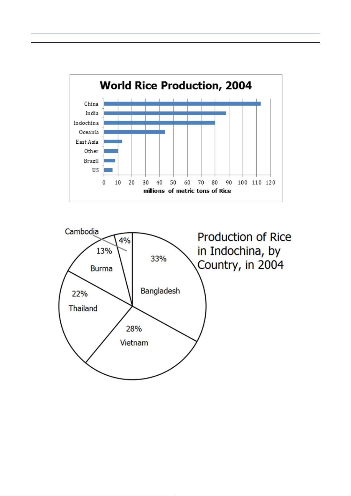
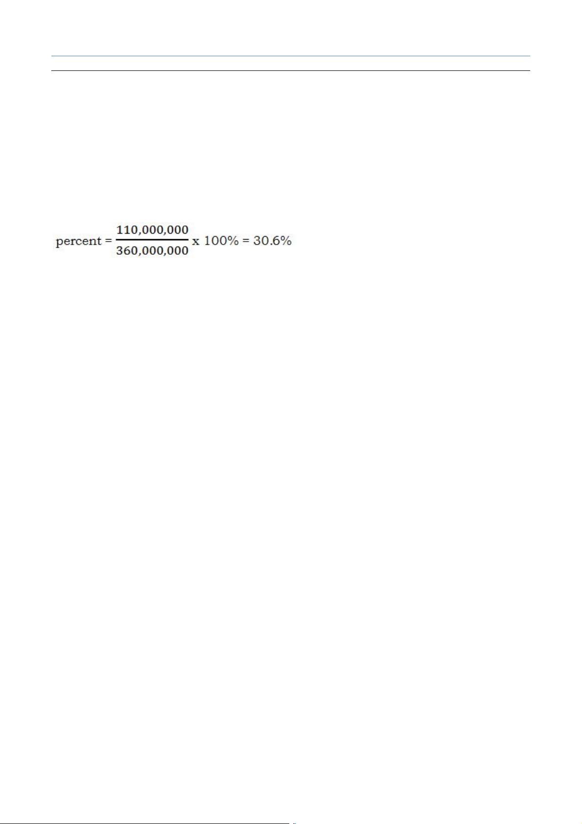
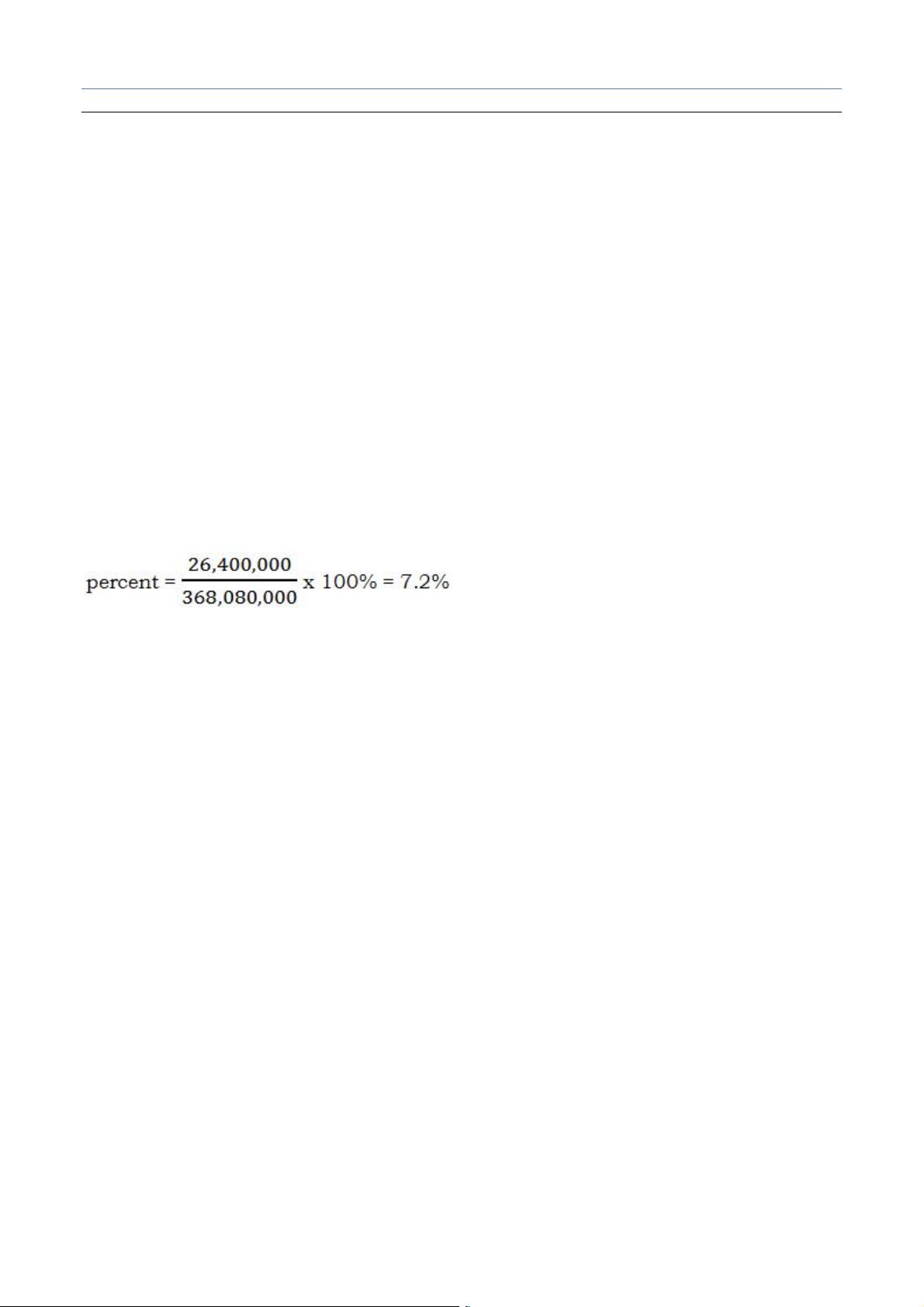
World's Total Rice Production in 2004 = 368,080,000 metric tons
1 China accounted for approximately what percent of world rice production in 2004?
! 9.6%
! 24.0%
! 30.7%
! 40.1%
剩余57页未读,继续阅读
2023-06-10 上传
2023-06-09 上传
2023-04-06 上传
2023-06-02 上传
2023-07-11 上传
2023-10-23 上传

内酷少女
- 粉丝: 16
- 资源: 302
 我的内容管理
展开
我的内容管理
展开


最新资源
- 李兴华Java基础教程:从入门到精通
- U盘与硬盘启动安装教程:从菜鸟到专家
- C++面试宝典:动态内存管理与继承解析
- C++ STL源码深度解析:专家级剖析与关键技术
- C/C++调用DOS命令实战指南
- 神经网络补偿的多传感器航迹融合技术
- GIS中的大地坐标系与椭球体解析
- 海思Hi3515 H.264编解码处理器用户手册
- Oracle基础练习题与解答
- 谷歌地球3D建筑筛选新流程详解
- CFO与CIO携手:数据管理与企业增值的战略
- Eclipse IDE基础教程:从入门到精通
- Shell脚本专家宝典:全面学习与资源指南
- Tomcat安装指南:附带JDK配置步骤
- NA3003A电子水准仪数据格式解析与转换研究
- 自动化专业英语词汇精华:必备术语集锦
