18 CHAPTER 3. STEP-BY-STEP TUTORIALS
indented: each option is on a separate line, and each line has a tab stop as first character. This is a
good practice. Another good practice is to place a comma after the last option (in our case, after the
value for ylabel). This allows to add more keys easily – and you won’t forget the comma. It does
not hurt at all. The second “set” of keys after \addplot shows that indentation and trailing comma
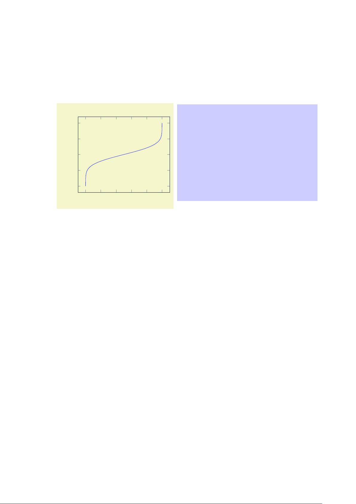
a really just a best practice: we simply said \addplot[blue], meaning that the plot will be placed in
blue color, without any plot mark. Of course, once another option would be added here, it would be
best to switch to indentation and trailing comma:
\addplot[
blue,
mark=*,
]
table {invcum.dat};
5. Inside of an axis, pgfplots accepts an \addplot ... ; statement (note the final semicolon).
In our case, we use \addplot table: it loads a table from a file and plots the first two columns.
There are, however, more input methods. The most important available inputs methods are \addplot
expression (which samples from some mathematical expression) and \addplot table (loads data
from tables), and a combination of both which is also supported by \addplot table (loads data from
tables and applies mathematical expressions). Besides those tools which rely only on built-in methods,
there is also an option to calculated data using external to ols: \addplot gnuplot which uses gnuplot
as “desktop calculator” and imports numerical data, \addplot shell (which can load table data from
any system call), and the special \addplot graphics tool which loads an image together with meta
data and draws only the associated axis.
In our axis, we find a couple of tokens: the first is the m andatory \addplot token. It “starts” a further
plot. The second is the option list for that plot, which is delimited by square brackets (see also the
notes about best practices above). The name “option list” indicates that this list can be empty. It
can also be omitted completely in which case pgfplots will choose an option list from its current
cycle list (more about that in a different lecture). The next token is the keyword “table”. It tells
pgfplots that table data follows. The keyword “table” also accepts an option list (for example, to
choose columns, to define a different col sep or row sep or to provide some math expression which
is applied to each row). More on that in a different lecture. The next token is {invcum.dat}: an
argument in curly braces which provides the table data. This argument is interpreted by “plot table”.
Other input types would expect different types of arguments. In our case, the curly braces contain a
file name. Plot table expects either a file name as in our case or a so-called “inline table”. An inline
table means that you would simply insert the contents of your file inside of the curly braces. In our
case, the table is too long to be inserted into the argument, so we place it into a separate file. Finally,
the last (mandatory!) token is a semicolon. It terminates the \addplot statement.
6. Axis descriptions can be added using the keys title, xlabel, ylabel as we have in our example
listing.
pgfplots accepts lots of keys – and sometimes it is the art of finding just the one that you were looking
for. Hop efully, a search through the table of contents of the reference manual and/or a keyword search
through the entire reference manual will show a hit.
3.2.2 Fine-Tuning of the First Picture
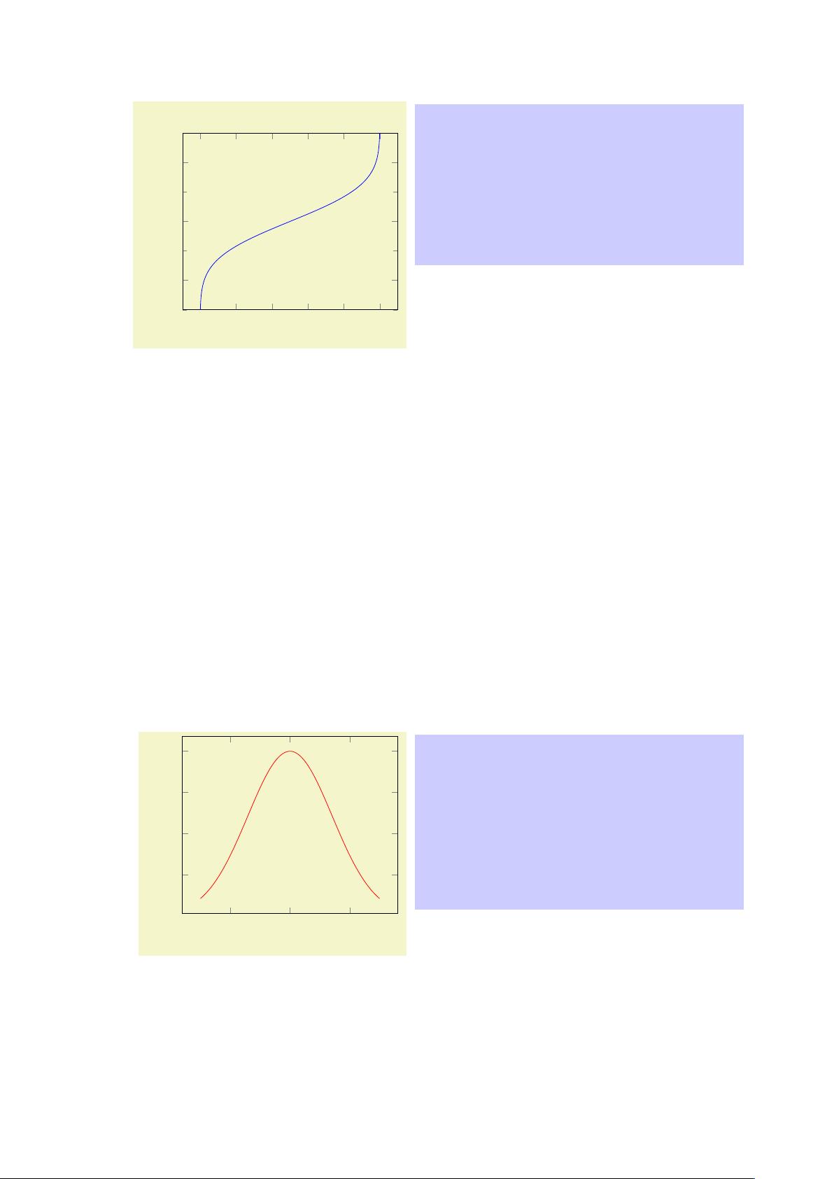
While looking at the result of Section 3.2.1, we decide that we want to change something. First, we decide
that the open ends on the left and on the right are disturbing (perhaps we have a strange taste – or perhaps
we know in advance that the underlying function is not limited to any interval). Anyway, we would like to
show it only in the y interval from −3 to +3.
We can do so as follows:


