
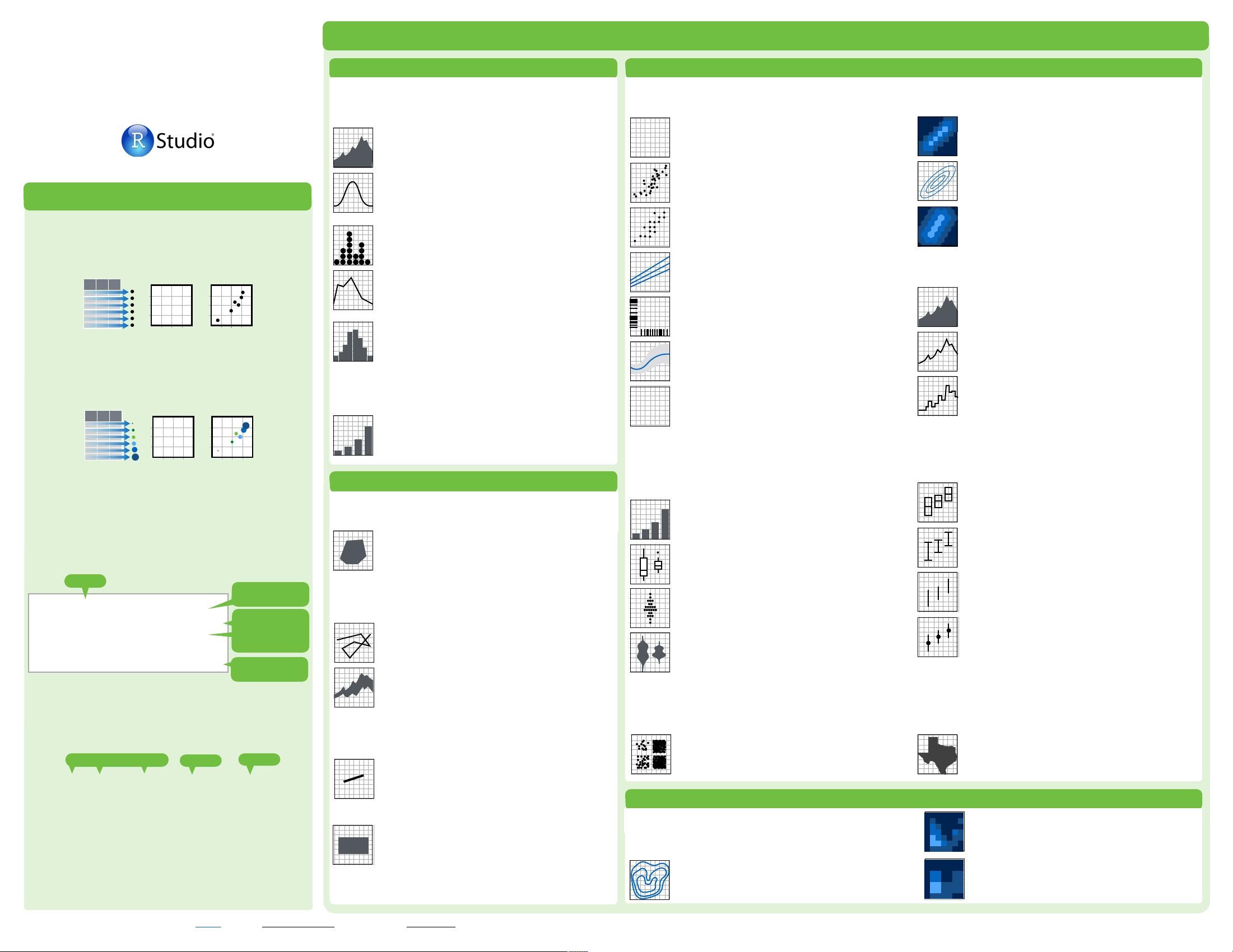
Graphical Primitives
Data Visualization
with ggplot2
Cheat Sheet
RStudio® is a trademark of RStudio, Inc. • CC BY RStudio • info@rstudio.com • 844-448-1212 • rstudio.com
Geoms - Use a geom to represent data points, use the geom’s aesthetic properties to represent variables. Each function returns a layer.
One Variable
a + geom_area(stat = "bin")
x, y, alpha, color, fill, linetype, size
b + geom_area(aes(y = ..density..), stat = "bin")
a + geom_density(kernel = "gaussian")
x, y, alpha, color, fill, linetype, size, weight
b + geom_density(aes(y = ..county..))
a + geom_dotplot()
x, y, alpha, color, fill
a + geom_freqpoly()
x, y, alpha, color, linetype, size
b + geom_freqpoly(aes(y = ..density..))
a + geom_histogram(binwidth = 5)
x, y, alpha, color, fill, linetype, size, weight
b + geom_histogram(aes(y = ..density..))
Discrete
b <- ggplot(mpg, aes(fl))
b + geom_bar()
x, alpha, color, fill, linetype, size, weight
Continuous
a <- ggplot(mpg, aes(hwy))
Two Variables
Continuous Function
Discrete X, Discrete Y
h <- ggplot(diamonds, aes(cut, color))
h + geom_jitter()
x, y, alpha, color, fill, shape, size
Discrete X, Continuous Y
g <- ggplot(mpg, aes(class, hwy))
g + geom_bar(stat = "identity")
x, y, alpha, color, fill, linetype, size, weight
g + geom_boxplot()
lower, middle, upper, x, ymax, ymin, alpha,
color, fill, linetype, shape, size, weight
g + geom_dotplot(binaxis = "y",
stackdir = "center")
x, y, alpha, color, fill
g + geom_violin(scale = "area")
x, y, alpha, color, fill, linetype, size, weight
Continuous X, Continuous Y
f <- ggplot(mpg, aes(cty, hwy))
f + geom_blank()
(Useful for expanding limits)
f + geom_jitter()
x, y, alpha, color, fill, shape, size
f + geom_point()
x, y, alpha, color, fill, shape, size
f + geom_quantile()
x, y, alpha, color, linetype, size, weight
f + geom_rug(sides = "bl")
alpha, color, linetype, size
f + geom_smooth(method = lm)
x, y, alpha, color, fill, linetype, size, weight
f + geom_text(aes(label = cty))
x, y, label, alpha, angle, color, family, fontface,
hjust, lineheight, size, vjust
Three Variables
m + geom_contour(aes(z = z))
x, y, z, alpha, colour, linetype, size, weight
seals$z <- with(seals, sqrt(delta_long^2 + delta_lat^2))
m <- ggplot(seals, aes(long, lat))
j <- ggplot(economics, aes(date, unemploy))
j + geom_area()
x, y, alpha, color, fill, linetype, size
j + geom_line()
x, y, alpha, color, linetype, size
j + geom_step(direction = "hv")
x, y, alpha, color, linetype, size
Continuous Bivariate Distribution
i <- ggplot(movies, aes(year, rating))
i + geom_bin2d(binwidth = c(5, 0.5))
xmax, xmin, ymax, ymin, alpha, color, fill,
linetype, size, weight
i + geom_density2d()
x, y, alpha, colour, linetype, size
i + geom_hex()
x, y, alpha, colour, fill size
e + geom_segment(aes(
xend = long + delta_long,
yend = lat + delta_lat))
x, xend, y, yend, alpha, color, linetype, size
e + geom_rect(aes(xmin = long, ymin = lat,
xmax= long + delta_long,
ymax = lat + delta_lat))
xmax, xmin, ymax, ymin, alpha, color, fill,
linetype, size
c + geom_polygon(aes(group = group))
x, y, alpha, color, fill, linetype, size
e <- ggplot(seals, aes(x = long, y = lat))
m + geom_raster(aes(fill = z), hjust=0.5,
vjust=0.5, interpolate=FALSE)
x, y, alpha, fill (fast)
m + geom_tile(aes(fill = z))
x, y, alpha, color, fill, linetype, size (slow)
k + geom_crossbar(fatten = 2)
x, y, ymax, ymin, alpha, color, fill, linetype,
size
k + geom_errorbar()
x, ymax, ymin, alpha, color, linetype, size,
width (also geom_errorbarh())
k + geom_linerange()
x, ymin, ymax, alpha, color, linetype, size
k + geom_pointrange()
x, y, ymin, ymax, alpha, color, fill, linetype,
shape, size
Visualizing error
df <- data.frame(grp = c("A", "B"), fit = 4:5, se = 1:2)
k <- ggplot(df, aes(grp, fit, ymin = fit-se, ymax = fit+se))
d + geom_path(lineend="butt",
linejoin="round’, linemitre=1)
x, y, alpha, color, linetype, size
d + geom_ribbon(aes(ymin=unemploy - 900,
ymax=unemploy + 900))
x, ymax, ymin, alpha, color, fill, linetype, size
d <- ggplot(economics, aes(date, unemploy))
c <- ggplot(map, aes(long, lat))
data <- data.frame(murder = USArrests$Murder,
state = tolower(rownames(USArrests)))
map <- map_data("state")
l <- ggplot(data, aes(fill = murder))
l + geom_map(aes(map_id = state), map = map) +
expand_limits(x = map$long, y = map$lat)
map_id, alpha, color, fill, linetype, size
Maps
A
B
C
Basics
Build a graph with ggplot() or qplot()
ggplot2 is based on the grammar of graphics, the
idea that you can build every graph from the same
few components: a data set, a set of geoms—visual
marks that represent data points, and a coordinate
system.
To display data values, map variables in the data set
to aesthetic properties of the geom like size, color,
and x and y locations.
Graphical Primitives
Data Visualization
with ggplot2
Cheat Sheet
RStudio® is a trademark of RStudio, Inc. • CC BY RStudio • info@rstudio.com • 844-448-1212 • rstudio.com Learn more at docs.ggplot2.org • ggplot2 0.9.3.1 • Updated: 3/15
Geoms - Use a geom to represent data points, use the geom’s aesthetic properties to represent variables
Basics
One Variable
a + geom_area(stat = "bin")
x, y, alpha, color, fill, linetype, size
b + geom_area(aes(y = ..density..), stat = "bin")
a + geom_density(kernal = "gaussian")
x, y, alpha, color, fill, linetype, size, weight
b + geom_density(aes(y = ..county..))
a+ geom_dotplot()
x, y, alpha, color, fill
a + geom_freqpoly()
x, y, alpha, color, linetype, size
b + geom_freqpoly(aes(y = ..density..))
a + geom_histogram(binwidth = 5)
x, y, alpha, color, fill, linetype, size, weight
b + geom_histogram(aes(y = ..density..))
Discrete
a <- ggplot(mpg, aes(fl))
b + geom_bar()
x, alpha, color, fill, linetype, size, weight
Continuous
a <- ggplot(mpg, aes(hwy))
Two Variables
Discrete X, Discrete Y
h <- ggplot(diamonds, aes(cut, color))
h + geom_jitter()
x, y, alpha, color, fill, shape, size
Discrete X, Continuous Y
g <- ggplot(mpg, aes(class, hwy))
g + geom_bar(stat = "identity")
x, y, alpha, color, fill, linetype, size, weight
g + geom_boxplot()
lower, middle, upper, x, ymax, ymin, alpha,
color, fill, linetype, shape, size, weight
g + geom_dotplot(binaxis = "y",
stackdir = "center")
x, y, alpha, color, fill
g + geom_violin(scale = "area")
x, y, alpha, color, fill, linetype, size, weight
Continuous X, Continuous Y
f <- ggplot(mpg, aes(cty, hwy))
f + geom_blank()
f + geom_jitter()
x, y, alpha, color, fill, shape, size
f + geom_point()
x, y, alpha, color, fill, shape, size
f + geom_quantile()
x, y, alpha, color, linetype, size, weight
f + geom_rug(sides = "bl")
alpha, color, linetype, size
f + geom_smooth(model = lm)
x, y, alpha, color, fill, linetype, size, weight
f + geom_text(aes(label = cty))
x, y, label, alpha, angle, color, family, fontface,
hjust, lineheight, size, vjust
Three Variables
i + geom_contour(aes(z = z))
x, y, z, alpha, colour, linetype, size, weight
seals$z <- with(seals, sqrt(delta_long^2 + delta_lat^2))
i <- ggplot(seals, aes(long, lat))
g <- ggplot(economics, aes(date, unemploy))
Continuous Function
g + geom_area()
x, y, alpha, color, fill, linetype, size
g + geom_line()
x, y, alpha, color, linetype, size
g + geom_step(direction = "hv")
x, y, alpha, color, linetype, size
Continuous Bivariate Distribution
h <- ggplot(movies, aes(year, rating))
h + geom_bin2d(binwidth = c(5, 0.5))
xmax, xmin, ymax, ymin, alpha, color, fill,
linetype, size, weight
h + geom_density2d()
x, y, alpha, colour, linetype, size
h + geom_hex()
x, y, alpha, colour, fill size
d + geom_segment(aes(
xend = long + delta_long,
yend = lat + delta_lat))
x, xend, y, yend, alpha, color, linetype, size
d + geom_rect(aes(xmin = long, ymin = lat,
xmax= long + delta_long,
ymax = lat + delta_lat))
xmax, xmin, ymax, ymin, alpha, color, fill,
linetype, size
c + geom_polygon(aes(group = group))
x, y, alpha, color, fill, linetype, size
d<- ggplot(seals, aes(x = long, y = lat))
i + geom_raster(aes(fill = z), hjust=0.5,
vjust=0.5, interpolate=FALSE)
x, y, alpha, fill
i + geom_tile(aes(fill = z))
x, y, alpha, color, fill, linetype, size
e + geom_crossbar(fatten = 2)
x, y, ymax, ymin, alpha, color, fill, linetype,
size
e + geom_errorbar()
x, ymax, ymin, alpha, color, linetype, size,
width (also geom_errorbarh())
e + geom_linerange()
x, ymin, ymax, alpha, color, linetype, size
e + geom_pointrange()
x, y, ymin, ymax, alpha, color, fill, linetype,
shape, size
Visualizing error
df <- data.frame(grp = c("A", "B"), fit = 4:5, se = 1:2)
e <- ggplot(df, aes(grp, fit, ymin = fit-se, ymax = fit+se))
g + geom_path(lineend="butt",
linejoin="round’, linemitre=1)
x, y, alpha, color, linetype, size
g + geom_ribbon(aes(ymin=unemploy - 900,
ymax=unemploy + 900))
x, ymax, ymin, alpha, color, fill, linetype, size
g <- ggplot(economics, aes(date, unemploy))
c <- ggplot(map, aes(long, lat))
data <- data.frame(murder = USArrests$Murder,
state = tolower(rownames(USArrests)))
map <- map_data("state")
e <- ggplot(data, aes(fill = murder))
e + geom_map(aes(map_id = state), map = map) +
expand_limits(x = map$long, y = map$lat)
map_id, alpha, color, fill, linetype, size
Maps
F
M
A
=
1
2
3
0
0
1
2
3
4
4
1
2
3
0
0
1
2
3
4
4
+
data
geom
coordinate
system
plot
+
F
M
A
=
1
2
3
0
0
1
2
3
4
4
1
2
3
0
0
1
2
3
4
4
data
geom
coordinate
system
plot
x = F
y = A
color = F
size = A
1
2
3
0
0
1
2
3
4
4
plot
+
F
M
A
=
1
2
3
0
0
1
2
3
4
4
data
geom
coordinate
system
x = F
y = A
x = F
y = A
ggsave("plot.png", width = 5, height = 5)
Saves last plot as 5’ x 5’ file named "plot.png" in
working directory. Matches file type to file extension.
qplot(x = cty, y = hwy, color = cyl, data = mpg, geom = "point")
Creates a complete plot with given data, geom, and
mappings. Supplies many useful defaults.
aesthetic mappings
data
geom
ggplot(data = mpg, aes(x = cty, y = hwy))
Begins a plot that you finish by adding layers to. No
defaults, but provides more control than qplot().
ggplot(mpg, aes(hwy, cty)) +
geom_point(aes(color = cyl)) +
geom_smooth(method ="lm") +
coord_cartesian() +
scale_color_gradient() +
theme_bw()
data
add layers,
elements with +
layer = geom +
default stat +
layer specific
mappings
additional
elements
Add a new layer to a plot with a geom_*()
or stat_*() function. Each provides a geom, a
set of aesthetic mappings, and a default stat
and position adjustment.
last_plot()
Returns the last plot
Learn more at docs.ggplot2.org • ggplot2 1.0.0 • Updated: 4/15
map <- map_data("state")

木之如水
- 粉丝: 1w+
- 资源: 6
 我的内容管理
收起
我的内容管理
收起
- 我的资源
快来上传第一个资源
 我的收益 登录查看自己的收益
 我的积分
登录查看自己的积分
我的积分
登录查看自己的积分
 我的C币
登录后查看C币余额
我的C币
登录后查看C币余额
 我的收藏
我的收藏  我的下载
我的下载  下载帮助
下载帮助

会员权益专享


最新资源
- c++校园超市商品信息管理系统课程设计说明书(含源代码) (2).pdf
- 建筑供配电系统相关课件.pptx
- 企业管理规章制度及管理模式.doc
- vb打开摄像头.doc
- 云计算-可信计算中认证协议改进方案.pdf
- [详细完整版]单片机编程4.ppt
- c语言常用算法.pdf
- c++经典程序代码大全.pdf
- 单片机数字时钟资料.doc
- 11项目管理前沿1.0.pptx
- 基于ssm的“魅力”繁峙宣传网站的设计与实现论文.doc
- 智慧交通综合解决方案.pptx
- 建筑防潮设计-PowerPointPresentati.pptx
- SPC统计过程控制程序.pptx
- SPC统计方法基础知识.pptx
- MW全能培训汽轮机调节保安系统PPT教学课件.pptx
资源上传下载、课程学习等过程中有任何疑问或建议,欢迎提出宝贵意见哦~我们会及时处理!
点击此处反馈


评论0