
Android实现圆角实现圆角Button按钮按钮
本文实例讲述了Android开发圆角Button按钮实现过程,分享给大家供大家参考,具体内容如下
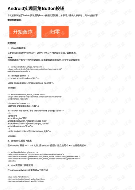
需求及效果图:需求及效果图:
实现思路:实现思路:
1、shape实现圆角
在drawable新建两个xml 文件, 这两个 xml文件用shape 实现了圆角效果。
Note:
因为要让用户有按下去的效果体验, 所有要有两套圆角图, 在按下去时候切换
<!-- res/drawable/button_shape_normal.xml -->
<shape xmlns:android="http://schemas.android.com/apk/res/android"
android:shape="rectangle" >
<!-- rounded corner -->
<corners android:radius="5dp" />
<solid android:color="@color/orange_normal" />
</shape>
<!-- res/drawable/button_shape_pressed.xml -->
<shape xmlns:android="http://schemas.android.com/apk/res/android"
android:shape="rectangle" >
<!-- rounded corner -->
<corners android:radius="5dp" />
<!-- fill with two colors, and the two colors change softly -->
<!--
<gradient
android:angle="270"
android:startColor="@color/orange_light"
android:endColor="@color/orange_normal"
android:useLevel="true" />
-->
<solid android:color="@color/orange_light" />
</shape>
2、selector实现按下效果
在 drawable 新建 一个 xml 文件, 用 selector 把刚才 建立的两个 xml 文件组织起来
<!-- res/drawable/button_shape.xml -->
<selector xmlns:android="http://schemas.android.com/apk/res/android">
<item android:drawable="@drawable/button_shape_normal" android:state_pressed="false"/>
<item android:drawable="@drawable/button_shape_pressed" android:state_pressed="true"/>
</selector>
3、style实现多个按钮复用
在res/values/styles.xml 里面输入下面代码
<style name="SmsButton">
<item name="android:layout_width">0dp</item>
<item name="android:layout_weight">1</item>

weixin_38597300
- 粉丝: 6
- 资源: 983
 我的内容管理
收起
我的内容管理
收起
- 我的资源
快来上传第一个资源
 我的收益 登录查看自己的收益
 我的积分
登录查看自己的积分
我的积分
登录查看自己的积分
 我的C币
登录后查看C币余额
我的C币
登录后查看C币余额
 我的收藏
我的收藏  我的下载
我的下载  下载帮助
下载帮助

会员权益专享


最新资源
- RTL8188FU-Linux-v5.7.4.2-36687.20200602.tar(20765).gz
- c++校园超市商品信息管理系统课程设计说明书(含源代码) (2).pdf
- 建筑供配电系统相关课件.pptx
- 企业管理规章制度及管理模式.doc
- vb打开摄像头.doc
- 云计算-可信计算中认证协议改进方案.pdf
- [详细完整版]单片机编程4.ppt
- c语言常用算法.pdf
- c++经典程序代码大全.pdf
- 单片机数字时钟资料.doc
- 11项目管理前沿1.0.pptx
- 基于ssm的“魅力”繁峙宣传网站的设计与实现论文.doc
- 智慧交通综合解决方案.pptx
- 建筑防潮设计-PowerPointPresentati.pptx
- SPC统计过程控制程序.pptx
- SPC统计方法基础知识.pptx
资源上传下载、课程学习等过程中有任何疑问或建议,欢迎提出宝贵意见哦~我们会及时处理!
点击此处反馈


评论10