CSS Sprite图片处理技巧图片处理技巧
在以前我们的工作中,以传统切图思想进行操作,讲究精细,图片规格越小越好,重量越小越好,其实规格大小无所谓,
计算机统一都按Byte计算。
客户端每显示一张图片都会向服务器发送请求,所以,图片越多请求次数越多,造成延迟的可能性也就越大。因为一张图
片的传输时间,通常远小于请求等待的时间。
典型如文本编辑器,小图标特别多,打开时一张张跑出来,给用户的感觉很不好。如果能用一张图解决,则不会有这个问
题,比如百度空间、163博客、Gmail都是这么做的,jb51.net也提倡这样的操作方法。
CSS Sprites: Image Slicing’s Kiss of Death
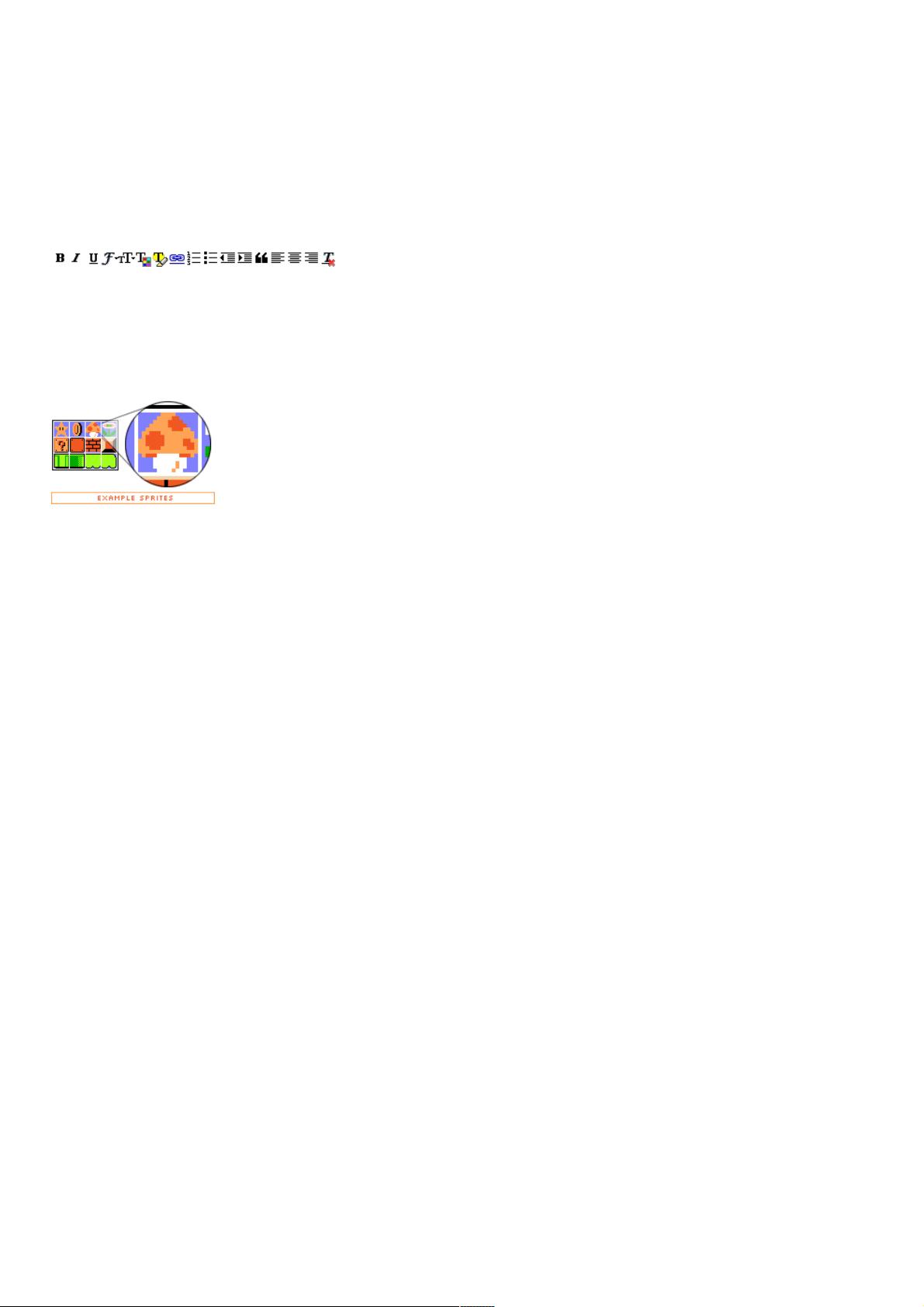
Back when video games were still fun (we’re talking about the 8-bit glory days here), graphics were a much simpler matter
by necessity. Bitmapped 2-dimensional character data and background scenery was individually drawn, much like today’s
resurgent pixel art. Hundreds and later thousands of small graphics called sprites were the building blocks for all things
visual in a game.
As game complexity increased, techniques developed to manage the multitude of sprites while keeping game play flowing.
One variation saw sprites being plugged into a master grid, then later pulled out as needed by code that mapped positions
of each individual graphic, and selectively painted them on the screen.
And what does this have to do with the web?
Everything old is new again, and though the rise of 3D games has made sprite maps obsolete, the concurrent rise of mobile
devices with 2D gaming capabilities have brought them back into vogue. And now, with a bit of math and a lot of CSS, we’re
going to take the basic concept and apply it to the world of web design.
Specifically, we’re going to replace old-school image slicing and dicing (and the necessary JavaScript) with a CSS solution.
And because of the way CSS works, we’re going to take it further: by building a grid of images and devising a way to get
each individual cell out of the grid, we can store all buttons/navigation items/whatever we wish in a single master image file,
along with the associated “before” and “after” link states.
How do CSS Sprites work?
As it turns out, the basic tools to do this are built into CSS, given a bit of creative thinking.
Let’s start with the master image itself. Dividing a rectangle into four items, you’ll observe in this master image that our
intended “before" link images are on the top row, with “after" :hover states immediately below. There’s no clear division
between the four links at the moment, so imagine that each piece of text is a link for now. (For the sake of simplicity, we’ll
continue to refer to link images as “before” images and the :hover state as “after” for the rest of this article. It’s possible to
extend this method to :active, :focus, and :visited links states as well, but we won’t go into that here.)
Those familiar with Petr Stanicek’s (Pixy) Fast Rollovers may already see where we’re going with this. This article owes a
debt of gratitude to Pixy’s example for the basic function we’ll be relying on. But let’s not get ahead of ourselves.
On to the HTML. Every good CSS trick strives to add a layer of visuals on top of a clean block of code, and this technique is
no exception:
<ul id="skyline">
<li id="panel1b"><a href="#1"></a></li>
<li id="panel2b"><a href="#2"></a></li>
<li id="panel3b"><a href="#3"></a></li>
<li id="panel4b"><a href="#4"></a></li>
</ul>
This code will serve as a base for our example. Light-weight, simple markup that degrades well in older and CSS-disabled


