6 Antony Unwin, Chun-houh Chen, Wolfgang K . Härdle
ese comments relate to presentation graphics, that is, graphics drawn for the
purpose of illustrating and explaining results. Computing advances have benefitted
exploratory graphics, that is, graphics drawn to support exploring data, far more.
Not just the quality of graphic representation has improved but also the quantity. It is
now trivial to draw many different displays of the same data or to riffle through many
different versions interactively to look for information in data. ese capabilities are
only gradually becoming appreciated and capitalized on.
e importance of soware availability and popularity in determining what anal-
yses are carried out and how they are presented will be an interesting research topic
forfuturehistoriansofscience.Inthebusinessworld,nooneseemstobeableto
do without the spreadsheet Excel. If Excel does not offer a particular graphic form,
then that form will not be used. (In fact Excel offers many graphic forms, though
not all that a statistician would want.) Many scientists, who only rarely need access
to computational power, also rely on Excel and its options. In the world of statistics
itself, the packages SAS and SPSS were long dominant. In the last years, first S and
S-plus and now R have emerged as important competitors. None of these packages
currently provide effective interactive tools for exploratory graphics, though they are
all moving slowly in that direction as well as extending the range and flexibility of the
presentation graphics they offer.
Data visualization is a new term. It expresses the idea that it involves more than
just representing data in a graphical form (instead of using a table). e information
behind the data should also be revealed in a good display; the graphic should aid
readers or viewers in seeing the structure in the data. e term data visualization is
related to the new field of information visualization. is includes visualization of
all kinds of information, not just of data, and is closely associated with research by
computer scientists. Up till now the work in this area has tended to concentrate just
on presenting information, rather than on what may be deduced from it. Statisticians
tend to be concerned more with variability and to emphasize the statistical properties
of results. e closer linking of graphics with statistical modelling can make this more
explicit and is a promising research direction that is facilitated by the flexible nature
of current computing soware. Statisticians have an important role to play here.
The Chapters
1.2
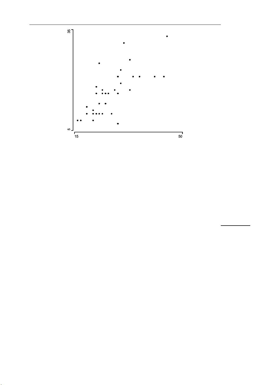
Needless to say, each Handbook chapter uses a lot of graphic displays. Figure . is
a scatterplot of the number of figures against the number of pages. ere is an ap-
proximate linear relationship with a couple of papers having somewhat more figures
per page and one somewhat less. e scales have been chosen to maximize the data-
ink ratio. An alternative version with equal scales makes clearer that the number of
figures per page is almost always less than one.
e Handbook has been divided into three sections: Principles, Methodology,
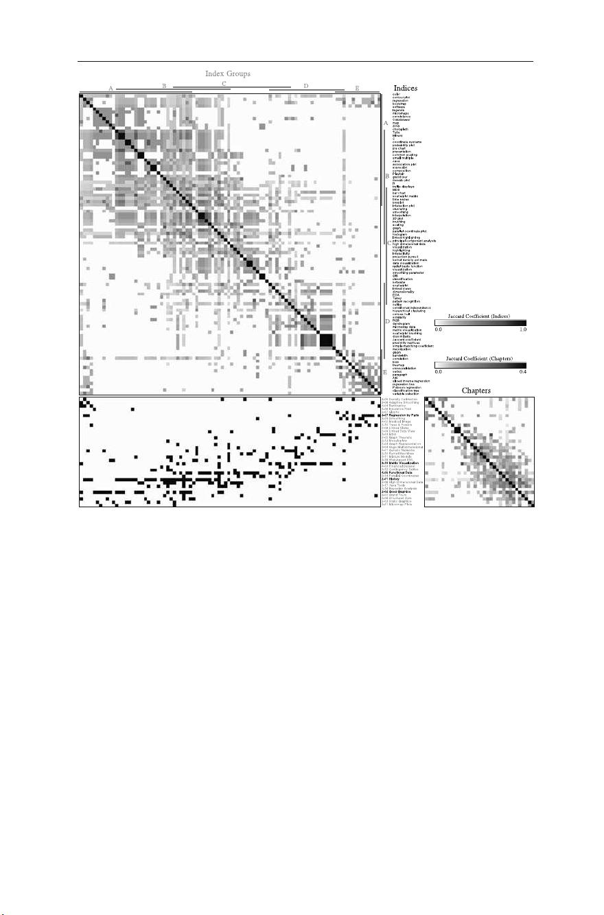
and Applications. Needless to say, the sections overlap. Figure . is a binary matrix
visualization using Jaccard coefficients for both chapters (rows) and index entries


