没有合适的资源?快使用搜索试试~ 我知道了~
首页Windows Phone 7 UI设计与交互指南(中英对照版)
Windows Phone 7 UI设计与交互指南(中英对照版)
需积分: 10 4 下载量 127 浏览量
更新于2024-07-26
2
收藏 4.15MB PDF 举报
"Windows Phone 7 UI设计及人机交互指南v2.0中英文对照版,由王璟翻译,Amy Luan校对,详细介绍了Windows Phone 7平台的用户界面设计原则和人机交互最佳实践。"
这篇文档是关于Windows Phone 7平台的用户界面(UI)设计和人机交互的详细指南,旨在帮助开发者和设计师创建出符合用户习惯的、直观且高效的移动应用。由于是预发布版本,文档中提到的内容可能会在最终的商业发布时有所变化。尽管如此,它仍提供了关于Windows Phone 7开发的重要信息。
文档指出,为保持一致性,一些常见的专业术语缩写(如UI代表用户界面)并未翻译。同时,专有名词如Windows Phone和Silverlight保持原文,而对不确定的英文翻译则保留原单词或使用括号注解。这确保了读者能够准确理解技术细节,而不被翻译可能引起的歧义所困扰。
Version 2.0的更新可能包含了对初版的改进和修正,使得内容更加完善和精确。微软明确表示,此文档仅供信息参考,不提供任何明示或暗示的保证。文档中的信息,包括URL和互联网网站引用,可能随时变更,因此用户应理解并接受这一风险。
文档中使用的公司、组织、产品、域名、电子邮件地址、标志、人物、地点和事件等例子都是虚构的,不应与现实中的任何实体产生关联。此外,文档提醒用户遵守所有适用的版权法律,未经许可,不得复制文档的任何部分。
该指南涵盖了Windows Phone 7平台UI设计的基本原则,包括布局、颜色、字体、图标、触摸交互等方面,以及如何利用Silverlight技术来实现动态和响应式的用户界面。它还强调了人机交互设计的重要性,比如用户体验设计、导航设计、反馈机制等,这些都是创造优质移动应用的关键因素。通过学习和遵循这些指南,开发者可以创建出更符合Windows Phone 7用户需求的应用,提升产品的质量和用户体验。
The Application Bar provides a place for developers to display up to four of the most common application tasks and vie
as icon buttons.
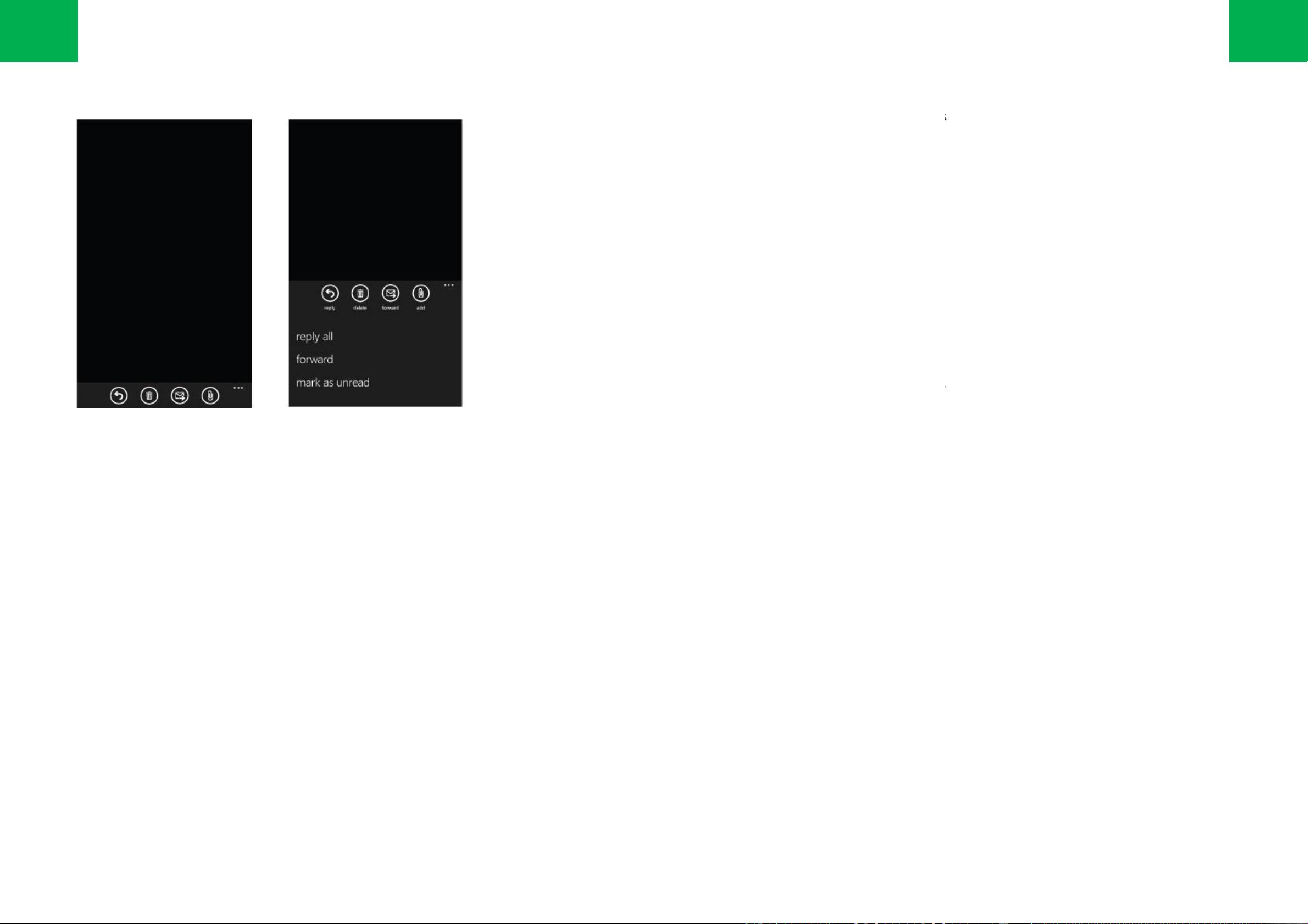
The Application Bar provides a view that displays icon buttons with text hints and an optional context menu when a user
taps the visual indica
tor of sequential dots or flicks up the Application Bar. This view can be dismissed by tappi
the menu area or on the dots, using the back button, or selecting a menu item or Application Bar Icon.
The Application Bar always stays on the same edge of the display as the Steering Buttons (Back, Start, and Search) and
extends the full wid
th of the screen in portrait or landscape mode. Icon buttons will rotate to align with the three phone
orientations.
Application Bar buttons can be displayed in an enabled or disabled state. An example of a disabled button would be a
delete button in read-only scenarios.
The application bar height in portrait mode and width in landscape mode is fixed at 72 pixels and cannot be modified. It can
be set to be displayed or hidden.
Use icon buttons for the primary, most-
used actions in the application. Do not us
more in this space.
Some actions are difficult to clearly convey with an icon. Place it in the Application Bar Menu instead.
For guidelines about icon button sizing, color, formatting, and text hints, see the Applicat
guidelines about the Application Bar Menu, see the Application Bar Menu topic.
No text-only buttons are permitted.
Place tasks that are not frequently accessed in the Application Bar Menu.
Application Bar Menu item text will run of
f the screen if it is too long. The recommended maximum length for the
text of a menu item is between 14 to 20 characters. Again, less is more in this space.
Use the user-
defined system theme color unless there is a compelling reason to override it. Using
affect the display quality of the button icons, create unusual visual effects in menu animations, and negatively
influence power consumption on some display types.
The opacity of the Application Bar can be adjusted finely, but it is rec
ommended that you use only opacity values of
0, .5, and 1. If the opacity is set to less than 1, the Application Bar will overlay the UI. If the opacity is set to 1, the
displayed page size will change.
应用程序栏为开发者提供可以放置四个最常用的应用程序点的位置,以图标的形式显示。
应用程序栏提供一个视图显示图标按键及其名称,还有一个可选的
菜单,点击应用程序栏内右侧的序列点或拖拽该序列点都
可以呼出此菜单。点击目录区域的外边、点击序列点,返回键、
选择一个菜单项
应用程序栏总是紧挨着操作键(返回,开始,搜索)的上边
,并且在横向或纵向的显示模式中
键将随手机方向(三个方向)的转动而转动。
应用程序栏的按键可以显示可用或不可用的状态。例如在只读情境下,删除键是不可用的。
应用程序栏在纵向模式的高度及横向模式的宽度固定为 72
像素,且不可更改。可以设置为显示或隐
将应用程序内最重要的任务设为常驻底部的图标键。记得不要为了
占满四个位置而去设计
一些任务很难用图标去表示。因此应该放置在应用程序栏的菜单中。
关于图标大小、颜色、格式和图标名称的指导原则,参见主题
Application Bar Icons
参加主题 Application Bar Menu。
只有文字的按钮是不允许的。将不常用的任务放在应用程序栏的菜单中。
应用程序菜单栏的菜单项名称如果太长,会跑出屏幕。
推荐名称的文本最大长度为
最重要。
用户尽量不要擅自自定义的系统主题的颜色。
使用自定义颜色会影响图标的显示质量
并在一些显示类型中增大能耗。
应用程序栏的透明度可以细微的调整,但是推荐您仅使用 0,0.5 和 1
的透明度
重叠,如果透明度为 1,显示页面的大小会改变。
30
Application bar
The Application Bar provides a place for developers to display up to four of the most common application tasks and vie
ws
The Application Bar provides a view that displays icon buttons with text hints and an optional context menu when a user
tor of sequential dots or flicks up the Application Bar. This view can be dismissed by tappi
ng outside of
the menu area or on the dots, using the back button, or selecting a menu item or Application Bar Icon.
The Application Bar always stays on the same edge of the display as the Steering Buttons (Back, Start, and Search) and
th of the screen in portrait or landscape mode. Icon buttons will rotate to align with the three phone
Application Bar buttons can be displayed in an enabled or disabled state. An example of a disabled button would be a
The application bar height in portrait mode and width in landscape mode is fixed at 72 pixels and cannot be modified. It can
used actions in the application. Do not us
e four icons just to use them. Less is
Some actions are difficult to clearly convey with an icon. Place it in the Application Bar Menu instead.
For guidelines about icon button sizing, color, formatting, and text hints, see the Applicat
ion Bar Icons topic. For
guidelines about the Application Bar Menu, see the Application Bar Menu topic.
Place tasks that are not frequently accessed in the Application Bar Menu.
f the screen if it is too long. The recommended maximum length for the
text of a menu item is between 14 to 20 characters. Again, less is more in this space.
defined system theme color unless there is a compelling reason to override it. Using
a custom color can
affect the display quality of the button icons, create unusual visual effects in menu animations, and negatively
ommended that you use only opacity values of
0, .5, and 1. If the opacity is set to less than 1, the Application Bar will overlay the UI. If the opacity is set to 1, the
应用程序栏为开发者提供可以放置四个最常用的应用程序点的位置,以图标的形式显示。
菜单,点击应用程序栏内右侧的序列点或拖拽该序列点都
选择一个菜单项
、点击应用程序栏的图标均可隐藏此菜单。
,并且在横向或纵向的显示模式中
保持与屏幕相同的宽度。图标
应用程序栏的按键可以显示可用或不可用的状态。例如在只读情境下,删除键是不可用的。
像素,且不可更改。可以设置为显示或隐
藏。
占满四个位置而去设计
,在此区域,简洁最重要。
Application Bar Icons
。关于应用程序栏菜单的指导原则,
推荐名称的文本最大长度为
14 到 20 个字符。这个区域同样,简洁
使用自定义颜色会影响图标的显示质量
,在菜单动画中造成异常的视觉效果,
的透明度
。如果透明度小于 1,应用程序栏会与 UI
31
Application Bar Icons should be clear, understandable, and leverage real-
world metaphors t
The best icons have simple geometry and limit the amount of fine detail.
Icon text hints are displayed when users display the Application Bar Menu.
Use icon buttons for the primary, most-
used actions in an application. Do not
more in this space.
Some actions are difficult to clearly convey with an icon. Present those actions in the Application Bar Menu instead.
For more information about the Application Bar Menu, see the Application B
Application Bar Icon images should be 48 pixels by 48 pixels and have a white foreground on a transparent
background using an alpha channel. The Application Bar will colorize the icon according to the current style settings
and colored icons can cause this effect to display unpredictably.
Images that are sized at sizes other than the recommended size will be scaled to fit and can potentially lower the
overall image quality of the Application Bar Icon.
The circle that is displayed on each icon bu
tton is drawn by the Application Bar and should not be included in the
source image.
应用程序栏的图标应该简洁、易懂,并且使用切近生活的、用户熟悉的隐喻。
好的图标具有简单的几何形状和有限的细节。当用户查看应用程序栏的菜单时,图标的名称会一同显示。
将应用程序内最重要的任务设为常驻底部的图标键。
记得不要为了占满四个位置而去设计
一些任务很难用图标去表示,因此应该放置在应用程序栏的菜单里。
关于应用程序栏菜单的指导原则,参加主题 Application Bar 一节。
应用程序菜单栏的图标图像为 48*48 像素,在 alpha 通道透明
的背景之上绘制
设置为图标上色,从而引发难以预料的效果。
不符合推荐尺寸的图片将缩放至推荐大小,这样可能会降低图标的图像质量
。
每个图标上的小圆圈是由应用程序栏绘制的,源图像中不应包含。
32
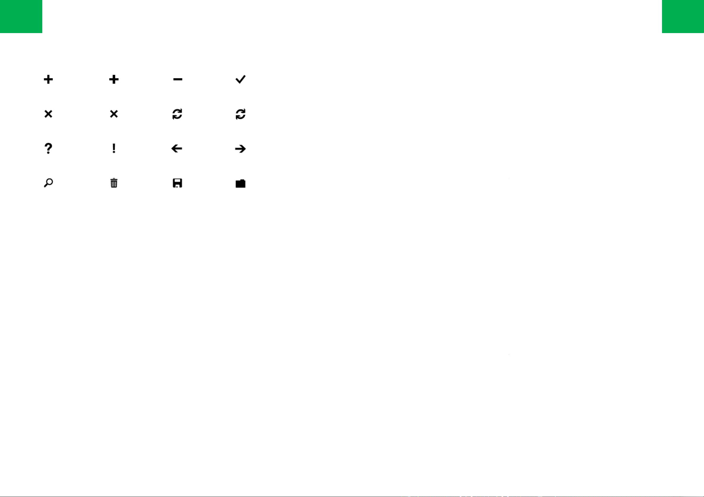
Application bar icons
NEW ADD MINUS CHECK
CLOSE CANCEL SYNC REFRESH
QUESTION MARK EXCLAMATION BACK NEXT
SEARCH DELETE SAVE FOLDER
world metaphors t
hat are familiar to users.
used actions in an application. Do not
use four icons just to use them. Less is
Some actions are difficult to clearly convey with an icon. Present those actions in the Application Bar Menu instead.
For more information about the Application Bar Menu, see the Application B
ar topic.
Application Bar Icon images should be 48 pixels by 48 pixels and have a white foreground on a transparent
background using an alpha channel. The Application Bar will colorize the icon according to the current style settings
Images that are sized at sizes other than the recommended size will be scaled to fit and can potentially lower the
tton is drawn by the Application Bar and should not be included in the
应用程序栏的图标应该简洁、易懂,并且使用切近生活的、用户熟悉的隐喻。
好的图标具有简单的几何形状和有限的细节。当用户查看应用程序栏的菜单时,图标的名称会一同显示。
记得不要为了占满四个位置而去设计
,在此区域,简洁最重要。
的背景之上绘制
白色前景色。应用程序栏会根据当前的风格
。
33
Use the user-defined system theme color unless there is a comp
elling reason to override it. Using a custom color can
affect the display quality of the button icons, create unusual visual effects in menu animations, and negatively
influence power consumption on some display types.
Buttons must have an icon and must
have a text hint. Text hints should be short and provide context for what the
button does and do not need to be fully descriptive. An example would be a button that flips an image horizontally.
Instead of ¡flip horizontally¡, ¡flip¡ would be sufficient.
Fo
r more information, see the Application Bar and Application Bar Menu topic.
A set of 64 Application Bar Icons, 32 dark and 32 light in PNG format, are installed as a part of the Windows Phone
Developer Tools Beta at C:\Program Files\Microsoft SDKs\Windows
Phone
Only the white icons should be used in the Application Bar..
用户尽量不要擅自自定义的系统主题的颜色。
使用自定义颜色会影响图标的显示质量
并在一些显示类型中增大能耗。
按键必须有图标及名称。名称应该简短地表示图标的意义,
不需要详细的描述
了,不用说¡ 水平的翻转¡。
更多信息参见主题 Application Bar 和 Application Bar Menu。
一套 PNG 格式的图标,包括 32 个深色图标和 32 个浅色图标,共 64
个图标
Phone Developer Tools Beta 的一部分安装在 C:\Program Files\
Microsoft SDKs
应用程序栏应该只用到白色的图标。
34
Application bar icons
VIDEO CAMERA E-
MAIL SETTINGS
FAVORITES ADD TO FAVORITES
DOWNLOAD UPLOAD
SHARE EDIT OVERFLOW DOTS
PALY PAUSE PREVIOUS/REWIND NEXT/FASTFORWARD
elling reason to override it. Using a custom color can
affect the display quality of the button icons, create unusual visual effects in menu animations, and negatively
have a text hint. Text hints should be short and provide context for what the
button does and do not need to be fully descriptive. An example would be a button that flips an image horizontally.
r more information, see the Application Bar and Application Bar Menu topic.
A set of 64 Application Bar Icons, 32 dark and 32 light in PNG format, are installed as a part of the Windows Phone
Phone
\v7.0\Icons.
使用自定义颜色会影响图标的显示质量
,在菜单动画中造成异常的视觉效果,
不需要详细的描述
。例如水平翻转图片,起名为¡ 翻转¡ 就可以
个图标
,并作为 Windows
Microsoft SDKs
\Windows Phone\v7.0\Icons.
35
The Application Bar Menu is an optional way for users to access specific tasks from the Application Bar. The Application Bar
Menu can be accessed
by tapping the visual indicator of sequential dots in the Application Bar or by flicking the Application
Bar up. This view can be dismissed by tapping outside of the menu area or on the dots, using the back button, or select
a menu item or Application Bar Icon.
To prevent the menu from scrolling, the number of items displayed in the menu is limited to five.
A maximum of five menu items can be displayed.
If no menu items are displayed, only the icon text hints are displayed.
The Application Bar Menu wil
l remain on the screen until the user performs
应用程序栏的菜单是一种方便用户在应用程序栏进入特定操作
的一种可选的方式。点击应用程序栏内
序列点都可以呼出
应用程序栏的菜单。这个视图可以通过点击目录区域的外边,点击序列点,使用返回键,选择一个菜单项,
或者应用程序栏图标的方式来隐藏。
为了避免菜单滚动,显示在菜单中的菜单项数目限制为 5.
最大显示 5 个菜单项。
如果没有菜单项显示,那么只显示图标项的名称。
除非用户采取某种操作,否则应用程序栏的菜单项将一直显示在屏幕上。
36
Application bar menu
The Application Bar Menu is an optional way for users to access specific tasks from the Application Bar. The Application Bar
by tapping the visual indicator of sequential dots in the Application Bar or by flicking the Application
Bar up. This view can be dismissed by tapping outside of the menu area or on the dots, using the back button, or select
ing
To prevent the menu from scrolling, the number of items displayed in the menu is limited to five.
l remain on the screen until the user performs
an action.
的一种可选的方式。点击应用程序栏内
右侧的序列点或拖拽该
应用程序栏的菜单。这个视图可以通过点击目录区域的外边,点击序列点,使用返回键,选择一个菜单项,
37
Windows Phone supports three views of screen orientation: portrait, landscape left, and landscape right.
In portrait view, the page is vertically oriented with the steering buttons appearing at the bottom o
f the phone and the height of the page is greater than
the width.
In either of the two landscape views, the Status Bar and Application Bar remain on the side of the screen that has the Power
Landscape left has the Status Bar on the left and landscape right has the Status Bar on the right.
The Status Bar grows from 32 pixel in portrait view to 72 pixel in both landscape views, as measured from the side of the pho
toward the center of the screen.
Portrait view is the default view for applications.
Start is always presented in portrait view.
The screen orientation will change based on the following actions:
Beginning Screen Orientation
Rotating
Ending Screen Orientation
Portrait 60 degrees left Landscape Left
Portrait 60 degrees right Landscape Right
Landscape Left 60 degrees right Portrait
Landscape Right 60 degrees left Portrait
Landscape Left or Right, flat on a table 30 degrees up Portrait
If in portrait view, the screen orientation will change to either of the land
scape views when a user slides out a horizontal hardware keyboard.
There is no programmatic way to switch orientations as the orientation property is set to read-
only but it is possible to set a fixed orientation.
Screen transition animation effects are played when screen rotation occurs.
In-application landscape view-
aware system components are the Status Bar, Application Bar, Application Bar Menu, Volume/Ring/Vibrate Display, Push
Notifications, and Dialogs.
Developers must add code to support landscape views.
Applications cannot specify only left or only right landscape views if they support
orientation changes ¨ both views must be supported.
Applications can define a static orientation view using the Supported Orientations property.
Applications that support text input should assume a horizontal hardware keyboard is present and support landscape views.
Custom screen transition animation effects are prohibited.
Windows Phone支持三种视图旋转:纵向,左侧横向,右侧横向。
在纵向视图中,页面是垂直的,操作键在手机底部,页面的高度比宽度长。
在其他两种横向视图中,状态栏和应用程序栏分别保留在有电源键和开始键的屏幕的一侧。
左侧横向中,状态栏在左侧;右侧横向中,状态栏在右侧。
当从纵向视图变为两种横向视图中任何一种时,从手机靠近电源键的边缘到屏幕中心测量,状态栏从32
像素增大到
纵向视图是程序的默认视图。
开始界面永远是纵向视图。
屏幕依据以下动作旋转:
在纵向视图的情况下,当用户滑出水平硬件键盘时,屏幕变为两者之一的横向视图。
没有程序化的方法切换屏幕的方向,因为方向的属性为只读,但是可以设置一个固定的方向。
屏幕过渡的动画效果在屏幕开始旋转时播放。
应用程序内横向视图可感知的部件包括状态栏、应用程序栏,应用程序栏的菜单,音量/铃声/
震动显示,推入消息和对话框。
开发者必须增加代码以支持横向视图。如果应用程序支持旋转,那么就不能只支持一侧的旋转,
两面的视图必须同时支持
使用Supported Orientations属性,应用程序可以定义一个固定方向视图。
应用程序要支持文字输入必须确保有横向的硬件键盘并且
不允许自定义的屏幕转向动画。
38
Screen orientations
屏幕开始方位 旋转 屏幕结束方位
纵向 向左 60 度 左侧横向
纵向 向右 60 度 右侧横向
左侧横向 向右 60 度 纵向
右侧横向 向左 60 度 纵向
左侧或右侧横向,平放在桌上 向上 30 度 纵向
f the phone and the height of the page is greater than
In either of the two landscape views, the Status Bar and Application Bar remain on the side of the screen that has the Power
and Start Button, respectively.
The Status Bar grows from 32 pixel in portrait view to 72 pixel in both landscape views, as measured from the side of the pho
ne that has the power button
scape views when a user slides out a horizontal hardware keyboard.
only but it is possible to set a fixed orientation.
aware system components are the Status Bar, Application Bar, Application Bar Menu, Volume/Ring/Vibrate Display, Push
Applications cannot specify only left or only right landscape views if they support
Applications that support text input should assume a horizontal hardware keyboard is present and support landscape views.
像素增大到
72像素。
震动显示,推入消息和对话框。
两面的视图必须同时支持
。
应用程序要支持文字输入必须确保有横向的硬件键盘并且
支持横向视图。
39
剩余100页未读,继续阅读
eunice_tian
- 粉丝: 0
- 资源: 1
上传资源 快速赚钱
- 我的内容管理 展开
- 我的资源 快来上传第一个资源
- 我的收益 登录查看自己的收益
- 我的积分 登录查看自己的积分
- 我的C币 登录后查看C币余额
- 我的收藏
- 我的下载
- 下载帮助
最新资源
- 构建基于Django和Stripe的SaaS应用教程
- Symfony2框架打造的RESTful问答系统icare-server
- 蓝桥杯Python试题解析与答案题库
- Go语言实现NWA到WAV文件格式转换工具
- 基于Django的医患管理系统应用
- Jenkins工作流插件开发指南:支持Workflow Python模块
- Java红酒网站项目源码解析与系统开源介绍
- Underworld Exporter资产定义文件详解
- Java版Crash Bandicoot资源库:逆向工程与源码分享
- Spring Boot Starter 自动IP计数功能实现指南
- 我的世界牛顿物理学模组深入解析
- STM32单片机工程创建详解与模板应用
- GDG堪萨斯城代码实验室:离子与火力基地示例应用
- Android Capstone项目:实现Potlatch服务器与OAuth2.0认证
- Cbit类:简化计算封装与异步任务处理
- Java8兼容的FullContact API Java客户端库介绍
安全验证
文档复制为VIP权益,开通VIP直接复制
信息提交成功