1.<el-card>生成带图片、内容、操作按钮的卡片。 2.循环的时候,一行固定五个,最多只有两行共10条数据。 3.设置好相隔宽度,自动适应屏幕,先用死数据。 4.最后在底部,生成elementUI的分页 5.框架为vue2脚手架使用
时间: 2024-03-08 15:45:04 浏览: 37
好的,根据您的要求,我来帮您编写一个Vue2的代码示例,实现您所需的功能。
首先,您可以使用Element UI的卡片组件`<el-card>`来展示您的数据。在卡片中,您可以设置卡片的图片、标题、描述、操作按钮等内容。以下是一个简单的示例代码:
```html
<template>
<div>
<el-row :gutter="20">
<el-col v-for="(item, index) in items" :key="index" :span="5">
<el-card :body-style="{ padding: '20px' }">
<img :src="item.image" class="image">
<div class="text">
<span class="title">{{ item.title }}</span>
<p class="description">{{ item.description }}</p>
</div>
<div class="actions">
<el-button type="primary" size="small">操作</el-button>
</div>
</el-card>
</el-col>
</el-row>
<el-pagination
:total="total"
:page-size="pageSize"
:current-page="currentPage"
@current-change="handlePageChange"
></el-pagination>
</div>
</template>
<script>
export default {
data() {
return {
items: [
{
title: '标题1',
description: '描述1',
image: 'https://picsum.photos/200/200'
},
// 其他数据...
],
total: 10,
pageSize: 5,
currentPage: 1
}
},
methods: {
handlePageChange(newPage) {
// 调用API获取对应页数的数据
// 更新items数据
// ...
}
}
}
</script>
<style scoped>
.image {
width: 100%;
height: 200px;
object-fit: cover;
}
.title {
font-size: 18px;
font-weight: bold;
}
.description {
margin-top: 10px;
font-size: 14px;
color: #666;
}
.actions {
margin-top: 20px;
text-align: right;
}
</style>
```
上述代码中,我们使用了`<el-row>`和`<el-col>`来实现每行固定五个卡片的布局,使用了`<el-pagination>`来实现分页功能。在`<el-card>`中,我们使用了图片、标题、描述和操作按钮等内容来展示数据。
当用户点击分页按钮时,我们可以通过调用API获取对应页数的数据,并更新`items`数据。同时,`<el-card>`的布局会自动适应屏幕大小,因此您无需进行额外的设置。
希望以上代码能够满足您的需求!
相关推荐
最新推荐
2024嵌入式大厂面经C++首创
2024嵌入式大厂面经C++首创提取方式是百度网盘分享地址
C++ 高性能爬虫代码,带UI
C++ 高性能爬虫代码,带UI
2024嵌入式面试资料裕日软件C笔试题
2024嵌入式面试资料裕日软件C笔试题提取方式是百度网盘分享地址
zigbee-cluster-library-specification
最新的zigbee-cluster-library-specification说明文档。
管理建模和仿真的文件
管理Boualem Benatallah引用此版本:布阿利姆·贝纳塔拉。管理建模和仿真。约瑟夫-傅立叶大学-格勒诺布尔第一大学,1996年。法语。NNT:电话:00345357HAL ID:电话:00345357https://theses.hal.science/tel-003453572008年12月9日提交HAL是一个多学科的开放存取档案馆,用于存放和传播科学研究论文,无论它们是否被公开。论文可以来自法国或国外的教学和研究机构,也可以来自公共或私人研究中心。L’archive ouverte pluridisciplinaire
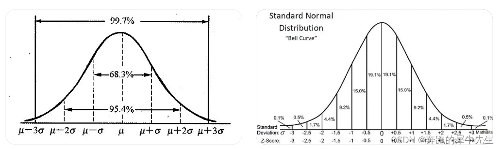
MATLAB正态分布协方差分析:揭示正态分布变量之间的协方差
# 1. 正态分布概述
正态分布,又称高斯分布,是统计学中最重要的连续概率分布之一。它广泛应用于自然科学、社会科学和工程领域。
正态分布的概率密度函数为:
```
f(x) = (1 / (σ√(2π))) * exp(-(x - μ)² / (2σ²))
```
其中:
- μ:正态分布的均值
- σ:正态分布的标准差
- π:圆周率
正态分布具有以下特性:
- 对称性:
我正在开发一款个人碳足迹计算app,如何撰写其需求分析文档,请给我一个范例
为了更全面、清晰地定义个人碳足迹计算app的需求,需求分析文档应该包含以下内容:
1.项目简介:对该app项目的概述及目标进行说明。
2.用户分析:包括目标用户群、用户需求、行为等。
3.功能需求:对app的基本功能进行定义,如用户登录、数据录入、数据统计等。
4.非功能需求:对使用app的性能和质量等进行定义,如界面设计、数据安全、可扩展性等。
5.运行环境:包括app的开发环境和使用环境。
下面是一个范例:
需求分析文档
1. 项目简介
该app项目旨在为用户提供一款方便、易用、可定制的个人碳足迹计算平台,以促进环保和可持续性发展。
2. 用户分析
目标用户群:全球关
JSBSim Reference Manual
JSBSim参考手册,其中包含JSBSim简介,JSBSim配置文件xml的编写语法,编程手册以及一些应用实例等。其中有部分内容还没有写完,估计有生之年很难看到完整版了,但是内容还是很有参考价值的。
"互动学习:行动中的多样性与论文攻读经历"
多样性她- 事实上SCI NCES你的时间表ECOLEDO C Tora SC和NCESPOUR l’Ingén学习互动,互动学习以行动为中心的强化学习学会互动,互动学习,以行动为中心的强化学习计算机科学博士论文于2021年9月28日在Villeneuve d'Asq公开支持马修·瑟林评审团主席法布里斯·勒菲弗尔阿维尼翁大学教授论文指导奥利维尔·皮耶昆谷歌研究教授:智囊团论文联合主任菲利普·普雷教授,大学。里尔/CRISTAL/因里亚报告员奥利维耶·西格德索邦大学报告员卢多维奇·德诺耶教授,Facebook /索邦大学审查员越南圣迈IMT Atlantic高级讲师邀请弗洛里安·斯特鲁布博士,Deepmind对于那些及时看到自己错误的人...3谢谢你首先,我要感谢我的两位博士生导师Olivier和Philippe。奥利维尔,"站在巨人的肩膀上"这句话对你来说完全有意义了。从科学上讲,你知道在这篇论文的(许多)错误中,你是我可以依
MATLAB正态分布相关性分析:探索正态分布变量之间的关联
# 1. MATLAB中正态分布的理论基础
正态分布,又称高斯分布,是一种常见的概率分布,其概率密度函数为:
```
f(x) = (1 / (σ√(2π))) * e^(-(x-μ)² / (2σ²))
```
其中,μ表示正态分布的均值,σ表示标准差。正态分布具有以下特点:
- **对称性:**正态分布的概率密度函数关于均值μ对称。
- **钟形曲线:**正态分布的概率密度函数呈钟形曲线