要求用到swiper+view
时间: 2023-07-30 18:09:53 浏览: 141

微信小程序之scroll-view选项卡与跳转 (一)
在使用swiper+view来实现长列表时,可以通过以下方式解决高度自适应问题:
1. 在获取列表数据后,计算每个列表项的高度,并将其保存到对应的数据项中。可以通过swiper的回调函数onSlideChangeTransitionEnd获取当前显示的列表项,然后通过view的selectComponent方法和createSelectorQuery()方法获取当前列表项的高度,将其保存到对应的数据项中。
2. 在view组件中,可以使用wx:if或wx:for指令来渲染每个列表项,并设置高度为auto,这样可以让列表项的高度自适应。
3. 如果列表项高度不同,可以在计算列表项高度时,把最大高度作为默认高度,这样可以保证列表项展示时高度不会出现问题。
综上所述,通过使用swiper+view,结合计算列表项高度的方法,可以解决长列表的渲染和高度自适应问题。需要注意的是,在性能方面,使用虚拟列表技术会更优秀。
阅读全文
相关推荐
最新推荐
微信小程序swiper组件实现抖音翻页切换视频功能的实例代码
在这个实例中,我们将讨论如何使用`swiper`组件来实现类似抖音短视频的翻页切换功能。`swiper`组件是微信小程序提供的一种滑动容器,它允许用户在多个页面之间进行平滑的横向或纵向滑动,常用于创建轮播图或者翻页...
react中使用swiper的具体方法
React中使用Swiper的具体方法 React中使用Swiper的具体方法是指在React项目中如何使用Swiper库来实现轮播图功能。Swiper是一个流行的轮播图库,能够帮助开发者快速实现轮播图功能。但是,在React项目中使用Swiper...
Vue框架里使用Swiper的方法示例
在Vue框架中,Swiper是一个常用的轮播图插件,它可以提供丰富的动画效果和交互功能。下面我们将详细探讨如何在Vue项目中集成和使用Swiper。 首先,你需要通过npm或cnpm来安装Swiper库: ```bash cnpm install ...
swiper自定义分页器使用方法详解
swiper自定义分页器使用方法详解 swiper是一款流行的JavaScript插件,用于创建高性能、多功能的轮播图效果。swiper提供了多种分页器样式,包括圆钮式、数字式等,但有时我们需要根据项目需求,自定义分页器的样式和...
swiper移动端轮播插件(触碰图片之后停止轮播)
Swiper 是一款强大的移动端触摸滑动插件,广泛应用于网页轮播、幻灯片展示等场景。在移动端应用中,为了提供更好的用户体验,有时我们希望用户触碰或交互后轮播停止,直到用户完成操作后再恢复自动轮播。这篇内容将...
JHU荣誉单变量微积分课程教案介绍
资源摘要信息:"jhu2017-18-honors-single-variable-calculus"
知识点一:荣誉单变量微积分课程介绍
本课程为JHU(约翰霍普金斯大学)的荣誉单变量微积分课程,主要针对在2018年秋季和2019年秋季两个学期开设。课程内容涵盖两个学期的微积分知识,包括整合和微分两大部分。该课程采用IBL(Inquiry-Based Learning)格式进行教学,即学生先自行解决问题,然后在学习过程中逐步掌握相关理论知识。
知识点二:IBL教学法
IBL教学法,即问题导向的学习方法,是一种以学生为中心的教学模式。在这种模式下,学生在教师的引导下,通过提出问题、解决问题来获取知识,从而培养学生的自主学习能力和问题解决能力。IBL教学法强调学生的主动参与和探索,教师的角色更多的是引导者和协助者。
知识点三:课程难度及学习方法
课程的第一次迭代主要包含问题,难度较大,学生需要有一定的数学基础和自学能力。第二次迭代则在第一次的基础上增加了更多的理论和解释,难度相对降低,更适合学生理解和学习。这种设计旨在帮助学生从实际问题出发,逐步深入理解微积分理论,提高学习效率。
知识点四:课程先决条件及学习建议
课程的先决条件为预演算,即在进入课程之前需要掌握一定的演算知识和技能。建议在使用这些笔记之前,先完成一些基础演算的入门课程,并进行一些数学证明的练习。这样可以更好地理解和掌握课程内容,提高学习效果。
知识点五:TeX格式文件
标签"TeX"意味着该课程的资料是以TeX格式保存和发布的。TeX是一种基于排版语言的格式,广泛应用于学术出版物的排版,特别是在数学、物理学和计算机科学领域。TeX格式的文件可以确保文档内容的准确性和排版的美观性,适合用于编写和分享复杂的科学和技术文档。
管理建模和仿真的文件
管理Boualem Benatallah引用此版本:布阿利姆·贝纳塔拉。管理建模和仿真。约瑟夫-傅立叶大学-格勒诺布尔第一大学,1996年。法语。NNT:电话:00345357HAL ID:电话:00345357https://theses.hal.science/tel-003453572008年12月9日提交HAL是一个多学科的开放存取档案馆,用于存放和传播科学研究论文,无论它们是否被公开。论文可以来自法国或国外的教学和研究机构,也可以来自公共或私人研究中心。L’archive ouverte pluridisciplinaire
【实战篇:自定义损失函数】:构建独特损失函数解决特定问题,优化模型性能
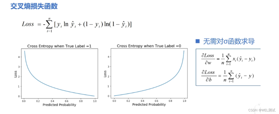
# 1. 损失函数的基本概念与作用
## 1.1 损失函数定义
损失函数是机器学习中的核心概念,用于衡量模型预测值与实际值之间的差异。它是优化算法调整模型参数以最小化的目标函数。
```math
L(y, f(x)) = \sum_{i=1}^{N} L_i(y_i, f(x_i))
```
其中,`L`表示损失函数,`y`为实际值,`f(x)`为模型预测值,`N`为样本数量,`L_i`为第`i`个样本的损失。
## 1.2 损
如何在ZYNQMP平台上配置TUSB1210 USB接口芯片以实现Host模式,并确保与Linux内核的兼容性?
要在ZYNQMP平台上实现TUSB1210 USB接口芯片的Host模式功能,并确保与Linux内核的兼容性,首先需要在硬件层面完成TUSB1210与ZYNQMP芯片的正确连接,保证USB2.0和USB3.0之间的硬件电路设计符合ZYNQMP的要求。
参考资源链接:[ZYNQMP USB主机模式实现与测试(TUSB1210)](https://wenku.csdn.net/doc/6nneek7zxw?spm=1055.2569.3001.10343)
具体步骤包括:
1. 在Vivado中设计硬件电路,配置USB接口相关的Bank502和Bank505引脚,同时确保USB时钟的正确配置。
Naruto爱好者必备CLI测试应用
资源摘要信息:"Are-you-a-Naruto-Fan:CLI测验应用程序,用于检查Naruto狂热者的知识"
该应用程序是一个基于命令行界面(CLI)的测验工具,设计用于测试用户对日本动漫《火影忍者》(Naruto)的知识水平。《火影忍者》是由岸本齐史创作的一部广受欢迎的漫画系列,后被改编成同名电视动画,并衍生出一系列相关的产品和文化现象。该动漫讲述了主角漩涡鸣人从忍者学校开始的成长故事,直到成为木叶隐村的领袖,期间包含了忍者文化、战斗、忍术、友情和忍者世界的政治斗争等元素。
这个测验应用程序的开发主要使用了JavaScript语言。JavaScript是一种广泛应用于前端开发的编程语言,它允许网页具有交互性,同时也可以在服务器端运行(如Node.js环境)。在这个CLI应用程序中,JavaScript被用来处理用户的输入,生成问题,并根据用户的回答来评估其对《火影忍者》的知识水平。
开发这样的测验应用程序可能涉及到以下知识点和技术:
1. **命令行界面(CLI)开发:** CLI应用程序是指用户通过命令行或终端与之交互的软件。在Web开发中,Node.js提供了一个运行JavaScript的环境,使得开发者可以使用JavaScript语言来创建服务器端应用程序和工具,包括CLI应用程序。CLI应用程序通常涉及到使用诸如 commander.js 或 yargs 等库来解析命令行参数和选项。
2. **JavaScript基础:** 开发CLI应用程序需要对JavaScript语言有扎实的理解,包括数据类型、函数、对象、数组、事件循环、异步编程等。
3. **知识库构建:** 测验应用程序的核心是其问题库,它包含了与《火影忍者》相关的各种问题。开发人员需要设计和构建这个知识库,并确保问题的多样性和覆盖面。
4. **逻辑和流程控制:** 在应用程序中,需要编写逻辑来控制测验的流程,比如问题的随机出现、计时器、计分机制以及结束时的反馈。
5. **用户界面(UI)交互:** 尽管是CLI,用户界面仍然重要。开发者需要确保用户体验流畅,这包括清晰的问题呈现、简洁的指令和友好的输出格式。
6. **模块化和封装:** 开发过程中应当遵循模块化原则,将不同的功能分隔开来,以便于管理和维护。例如,可以将问题生成器、计分器和用户输入处理器等封装成独立的模块。
7. **单元测试和调试:** 测验应用程序在发布前需要经过严格的测试和调试。使用如Mocha或Jest这样的JavaScript测试框架可以编写单元测试,并通过控制台输出调试信息来排除故障。
8. **部署和分发:** 最后,开发完成的应用程序需要被打包和分发。如果是基于Node.js的应用程序,常见的做法是将其打包为可执行文件(如使用electron或pkg工具),以便在不同的操作系统上运行。
根据提供的文件信息,虽然具体细节有限,但可以推测该应用程序可能采用了上述技术点。用户通过点击提供的链接,可能将被引导到一个网页或直接下载CLI应用程序的可执行文件,从而开始进行《火影忍者》的知识测验。通过这个测验,用户不仅能享受答题的乐趣,还可以加深对《火影忍者》的理解和认识。