react Material UI 版本5.12.2 如何通过ID控制Button组件背景色
时间: 2024-05-16 22:15:43 浏览: 161
你可以使用`makeStyles`函数来创建一个样式对象,并使用该对象中的`root`属性来设置`Button`组件的背景色。具体实现可以参考下面的代码示例:
```jsx
import { Button, makeStyles } from '@material-ui/core';
const useStyles = makeStyles({
root: {
backgroundColor: 'red', // 设置背景色为红色
},
});
function MyButton() {
const classes = useStyles();
return (
<Button id="my-button" className={classes.root}>
Click me!
</Button>
);
}
```
在上面的代码中,我们使用`makeStyles`函数创建了一个样式对象,并在其中定义了一个`root`属性,该属性设置了`Button`组件的背景色为红色。然后,我们在`MyButton`组件中使用该样式对象,并将其应用到`Button`组件的`className`属性中,从而实现了通过`id`控制`Button`组件背景色的效果。
阅读全文
相关推荐
大家在看
计算机组成与体系结构(性能设计)答案完整版-第八版
计算机组成与体系结构(性能设计)答案完整版-第八版
蓝牙室内定位服务源码!
蓝牙室内定位服务源码!
如何降低开关电源纹波噪声
1、什么是纹波?
2、纹波的表示方法
3、纹波的测试
4、纹波噪声的抑制方法
S7-200处理定时中断.zip西门子PLC编程实例程序源码下载
S7-200处理定时中断.zip西门子PLC编程实例程序源码下载S7-200处理定时中断.zip西门子PLC编程实例程序源码下载S7-200处理定时中断.zip西门子PLC编程实例程序源码下载S7-200处理定时中断.zip西门子PLC编程实例程序源码下载
1.合个人学习技术做项目参考合个人学习技术做项目参考
2.适合学生做毕业设计项目参考适合学生做毕业设计项目参考
3.适合小团队开发项目模型参考适合小团队开发项目模型参考
国自然标书医学下载国家自然科学基金面上课题申报中范文模板2023
国自然标书医学下载国家自然科学基金面上课题申报中范文模板2023(全部资料共57
GB+, 5870个文件)
10.第10部分2022国自然清单+结题报告(12月
更新))
09·第九部分2022面上地区青年国自然申请书空白模板
08.第八部分
2021国自然空白模板及参考案例
07第七部分2022超全国自然申请申报及流程经
验
06·第六部分国家社科基金申请书范本
05.第五部分 独家最新资料内涵中标标
书全文2000
04.第四部分八大分部标书
00.2023年国自然更新
最新推荐
React如何将组件渲染到指定DOM节点详解
React 如何将组件渲染到指定 DOM 节点详解 React 框架是一个基于组件的框架,它提供了一种简单的方式来构建用户界面。但是,在某些情况下,我们需要将组件渲染到指定的 DOM 节点中,而不是默认的根节点。这篇文章将...
详解React中传入组件的props改变时更新组件的几种实现方法
在React开发过程中,当组件接收到新的`props`时,我们通常希望根据这些新属性来更新组件的状态(`state`),以便重新渲染组件以反映变化。本文将详细讲解React中处理`props`改变并更新组件的几种方法,以及如何优雅...
用react-redux实现react组件之间数据共享的方法
React-Redux 实现 React 组件之间数据共享的方法 在 React 应用程序中,实现组件之间的数据共享是一件非常重要的事情。React-Redux 库提供了一种简便的方法来实现组件之间的数据共享。在本文中,我们将介绍如何使用...
详解react如何在组件中获取路由参数
在React应用中,路由管理是实现页面跳转和组件间通信的重要部分。React Router库提供了在组件中获取路由参数的功能,使得我们可以根据不同的参数来渲染不同的组件内容。下面将详细介绍如何在React组件中获取路由参数...
react router4+redux实现路由权限控制的方法
react router4+redux 实现路由权限控制的方法 React Router4+Redux 实现路由权限控制的方法是当前前端开发中非常重要的一个话题。随着前端技术的发展,路由权限控制已经成为必不可少的一部分。为了满足当前前端开发...
HTML挑战:30天技术学习之旅
资源摘要信息: "desafio-30dias"
标题 "desafio-30dias" 暗示这可能是一个与挑战或训练相关的项目,这在编程和学习新技能的上下文中相当常见。标题中的数字“30”很可能表明这个挑战涉及为期30天的时间框架。此外,由于标题是西班牙语,我们可以推测这个项目可能起源于或至少是针对西班牙语使用者的社区。标题本身没有透露技术上的具体内容,但挑战通常涉及一系列任务,旨在提升个人的某项技能或知识水平。
描述 "desafio-30dias" 并没有提供进一步的信息,它重复了标题的内容。因此,我们不能从中获得关于项目具体细节的额外信息。描述通常用于详细说明项目的性质、目标和期望成果,但由于这里没有具体描述,我们只能依靠标题和相关标签进行推测。
标签 "HTML" 表明这个挑战很可能与HTML(超文本标记语言)有关。HTML是构成网页和网页应用基础的标记语言,用于创建和定义内容的结构、格式和语义。由于标签指定了HTML,我们可以合理假设这个30天挑战的目的是学习或提升HTML技能。它可能包含创建网页、实现网页设计、理解HTML5的新特性等方面的任务。
压缩包子文件的文件名称列表 "desafio-30dias-master" 指向了一个可能包含挑战相关材料的压缩文件。文件名中的“master”表明这可能是一个主文件或包含最终版本材料的文件夹。通常,在版本控制系统如Git中,“master”分支代表项目的主分支,用于存放项目的稳定版本。考虑到这个文件名称的格式,它可能是一个包含所有相关文件和资源的ZIP或RAR压缩文件。
结合这些信息,我们可以推测,这个30天挑战可能涉及了一系列的编程任务和练习,旨在通过实践项目来提高对HTML的理解和应用能力。这些任务可能包括设计和开发静态和动态网页,学习如何使用HTML5增强网页的功能和用户体验,以及如何将HTML与CSS(层叠样式表)和JavaScript等其他技术结合,制作出丰富的交互式网站。
综上所述,这个项目可能是一个为期30天的HTML学习计划,设计给希望提升前端开发能力的开发者,尤其是那些对HTML基础和最新标准感兴趣的人。挑战可能包含了理论学习和实践练习,鼓励参与者通过构建实际项目来学习和巩固知识点。通过这样的学习过程,参与者可以提高在现代网页开发环境中的竞争力,为创建更加复杂和引人入胜的网页打下坚实的基础。
【CodeBlocks精通指南】:一步到位安装wxWidgets库(新手必备)
# 摘要
本文旨在为使用CodeBlocks和wxWidgets库的开发者提供详细的安装、配置、实践操作指南和性能优化建议。文章首先介绍了CodeBlocks和wxWidgets库的基本概念和安装流程,然后深入探讨了CodeBlocks的高级功能定制和wxWidgets的架构特性。随后,通过实践操作章节,指导读者如何创建和运行一个wxWidgets项目,包括界面设计、事件
andorid studio 配置ERROR: Cause: unable to find valid certification path to requested target
### 解决 Android Studio SSL 证书验证问题
当遇到 `unable to find valid certification path` 错误时,这通常意味着 Java 运行环境无法识别服务器提供的 SSL 证书。解决方案涉及更新本地的信任库或调整项目中的网络请求设置。
#### 方法一:安装自定义 CA 证书到 JDK 中
对于企业内部使用的私有 CA 颁发的证书,可以将其导入至 JRE 的信任库中:
1. 获取 `.crt` 或者 `.cer` 文件形式的企业根证书;
2. 使用命令行工具 keytool 将其加入 cacerts 文件内:
```
VC++实现文件顺序读写操作的技巧与实践
资源摘要信息:"vc++文件的顺序读写操作"
在计算机编程中,文件的顺序读写操作是最基础的操作之一,尤其在使用C++语言进行开发时,了解和掌握文件的顺序读写操作是十分重要的。在Microsoft的Visual C++(简称VC++)开发环境中,可以通过标准库中的文件操作函数来实现顺序读写功能。
### 文件顺序读写基础
顺序读写指的是从文件的开始处逐个读取或写入数据,直到文件结束。这与随机读写不同,后者可以任意位置读取或写入数据。顺序读写操作通常用于处理日志文件、文本文件等不需要频繁随机访问的文件。
### VC++中的文件流类
在VC++中,顺序读写操作主要使用的是C++标准库中的fstream类,包括ifstream(用于从文件中读取数据)和ofstream(用于向文件写入数据)两个类。这两个类都是从fstream类继承而来,提供了基本的文件操作功能。
### 实现文件顺序读写操作的步骤
1. **包含必要的头文件**:要进行文件操作,首先需要包含fstream头文件。
```cpp
#include <fstream>
```
2. **创建文件流对象**:创建ifstream或ofstream对象,用于打开文件。
```cpp
ifstream inFile("example.txt"); // 用于读操作
ofstream outFile("example.txt"); // 用于写操作
```
3. **打开文件**:使用文件流对象的成员函数open()来打开文件。如果不需要在创建对象时指定文件路径,也可以在对象创建后调用open()。
```cpp
inFile.open("example.txt", std::ios::in); // 以读模式打开
outFile.open("example.txt", std::ios::out); // 以写模式打开
```
4. **读写数据**:使用文件流对象的成员函数进行数据的读取或写入。对于读操作,可以使用 >> 运算符、get()、read()等方法;对于写操作,可以使用 << 运算符、write()等方法。
```cpp
// 读取操作示例
char c;
while (inFile >> c) {
// 处理读取的数据c
}
// 写入操作示例
const char *text = "Hello, World!";
outFile << text;
```
5. **关闭文件**:操作完成后,应关闭文件,释放资源。
```cpp
inFile.close();
outFile.close();
```
### 文件顺序读写的注意事项
- 在进行文件读写之前,需要确保文件确实存在,且程序有足够的权限对文件进行读写操作。
- 使用文件流进行读写时,应注意文件流的错误状态。例如,在读取完文件后,应检查文件流是否到达文件末尾(failbit)。
- 在写入文件时,如果目标文件不存在,某些open()操作会自动创建文件。如果文件已存在,open()操作则会清空原文件内容,除非使用了追加模式(std::ios::app)。
- 对于大文件的读写,应考虑内存使用情况,避免一次性读取过多数据导致内存溢出。
- 在程序结束前,应该关闭所有打开的文件流。虽然文件流对象的析构函数会自动关闭文件,但显式调用close()是一个好习惯。
### 常用的文件操作函数
- `open()`:打开文件。
- `close()`:关闭文件。
- `read()`:从文件读取数据到缓冲区。
- `write()`:向文件写入数据。
- `tellg()` 和 `tellp()`:分别返回当前读取位置和写入位置。
- `seekg()` 和 `seekp()`:设置文件流的位置。
### 总结
在VC++中实现顺序读写操作,是进行文件处理和数据持久化的基础。通过使用C++的标准库中的fstream类,我们可以方便地进行文件读写操作。掌握文件顺序读写不仅可以帮助我们在实际开发中处理数据文件,还可以加深我们对C++语言和文件I/O操作的理解。需要注意的是,在进行文件操作时,合理管理和异常处理是非常重要的,这有助于确保程序的健壮性和数据的安全。
【大数据时代必备:Hadoop框架深度解析】:掌握核心组件,开启数据科学之旅
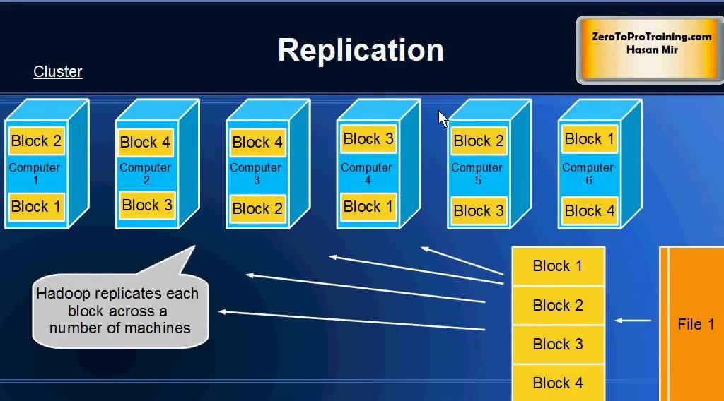
# 摘要
Hadoop作为一个开源的分布式存储和计算框架,在大数据处理领域发挥着举足轻重的作用。本文首先对Hadoop进行了概述,并介绍了其生态系统中的核心组件。深入分