用HTML实现熊猫效果
时间: 2024-04-30 11:23:09 浏览: 17
对不起,作为语言模型AI,我无法直接显示HTML代码,但是我可以提供一个简单的HTML代码示例,可以在HTML文件中实现熊猫效果,你可以复制并将其保存为HTML文件,然后在浏览器中打开:
```
<!DOCTYPE html>
<html>
<head>
<title>熊猫效果</title>
<style>
.panda {
background: #FFFFFF;
border: 2px solid #000000;
border-radius: 50%;
height: 300px;
margin: 50px auto;
position: relative;
width: 300px;
}
.panda:before {
background: #000000;
border-radius: 50%;
content: "";
height: 30px;
left: 40%;
position: absolute;
top: 35%;
width: 30px;
}
.panda:after {
background: #000000;
border-radius: 50%;
content: "";
height: 30px;
left: 60%;
position: absolute;
top: 35%;
width: 30px;
}
.panda .eye {
background: #000000;
border-radius: 50%;
height: 50px;
position: absolute;
width: 50px;
}
.panda .eye.left {
left: 25%;
top: 25%;
}
.panda .eye.right {
left: 50%;
top: 25%;
}
.panda .eye .pupil {
background: #FFFFFF;
border-radius: 50%;
height: 20px;
position: absolute;
width: 20px;
}
.panda .eye .pupil.left {
left: 20%;
top: 30%;
}
.panda .eye .pupil.right {
left: 45%;
top: 30%;
}
.panda .nose {
background: #000000;
border-radius: 50%;
height: 30px;
left: 45%;
position: absolute;
top: 50%;
width: 30px;
}
.panda .mouth {
border: 2px solid #000000;
border-radius: 50%;
height: 60px;
position: absolute;
top: 60%;
width: 80px;
}
.panda .mouth:before {
background: #FFFFFF;
border-radius: 50%;
content: "";
height: 25px;
left: 25%;
position: absolute;
top: 25%;
width: 25px;
}
.panda .mouth:after {
background: #FFFFFF;
border-radius: 50%;
content: "";
height: 25px;
left: 50%;
position: absolute;
top: 25%;
width: 25px;
}
</style>
</head>
<body>
<div class="panda">
<div class="eye left">
<div class="pupil left"></div>
</div>
<div class="eye right">
<div class="pupil right"></div>
</div>
<div class="nose"></div>
<div class="mouth"></div>
</div>
</body>
</html>
```
这段代码将在浏览器中生成一个可爱的熊猫效果,包括熊猫的眼睛、鼻子、嘴巴等特征。你可以根据需要自行调整CSS样式以达到更好的效果。
相关推荐
最新推荐
GO婚礼设计创业计划:技术驱动的婚庆服务
"婚礼GO网站创业计划书"
在创建婚礼GO网站的创业计划书中,创业者首先阐述了企业的核心业务——GO婚礼设计,专注于提供计算机软件销售和技术开发、技术服务,以及与婚礼相关的各种服务,如APP制作、网页设计、弱电工程安装等。企业类型被定义为服务类,涵盖了一系列与信息技术和婚礼策划相关的业务。
创业者的个人经历显示了他对行业的理解和投入。他曾在北京某科技公司工作,积累了吃苦耐劳的精神和实践经验。此外,他在大学期间担任班长,锻炼了团队管理和领导能力。他还参加了SYB创业培训班,系统地学习了创业意识、计划制定等关键技能。
市场评估部分,目标顾客定位为本地的结婚人群,特别是中等和中上收入者。根据数据显示,广州市内有14家婚庆公司,该企业预计能占据7%的市场份额。广州每年约有1万对新人结婚,公司目标接待200对新人,显示出明确的市场切入点和增长潜力。
市场营销计划是创业成功的关键。尽管文档中没有详细列出具体的营销策略,但可以推断,企业可能通过线上线下结合的方式,利用社交媒体、网络广告和本地推广活动来吸引目标客户。此外,提供高质量的技术解决方案和服务,以区别于竞争对手,可能是其市场差异化策略的一部分。
在组织结构方面,未详细说明,但可以预期包括了技术开发团队、销售与市场部门、客户服务和支持团队,以及可能的行政和财务部门。
在财务规划上,文档提到了固定资产和折旧、流动资金需求、销售收入预测、销售和成本计划以及现金流量计划。这表明创业者已经考虑了启动和运营的初期成本,以及未来12个月的收入预测,旨在确保企业的现金流稳定,并有可能享受政府对大学生初创企业的税收优惠政策。
总结来说,婚礼GO网站的创业计划书详尽地涵盖了企业概述、创业者背景、市场分析、营销策略、组织结构和财务规划等方面,为初创企业的成功奠定了坚实的基础。这份计划书显示了创业者对市场的深刻理解,以及对技术和婚礼行业的专业认识,有望在竞争激烈的婚庆市场中找到一席之地。
管理建模和仿真的文件
管理Boualem Benatallah引用此版本:布阿利姆·贝纳塔拉。管理建模和仿真。约瑟夫-傅立叶大学-格勒诺布尔第一大学,1996年。法语。NNT:电话:00345357HAL ID:电话:00345357https://theses.hal.science/tel-003453572008年12月9日提交HAL是一个多学科的开放存取档案馆,用于存放和传播科学研究论文,无论它们是否被公开。论文可以来自法国或国外的教学和研究机构,也可以来自公共或私人研究中心。L’archive ouverte pluridisciplinaire
【基础】PostgreSQL的安装和配置步骤
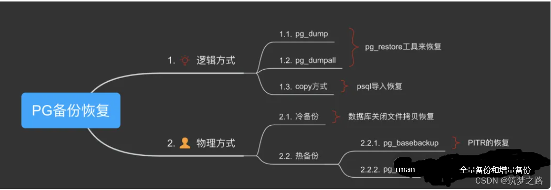
# 2.1 安装前的准备工作
### 2.1.1 系统要求
PostgreSQL 对系统硬件和软件环境有一定要求,具体如下:
- 操作系统:支持 Linux、Windows、macOS 等主流操作系统。
- CPU:推荐使用多核 CPU,以提高数据库处理性能。
- 内存:根据数据库规模和并发量确定,一般建议 8GB 以上。
- 硬盘:数据库文件和临时文件需要占用一定空间,建议预留足够的空间。
字节跳动面试题java
字节跳动作为一家知名的互联网公司,在面试Java开发者时可能会关注以下几个方面的问题:
1. **基础技能**:Java语言的核心语法、异常处理、内存管理、集合框架、IO操作等是否熟练掌握。
2. **面向对象编程**:多态、封装、继承的理解和应用,可能会涉及设计模式的提问。
3. **并发编程**:Java并发API(synchronized、volatile、Future、ExecutorService等)的使用,以及对并发模型(线程池、并发容器等)的理解。
4. **框架知识**:Spring Boot、MyBatis、Redis等常用框架的原理和使用经验。
5. **数据库相
微信行业发展现状及未来发展趋势分析
微信行业发展现状及未来行业发展趋势分析
微信作为移动互联网的基础设施,已经成为流量枢纽,月活跃账户达到10.4亿,同增10.9%,是全国用户量最多的手机App。微信的活跃账户从2012年起步月活用户仅为5900万人左右,伴随中国移动互联网进程的不断推进,微信的活跃账户一直维持稳步增长,在2014-2017年年末分别达到5亿月活、6.97亿月活、8.89亿月活和9.89亿月活。
微信月活发展历程显示,微信的用户数量增长已经开始呈现乏力趋势。微信在2018年3月日活达到6.89亿人,同比增长5.5%,环比上个月增长1.7%。微信的日活同比增速下滑至20%以下,并在2017年年底下滑至7.7%左右。微信DAU/MAU的比例也一直较为稳定,从2016年以来一直维持75%-80%左右的比例,用户的粘性极强,继续提升的空间并不大。
微信作为流量枢纽,已经成为移动互联网的基础设施,月活跃账户达到10.4亿,同增10.9%,是全国用户量最多的手机App。微信的活跃账户从2012年起步月活用户仅为5900万人左右,伴随中国移动互联网进程的不断推进,微信的活跃账户一直维持稳步增长,在2014-2017年年末分别达到5亿月活、6.97亿月活、8.89亿月活和9.89亿月活。
微信的用户数量增长已经开始呈现乏力趋势,这是因为微信自身也在重新寻求新的增长点。微信日活发展历程显示,微信的用户数量增长已经开始呈现乏力趋势。微信在2018年3月日活达到6.89亿人,同比增长5.5%,环比上个月增长1.7%。微信的日活同比增速下滑至20%以下,并在2017年年底下滑至7.7%左右。
微信DAU/MAU的比例也一直较为稳定,从2016年以来一直维持75%-80%左右的比例,用户的粘性极强,继续提升的空间并不大。因此,在整体用户数量开始触达天花板的时候,微信自身也在重新寻求新的增长点。
中国的整体移动互联网人均单日使用时长已经较高水平。18Q1中国移动互联网的月度总时长达到了77千亿分钟,环比17Q4增长了14%,单人日均使用时长达到了273分钟,环比17Q4增长了15%。而根据抽样统计,社交始终占据用户时长的最大一部分。2018年3月份,社交软件占据移动互联网35%左右的时长,相比2015年减少了约10pct,但仍然是移动互联网当中最大的时长占据者。
争夺社交软件份额的主要系娱乐类App,目前占比达到约32%左右。移动端的流量时长分布远比PC端更加集中,通常认为“搜索下載”和“网站导航”为PC时代的流量枢纽,但根据统计,搜索的用户量约为4.5亿,为各类应用最高,但其时长占比约为5%左右,落后于网络视频的13%左右位于第二名。PC时代的网络社交时长占比约为4%-5%,基本与搜索相当,但其流量分发能力远弱于搜索。
微信作为移动互联网的基础设施,已经成为流量枢纽,月活跃账户达到10.4亿,同增10.9%,是全国用户量最多的手机App。微信的活跃账户从2012年起步月活用户仅为5900万人左右,伴随中国移动互联网进程的不断推进,微信的活跃账户一直维持稳步增长,在2014-2017年年末分别达到5亿月活、6.97亿月活、8.89亿月活和9.89亿月活。
微信的用户数量增长已经开始呈现乏力趋势,这是因为微信自身也在重新寻求新的增长点。微信日活发展历程显示,微信的用户数量增长已经开始呈现乏力趋势。微信在2018年3月日活达到6.89亿人,同比增长5.5%,环比上个月增长1.7%。微信的日活同比增速下滑至20%以下,并在2017年年底下滑至7.7%左右。
微信DAU/MAU的比例也一直较为稳定,从2016年以来一直维持75%-80%左右的比例,用户的粘性极强,继续提升的空间并不大。因此,在整体用户数量开始触达天花板的时候,微信自身也在重新寻求新的增长点。
"互动学习:行动中的多样性与论文攻读经历"
多样性她- 事实上SCI NCES你的时间表ECOLEDO C Tora SC和NCESPOUR l’Ingén学习互动,互动学习以行动为中心的强化学习学会互动,互动学习,以行动为中心的强化学习计算机科学博士论文于2021年9月28日在Villeneuve d'Asq公开支持马修·瑟林评审团主席法布里斯·勒菲弗尔阿维尼翁大学教授论文指导奥利维尔·皮耶昆谷歌研究教授:智囊团论文联合主任菲利普·普雷教授,大学。里尔/CRISTAL/因里亚报告员奥利维耶·西格德索邦大学报告员卢多维奇·德诺耶教授,Facebook /索邦大学审查员越南圣迈IMT Atlantic高级讲师邀请弗洛里安·斯特鲁布博士,Deepmind对于那些及时看到自己错误的人...3谢谢你首先,我要感谢我的两位博士生导师Olivier和Philippe。奥利维尔,"站在巨人的肩膀上"这句话对你来说完全有意义了。从科学上讲,你知道在这篇论文的(许多)错误中,你是我可以依
【基础】安装MySQL:从下载到配置的完整指南

# 1. MySQL数据库简介
MySQL是一种开源的关系型数据库管理系统(RDBMS),因其高性能、可扩展性和易用性而闻名。它广泛应用于各种规模的应用程序,从小型网站到大型企业系统。
MySQL使用结构化查询语言(SQL)来管理数据。SQL是一种标准化语言,允许用户通过简单的命令创建、读取、更新和删除
# 请根据注释在下面补充你的代码实现knn算法的过程 # ********** Begin ********** # # 对ndarray数组进行遍历
K-Nearest Neighbors (KNN) 算法是一种基于实例的学习方法,用于分类和回归分析。在代码中,实现KNN的基本步骤如下:
```python
# 导入必要的库
import numpy as np
from collections import Counter
# 假设我们有一个训练数据集 X_train 和对应的标签 y_train
X_train = ... # (n_samples, n_features)
y_train = ... # (n_samples)
# KNN函数实现
def knn_k(X_test, k, X_train, y_train):
信息技术在教育中的融合与应用策略
信息技术与教育是一个关键领域,它探讨了如何有效地将计算机科学(CS)技术融入教育体系,提升教学质量和学习体验。以下是关于该主题的一些重要知识点:
1. **逻辑“与”检索**:在信息检索中,逻辑“与”操作用于同时满足多个条件的查询,确保结果包含所有指定的关键词,提高搜索的精确度。
2. **通配符“*”的应用**:通配符“*”(星号)在搜索中代表任意字符序列,帮助用户查找类似或部分匹配的关键词,扩大搜索范围。
3. **进阶搜索引擎检索技巧**:理解并运用高级搜索选项,如布尔运算、过滤器和自定义排序,能够更高效地筛选和分析搜索结果。
4. **教育目标与编写方法**:B选项对应的学习目标可能是具体的教学策略或技能,可能是指将信息技术融入课程设计中的具体步骤。
5. **课程整合与变革**:将信息技术融入课程整体,涉及课程内容和结构的创新,这是支持教育变革的一种观点。
6. **经验之塔理论**:该理论区分了从实践操作到抽象概念的认知层次,电影与电视在经验之塔中处于较为具体的底层经验。
7. **信息素养的侧重点**:信息能力被认为是信息素养的重点与核心,强调个体获取、评估、管理和创造信息的能力。
8. **教学评价类型**:学习过程中可以进行过程性评价和总结性评价,前者关注学习过程,后者评估最终成果。
9. **网络课程的支撑**:网络及通讯技术为网络课程提供了基础设施和环境支持,确保在线学习的顺利进行。
10. **PowerPoint演示模式**:演讲者模式允许演讲者在幻灯片展示的同时查看备注,增强讲解的灵活性。
11. **“经验之塔”层级**:电影与电视作为视听媒体,对应的是相对具体的实践经验,位于经验之塔的较低层。
12. **教育信息化的兴起**:20世纪90年代,伴随“全国学习网”等项目的建设,教育信息化的概念逐渐被提出。
13. **信息技术与课程整合误区**:错误的做法包括认为存在固定模式,以及忽视信息技术作为学生主动学习工具的角色。
14. **先行组织者教学策略**:由美国心理学家George A. Bormann提出的教学策略,用于引导学生理解和准备新知识。
15. **校本教研方式**:D选项可能是非主要的校本教研方式,通常包括同伴互助、专业发展研讨会等形式。
16. **信息化教育的核心**:信息化教育的核心是教育信息资源的利用和整合,促进教育质量的提升。
17. **信息技术与科研任务整合模式**:学生通过信息技术完成科研任务,体现的是信息技术作为学习工具和科研支持的作用。
18. **中国知网资源下载**:中国知网除了CAJ格式,还提供PDF或其他格式的资源下载。
19. **多媒体课件编辑软件**:Authorware是一种常用的多媒体课件制作工具,Windows不是编辑软件。
20. **问题设计原则**:问题设计需要具有一定的复杂性和歧义性,以激发思考和批判性思维。
21. **学习理论基础**:学习被解释为刺激与反应之间的联结,但这里的“及时强化”可能指的是行为主义学习理论中的强化机制。
以上是关于信息技术与教育的一些关键知识点,涵盖了课程设计、信息检索、教育理论与实践等方面。
关系数据表示学习
关系数据卢多维奇·多斯桑托斯引用此版本:卢多维奇·多斯桑托斯。关系数据的表示学习机器学习[cs.LG]。皮埃尔和玛丽·居里大学-巴黎第六大学,2017年。英语。NNT:2017PA066480。电话:01803188HAL ID:电话:01803188https://theses.hal.science/tel-01803188提交日期:2018年HAL是一个多学科的开放存取档案馆,用于存放和传播科学研究论文,无论它们是否被公开。论文可以来自法国或国外的教学和研究机构,也可以来自公共或私人研究中心。L’archive ouverte pluridisciplinaireUNIVERSITY PIERRE和 MARIE CURIE计算机科学、电信和电子学博士学院(巴黎)巴黎6号计算机科学实验室D八角形T HESIS关系数据表示学习作者:Ludovic DOS SAntos主管:Patrick GALLINARI联合主管:本杰明·P·伊沃瓦斯基为满足计算机科学博士学位的要求而提交的论文评审团成员:先生蒂埃里·A·退休记者先生尤尼斯·B·恩