style="margin-top:0px;display: flex;justify-content: center;text-align: center;"
时间: 2024-04-07 11:03:18 浏览: 77
你的第一个问题是关于一个样式属性的问题。你想知道如何使用样式属性来设置一个元素的上边距为0,并且使其在父元素中水平居中和垂直居中。
对于这个问题,你可以使用以下的样式代码:
```css
style="margin-top: 0px; display: flex; justify-content: center; text-align: center;"
```
这段代码中,`margin-top: 0px;` 将会把元素的上边距设置为0像素。`display: flex;` 将会使父元素使用弹性布局。`justify-content: center;` 将会使子元素在水平方向上居中对齐。`text-align: center;` 将会使子元素的文本在垂直方向上居中对齐。
请注意,这段代码将会应用于一个具体的元素或者CSS类中。如果你想要更具体的指导,请提供更多的上下文信息。
相关问题
.page { display: flex; flex-direction: column; align-items: flex-start; width: 375px; height: 812px; background-color: #000000; font-family: Roboto-Regular; white-space: nowrap; } .view { position: relative; display: flex; flex-direction: column; align-items: flex-start; margin-top: 100px; margin-left: 52px; } .caption { position: relative; overflow: hidden; height: 45px; max-width: 192px; font-family: Roboto-Bold; font-size: 32px; line-height: 45px; color: #ffffff; text-overflow: ellipsis; } .title { position: relative; margin-top: 4px; font-size: 32px; line-height: 38px; color: #c3c3c3; } .item-wrapper { position: relative; display: flex; justify-content: center; align-items: flex-start; margin-top: 69px; margin-left: 33px; white-space: normal; } .item { width: 294px; height: 287px; } .book-wrapper { position: relative; display: flex; align-items: center; align-self: flex-end; height: 49px; padding-left: 20px; padding-right: 20px; margin-top: 128px; margin-right: 50px; line-height: 20px; border-radius: 10px; box-sizing: border-box; border-width: 1px; border-style: solid; border-color: rgba(196, 196, 196, 1); } .book { font-size: 20px; color: #ffffff; } button{ background-color:transparent; border-style:none; }幫我加入自适应网頁手機
要使上述CSS样式适应手机设备,您可以使用媒体查询来调整样式和布局。以下是在现有代码中添加媒体查询以适应手机设备的示例:
```css
.page {
/* 桌面样式 */
display: flex;
flex-direction: column;
align-items: flex-start;
width: 375px;
height: 812px;
background-color: #000000;
font-family: Roboto-Regular;
white-space: nowrap;
}
.view {
/* 桌面样式 */
position: relative;
display: flex;
flex-direction: column;
align-items: flex-start;
margin-top: 100px;
margin-left: 52px;
}
.caption {
/* 桌面样式 */
position: relative;
overflow: hidden;
height: 45px;
max-width: 192px;
font-family: Roboto-Bold;
font-size: 32px;
line-height: 45px;
color: #ffffff;
text-overflow: ellipsis;
}
.title {
/* 桌面样式 */
position: relative;
margin-top: 4px;
font-size: 32px;
line-height: 38px;
color: #c3c3c3;
}
.item-wrapper {
/* 桌面样式 */
position: relative;
display: flex;
justify-content: center;
align-items: flex-start;
margin-top: 69px;
margin-left: 33px;
white-space: normal;
}
.item {
/* 桌面样式 */
width: 294px;
height: 287px;
}
.book-wrapper {
/* 桌面样式 */
position: relative;
display: flex;
align-items: center;
align-self: flex-end;
height: 49px;
padding-left: 20px;
padding-right: 20px;
margin-top: 128px;
margin-right: 50px;
line-height: 20px;
border-radius: 10px;
box-sizing: border-box;
border-width: 1px;
border-style: solid;
border-color: rgba(196, 196, 196, 1);
}
.book {
/* 桌面样式 */
font-size: 20px;
color: #ffffff;
}
button {
/* 桌面样式 */
background-color: transparent;
border-style: none;
}
/* 手机样式 */
@media (max-width: 480px) {
.page {
width: auto;
height: auto;
padding: 10px;
}
.view {
margin-top: 50px;
margin-left: 20px;
}
.caption {
height: auto;
max-width: none;
font-size: 24px;
line-height: 30px;
text-overflow: initial;
}
.title {
margin-top: 2px;
font-size: 24px;
line-height: 30px;
}
.item-wrapper {
margin-top: 40px;
margin-left: 20px;
}
.item {
width: auto;
height: auto;
max-width: 100%;
max-height: none;
}
.book-wrapper {
margin-top: 80px;
margin-right: 20px;
}
.book {
font-size: 16px;
}
}
```
在上述示例中,我们添加了一个媒体查询以应用适应手机设备的CSS样式。媒体查询的条件是最大宽度为480像素,这意味着当浏览器宽度小于或等于480像素时,将应用手机样式。在手机样式中,我们对各个元素进行了调整,以适应手机屏幕的大小和布局。
请注意,这只是一个示例,您可以根据您的具体需求和设计进行进一步的调整和优化。
display: flex; align-items: center; justify-content: center; align-self:flex-start; margin-top: 15px;解析
这是一个 CSS 样式代码,应用于某个元素的样式。该元素将应用以下属性:
- `display: flex;`:将该元素设置为弹性容器,其子元素将基于弹性布局排列。
- `align-items: center;`:子元素在交叉轴上居中对齐。
- `justify-content: center;`:子元素在主轴上居中对齐。
- `align-self:flex-start;`:该元素自身在交叉轴上靠上对齐。
- `margin-top: 15px;`:该元素的上边距为 15 像素。
阅读全文
相关推荐
大家在看
Chamber and Station test.pptx
Chamber and Station test.pptx
宽带信号下阻抗失配引起的群时延变化的一种计算方法 (2015年)
在基于时延测量的高精度测量设备中,对群时延测量的精度要求非常苛刻。在电路实现的过程中,阻抗失配是一种必然存在的现象,这种现象会引起信号传输过程中群时延的变化。电路实现过程中影响阻抗的一个很重要的现象便是趋肤效应,因此在研究阻抗失配对群时延影响时必须要考虑趋肤效应对阻抗的影响。结合射频电路理论、传输线理路、趋肤效应理论,提出了一种宽带信号下阻抗失配引起的群时延变化的一种方法。并以同轴电缆为例进行建模,利用Matlab软件计算该方法的精度并与ADS2009软件的仿真结果进行比对。群时延精度在宽带信号下可达5‰
短消息数据包协议
SMS PDU 描述了 短消息 数据包 协议
对通信敢兴趣的可以自己写这些程序,用AT命令来玩玩。
mediapipe_pose_torch_Android-main.zip
mediapipe 人体跟踪画线
蒸汽冷凝器模型和 PI 控制:具有 PID 控制的蒸汽冷凝器的动态模型。-matlab开发
zip 文件包括 pdf 文件中的模型描述、蒸汽冷凝器的 simulink 模型、执行React曲线 PID 调整的函数和运行模型的 m 文件。
m 文件可用于了解如何使用React曲线方法来调整 PID 控制器。 该模型本身可用于测试各种控制设计方法,例如 MPC。
该模型是在 R14SP3(MATLAB 7.1,Simulink 6.3)下开发的。 如果需要使用以前版本的 MATLAB/Simulink,请给我发电子邮件。
最新推荐
_三维电容层析成像组合电极激励测量模式.pdf
_三维电容层析成像组合电极激励测量模式
(1985-2024.6) 世界各国经济政策不确定性指数 (完整数据)
## 数据指标说明
经济政策不确定性(EPU)是指公众对未来政府经济政策方向、效果的不确定性。这种不确定性可能源于政治选举、政策变化预期、法规变动、国际关系紧张等多种因素。当政策不确定性较高时,企业和消费者可能会推迟投资和消费决策,从而影响经济活动
本次分享数据是全球及22个国家的经济政策不确定性指数,用于衡量各国经济政策的不确定性水平
数据介绍#井
数据名称:世界各国经济政策不确定性指数
数据年份:1985.1-2024.6
数据范围:22个国家
更新时间:2024年7月
数据来源:Economic Policy Uncertainty Index
数据说明:包括全球、中国、美国、日本等国家
数据用途##
用途:对全球格局、各国内部的经济政策不确定性进行量
3dsmax高效建模插件Rappatools3.3发布,附教程
资源摘要信息:"Rappatools3.3.rar是一个与3dsmax软件相关的压缩文件包,包含了该软件的一个插件版本,名为Rappatools 3.3。3dsmax是Autodesk公司开发的一款专业的3D建模、动画和渲染软件,广泛应用于游戏开发、电影制作、建筑可视化和工业设计等领域。Rappatools作为一个插件,为3dsmax提供了额外的功能和工具,旨在提高用户的建模效率和质量。"
知识点详细说明如下:
1. 3dsmax介绍:
3dsmax,又称3D Studio Max,是一款功能强大的3D建模、动画和渲染软件。它支持多种工作流程,包括角色动画、粒子系统、环境效果、渲染等。3dsmax的用户界面灵活,拥有广泛的第三方插件生态系统,这使得它成为3D领域中的一个行业标准工具。
2. Rappatools插件功能:
Rappatools插件专门设计用来增强3dsmax在多边形建模方面的功能。多边形建模是3D建模中的一种技术,通过添加、移动、删除和修改多边形来创建三维模型。Rappatools提供了大量高效的工具和功能,能够帮助用户简化复杂的建模过程,提高模型的质量和完成速度。
3. 提升建模效率:
Rappatools插件中可能包含诸如自动网格平滑、网格优化、拓扑编辑、表面细分、UV展开等高级功能。这些功能可以减少用户进行重复性操作的时间,加快模型的迭代速度,让设计师有更多时间专注于创意和细节的完善。
4. 压缩文件内容解析:
本资源包是一个压缩文件,其中包含了安装和使用Rappatools插件所需的所有文件。具体文件内容包括:
- index.html:可能是插件的安装指南或用户手册,提供安装步骤和使用说明。
- license.txt:说明了Rappatools插件的使用许可信息,包括用户权利、限制和认证过程。
- img文件夹:包含用于文档或界面的图像资源。
- js文件夹:可能包含JavaScript文件,用于网页交互或安装程序。
- css文件夹:可能包含层叠样式表文件,用于定义网页或界面的样式。
5. MAX插件概念:
MAX插件指的是专为3dsmax设计的扩展软件包,它们可以扩展3dsmax的功能,为用户带来更多方便和高效的工作方式。Rappatools属于这类插件,通过在3dsmax软件内嵌入更多专业工具来提升工作效率。
6. Poly插件和3dmax的关系:
在3D建模领域,Poly(多边形)是构建3D模型的主要元素。所谓的Poly插件,就是指那些能够提供额外多边形建模工具和功能的插件。3dsmax本身就支持强大的多边形建模功能,而Poly插件进一步扩展了这些功能,为3dsmax用户提供了更多创建复杂模型的方法。
7. 增强插件的重要性:
在3D建模和设计行业中,增强插件对于提高工作效率和作品质量起着至关重要的作用。随着技术的不断发展和客户对视觉效果要求的提高,插件能够帮助设计师更快地完成项目,同时保持较高的创意和技术水准。
综上所述,Rappatools3.3.rar资源包对于3dsmax用户来说是一个很有价值的工具,它能够帮助用户在进行复杂的3D建模时提升效率并得到更好的模型质量。通过使用这个插件,用户可以在保持工作流程的一致性的同时,利用额外的工具集来优化他们的设计工作。
【R-Studio技术路径】:从RAID 5数据恢复基础到高级操作
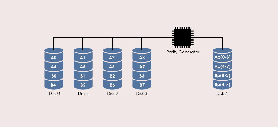
# 摘要
随着信息技术的发展,数据丢失问题日益突出,RAID 5作为常见的数据存储解决方案,其数据恢复技术显得尤为重要。本文首先介绍了RAID 5数据恢复的基础知识,然后详细解析了R-Studio软件的界面和核心功能,重点探讨了其在RAID 5数据恢复中的应用实践,包括磁盘镜像创建、数据提取、数据重组策略及一致性验证。进一步,本文还涉及了R-Studio的进阶技术,如脚本编
``` 定义1个圆类,成员有:1个半径成员变量,1个构造方法给成员变量赋初值,1个求面积方法。```定义1个圆类,成员有:1个半径成员变量,1个构造方法给成员变量赋初值,1个求面积方法。
当然,我们可以定义一个简单的`Circle`类,如下所示:
```java
public class Circle {
// 定义一个私有的半径成员变量
private double radius;
// 构造方法,用于初始化半径
public Circle(double initialRadius) {
this.radius = initialRadius;
}
// 求圆面积的方法
public double getArea() {
return Math.PI * Math.pow(radiu
Ruby实现PointInPolygon算法:判断点是否在多边形内
资源摘要信息:"PointInPolygon算法的Ruby实现是一个用于判断点是否在多边形内部的库。该算法通过计算点与多边形边界交叉线段的交叉次数来判断点是否在多边形内部。如果交叉数为奇数,则点在多边形内部,如果为偶数或零,则点在多边形外部。库中包含Pinp::Point类和Pinp::Polygon类。Pinp::Point类用于表示点,Pinp::Polygon类用于表示多边形。用户可以向Pinp::Polygon中添加点来构造多边形,然后使用contains_point?方法来判断任意一个Pinp::Point对象是否在该多边形内部。"
1. Ruby语言基础:Ruby是一种动态、反射、面向对象、解释型的编程语言。它具有简洁、灵活的语法,使得编写程序变得简单高效。Ruby语言广泛用于Web开发,尤其是Ruby on Rails这一著名的Web开发框架就是基于Ruby语言构建的。
2. 类和对象:在Ruby中,一切皆对象,所有对象都属于某个类,类是对象的蓝图。Ruby支持面向对象编程范式,允许程序设计者定义类以及对象的创建和使用。
3. 算法实现细节:算法基于数学原理,即计算点与多边形边界线段的交叉次数。当点位于多边形内时,从该点出发绘制射线与多边形边界相交的次数为奇数;如果点在多边形外,交叉次数为偶数或零。
4. Pinp::Point类:这是一个表示二维空间中的点的类。类的实例化需要提供两个参数,通常是点的x和y坐标。
5. Pinp::Polygon类:这是一个表示多边形的类,由若干个Pinp::Point类的实例构成。可以使用points方法添加点到多边形中。
6. contains_point?方法:属于Pinp::Polygon类的一个方法,它接受一个Pinp::Point类的实例作为参数,返回一个布尔值,表示传入的点是否在多边形内部。
7. 模块和命名空间:在Ruby中,Pinp是一个模块,模块可以用来将代码组织到不同的命名空间中,从而避免变量名和方法名冲突。
8. 程序示例和测试:Ruby程序通常包含方法调用、实例化对象等操作。示例代码提供了如何使用PointInPolygon算法进行点包含性测试的基本用法。
9. 边缘情况处理:算法描述中提到要添加选项测试点是否位于多边形的任何边缘。这表明算法可能需要处理点恰好位于多边形边界的情况,这类点在数学上可以被认为是既在多边形内部,又在多边形外部。
10. 文件结构和工程管理:提供的信息表明有一个名为"PointInPolygon-master"的压缩包文件,表明这可能是GitHub等平台上的一个开源项目仓库,用于管理PointInPolygon算法的Ruby实现代码。文件名称通常反映了项目的版本管理,"master"通常指的是项目的主分支,代表稳定版本。
11. 扩展和维护:算法库像PointInPolygon这类可能需要不断维护和扩展以适应新的需求或修复发现的错误。开发者会根据实际应用场景不断优化算法,同时也会有社区贡献者参与改进。
12. 社区和开源:Ruby的开源生态非常丰富,Ruby开发者社区非常活跃。开源项目像PointInPolygon这样的算法库在社区中广泛被使用和分享,这促进了知识的传播和代码质量的提高。
以上内容是对给定文件信息中提及的知识点的详细说明。根据描述,该算法库可用于各种需要点定位和多边形空间分析的场景,例如地理信息系统(GIS)、图形用户界面(GUI)交互、游戏开发、计算机图形学等领域。
【R-Studio恢复工具解析】:RAID 5恢复的功能优势与实际应用
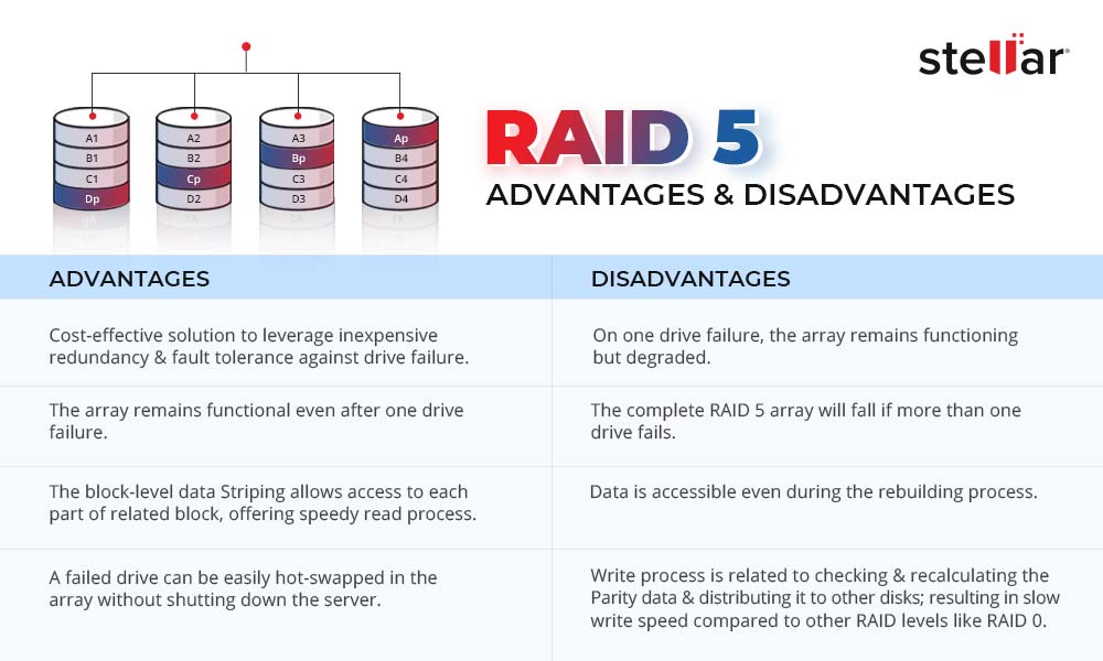
# 摘要
RAID 5技术因其高效的数据存储和容错能力被广泛应用。然而,数据丢失问题仍时有发生,R-Studio作为一种功能强大的恢复工具,为解决这一问题提供了有效的技术方案。本文概述了RAID 5的基本概念、R-Studio的理论基础及其数据恢复原理。通过分析R-Studio的主要功能和恢复流程,本文还探讨了该工具
汇编程序编写一个程序,实现在屏幕上输出helloworld。
汇编语言是一种低级编程语言,它直接操作计算机硬件。要在汇编程序中编写一个简单的"Hello, World!"程序,你需要针对特定的CPU架构编写指令。这里以x86架构为例,使用Intel x86汇编:
```assembly
section .data
message db 'Hello, World!',0 ; 字符串常量
len equ $ - message ; 计算字符串长度
section .text
global _start ; 标记程序入口点
_start:
; 设置段寄存
Salesforce Field Finder扩展:快速获取API字段名称
资源摘要信息:"Salesforce Field Finder-crx插件"
Salesforce Field Finder是一个专为Salesforce平台设计的浏览器插件,它极大地简化了开发者和管理员在查询和管理Salesforce对象字段时的工作流程。该插件的主要功能是帮助用户快速找到任何特定字段的API名称,从而提高工作效率和减少重复性工作。
首先,插件设计允许用户在Salesforce的各个对象中快速浏览字段。用户可以在需要的时候选择相应的对象名称,然后该插件会列出所有相关的字段及其对应的API名称。这个特性对于初学者和有经验的开发者都是极其有用的,因为它允许用户避免记忆和查找每个字段的API名称,尤其是在处理具有大量字段的复杂对象时。
其次,Salesforce Field Finder提供了搜索功能,这使得用户可以在众多字段中快速定位到他们想要的信息。这意味着,无论字段列表有多长,用户都可以直接输入关键词,插件会立即筛选出匹配的字段,并展示其API名称。这一点尤其有助于在开发过程中,当需要引用特定字段的API名称时,能够迅速而准确地找到所需信息。
插件的使用操作也非常简单。用户只需安装该插件到他们的浏览器中,然后在使用Salesforce时,打开Field Finder界面,选择相应的对象,就可以看到一个字段列表,其中列出了字段的标签名称和API名称。对于那些API名称不直观或难以记忆的场景,这个功能尤其有帮助。
值得注意的是,该插件支持的浏览器类型和版本,用户需要确保在自己的浏览器上安装了最新版本的Salesforce Field Finder插件,以获得最佳的使用体验和完整的功能支持。
总体来说,Salesforce Field Finder是一个非常实用的工具,它可以帮助用户在使用Salesforce平台进行开发和管理时,极大地减少查找字段API名称所需的时间和精力,提高工作效率。对于那些每天需要和Salesforce API打交道的用户来说,这个插件无疑是一个时间节省利器。
另外,由于Salesforce Field Finder是一个浏览器插件,它也展示了浏览器扩展在提高生产力和用户体验方面的潜力。通过为特定的在线应用或服务开发专门的插件,开发者能够为用户提供更加高效和定制化的服务,这是现代IT行业不断追求的目标之一。因此,了解和使用类似Salesforce Field Finder这样的工具,对于提高个人的技术能力以及适应不断变化的IT行业环境都具有重要意义。
【故障诊断与恢复】:R-Studio技术解决RAID 5数据挑战
# 摘要
RAID 5技术广泛应用于数据存储领域,提供了容错性和数据冗余,尽管如此,故障和数据丢失的风险依然存在。本文综合探讨了RAID 5的工作原理、常见故障类型、数据恢复的挑战以及R-Studio工具在数据恢复中的应用和高级功能。通过对RAID 5故障风险的分析和R-Studio使用案例的深入解析,本文旨在提供针对RAID 5数据恢复的实用知识和最佳实践,同时强调数据保护和预防措施的重要性,以增强系统稳定性并提升数据恢复效率。