vue设置div位置不随页面大小变化
时间: 2023-08-01 16:07:51 浏览: 459
你可以通过设置该 div 的 CSS 样式来实现其位置不随页面大小变化。具体而言,你可以将该 div 的 position 属性设置为 fixed,然后通过 top、left、right、bottom 等属性来指定其在页面中的位置。例如:
```css
#my-div {
position: fixed;
top: 100px;
left: 50%;
transform: translateX(-50%);
}
```
这段代码会将 id 为 my-div 的 div 固定在距离页面顶部 100px,距离页面左侧居中的位置,并且不会随着页面大小变化而改变位置。其中,transform: translateX(-50%) 是为了将该 div 水平居中,因为 left: 50% 只能将其左侧边缘居中。
相关问题
vue项目中怎么响应式设置页面大小
在Vue项目中,可以使用计算属性(computed)来设置响应式的页面大小。我们可以监听窗口的大小变化,然后根据窗口大小动态设置页面的样式。
举个例子,假设我们要设置一个响应式的页面高度,我们可以这样写:
```html
<template>
<div :style="{ height: pageHeight + 'px' }">
<!-- 页面内容 -->
</div>
</template>
<script>
export default {
computed: {
pageHeight() {
// 获取窗口高度
const windowHeight = window.innerHeight;
// 减去顶部和底部的高度
const headerHeight = 64;
const footerHeight = 48;
return windowHeight - headerHeight - footerHeight;
},
},
};
</script>
```
在这个例子中,我们使用了计算属性 `pageHeight` 来计算页面的高度。我们监听了窗口的大小变化,并动态计算页面高度。在模板中,我们使用 `:style` 绑定了一个对象,对象中的 `height` 属性使用了 `pageHeight` 计算属性的值。
这样,当窗口大小变化时,页面高度也会随之变化,从而实现了响应式的页面大小设置。
监听页面高度变化_vue监听页面大小变化重新刷新布局
你可以使用Vue的watch属性来监听页面高度变化,然后在回调函数中重新刷新布局。具体的代码实现如下:
```
<template>
<div ref="page" class="page">
<!-- your page content here -->
</div>
</template>
<script>
export default {
name: 'YourComponent',
mounted() {
window.addEventListener('resize', this.handleResize)
},
destroyed() {
window.removeEventListener('resize', this.handleResize)
},
methods: {
handleResize() {
this.$nextTick(() => {
// do your layout refresh here
})
}
},
watch: {
'$refs.page.offsetHeight': function(newVal, oldVal) {
this.handleResize()
}
}
}
</script>
```
在这个例子中,我们监听了窗口大小的变化,并且使用了Vue的watch属性来监听页面高度的变化。当页面高度变化时,我们会在回调函数中重新刷新布局。请注意,我们使用了Vue的$nextTick方法来确保页面已经完全渲染完成后再进行布局刷新。
相关推荐
最新推荐
基于Echarts图表在div动态切换时不显示的解决方式
首先,问题出现在使用Vue等前端框架时,通过事件(如`change`)来切换不同的div块,例如通过下拉框选择不同的选项。在给定的示例中,使用了一个`<select>`元素和`v-model`以及`v-on:change`来监听用户的选择,并通过...
vue实现商城购物车功能
样式部分(CSS)主要负责布局和视觉效果,如设置背景色、边框、字体大小等。Vue项目中,我们可以利用CSS预处理器(如Sass或Less)来编写更复杂的样式,并通过Vue的单文件组件(Single File Component, SFC)结构将...
GO婚礼设计创业计划:技术驱动的婚庆服务
"婚礼GO网站创业计划书"
在创建婚礼GO网站的创业计划书中,创业者首先阐述了企业的核心业务——GO婚礼设计,专注于提供计算机软件销售和技术开发、技术服务,以及与婚礼相关的各种服务,如APP制作、网页设计、弱电工程安装等。企业类型被定义为服务类,涵盖了一系列与信息技术和婚礼策划相关的业务。
创业者的个人经历显示了他对行业的理解和投入。他曾在北京某科技公司工作,积累了吃苦耐劳的精神和实践经验。此外,他在大学期间担任班长,锻炼了团队管理和领导能力。他还参加了SYB创业培训班,系统地学习了创业意识、计划制定等关键技能。
市场评估部分,目标顾客定位为本地的结婚人群,特别是中等和中上收入者。根据数据显示,广州市内有14家婚庆公司,该企业预计能占据7%的市场份额。广州每年约有1万对新人结婚,公司目标接待200对新人,显示出明确的市场切入点和增长潜力。
市场营销计划是创业成功的关键。尽管文档中没有详细列出具体的营销策略,但可以推断,企业可能通过线上线下结合的方式,利用社交媒体、网络广告和本地推广活动来吸引目标客户。此外,提供高质量的技术解决方案和服务,以区别于竞争对手,可能是其市场差异化策略的一部分。
在组织结构方面,未详细说明,但可以预期包括了技术开发团队、销售与市场部门、客户服务和支持团队,以及可能的行政和财务部门。
在财务规划上,文档提到了固定资产和折旧、流动资金需求、销售收入预测、销售和成本计划以及现金流量计划。这表明创业者已经考虑了启动和运营的初期成本,以及未来12个月的收入预测,旨在确保企业的现金流稳定,并有可能享受政府对大学生初创企业的税收优惠政策。
总结来说,婚礼GO网站的创业计划书详尽地涵盖了企业概述、创业者背景、市场分析、营销策略、组织结构和财务规划等方面,为初创企业的成功奠定了坚实的基础。这份计划书显示了创业者对市场的深刻理解,以及对技术和婚礼行业的专业认识,有望在竞争激烈的婚庆市场中找到一席之地。
管理建模和仿真的文件
管理Boualem Benatallah引用此版本:布阿利姆·贝纳塔拉。管理建模和仿真。约瑟夫-傅立叶大学-格勒诺布尔第一大学,1996年。法语。NNT:电话:00345357HAL ID:电话:00345357https://theses.hal.science/tel-003453572008年12月9日提交HAL是一个多学科的开放存取档案馆,用于存放和传播科学研究论文,无论它们是否被公开。论文可以来自法国或国外的教学和研究机构,也可以来自公共或私人研究中心。L’archive ouverte pluridisciplinaire
【基础】PostgreSQL的安装和配置步骤
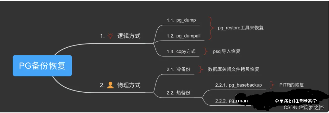
# 2.1 安装前的准备工作
### 2.1.1 系统要求
PostgreSQL 对系统硬件和软件环境有一定要求,具体如下:
- 操作系统:支持 Linux、Windows、macOS 等主流操作系统。
- CPU:推荐使用多核 CPU,以提高数据库处理性能。
- 内存:根据数据库规模和并发量确定,一般建议 8GB 以上。
- 硬盘:数据库文件和临时文件需要占用一定空间,建议预留足够的空间。
字节跳动面试题java
字节跳动作为一家知名的互联网公司,在面试Java开发者时可能会关注以下几个方面的问题:
1. **基础技能**:Java语言的核心语法、异常处理、内存管理、集合框架、IO操作等是否熟练掌握。
2. **面向对象编程**:多态、封装、继承的理解和应用,可能会涉及设计模式的提问。
3. **并发编程**:Java并发API(synchronized、volatile、Future、ExecutorService等)的使用,以及对并发模型(线程池、并发容器等)的理解。
4. **框架知识**:Spring Boot、MyBatis、Redis等常用框架的原理和使用经验。
5. **数据库相
微信行业发展现状及未来发展趋势分析
微信行业发展现状及未来行业发展趋势分析
微信作为移动互联网的基础设施,已经成为流量枢纽,月活跃账户达到10.4亿,同增10.9%,是全国用户量最多的手机App。微信的活跃账户从2012年起步月活用户仅为5900万人左右,伴随中国移动互联网进程的不断推进,微信的活跃账户一直维持稳步增长,在2014-2017年年末分别达到5亿月活、6.97亿月活、8.89亿月活和9.89亿月活。
微信月活发展历程显示,微信的用户数量增长已经开始呈现乏力趋势。微信在2018年3月日活达到6.89亿人,同比增长5.5%,环比上个月增长1.7%。微信的日活同比增速下滑至20%以下,并在2017年年底下滑至7.7%左右。微信DAU/MAU的比例也一直较为稳定,从2016年以来一直维持75%-80%左右的比例,用户的粘性极强,继续提升的空间并不大。
微信作为流量枢纽,已经成为移动互联网的基础设施,月活跃账户达到10.4亿,同增10.9%,是全国用户量最多的手机App。微信的活跃账户从2012年起步月活用户仅为5900万人左右,伴随中国移动互联网进程的不断推进,微信的活跃账户一直维持稳步增长,在2014-2017年年末分别达到5亿月活、6.97亿月活、8.89亿月活和9.89亿月活。
微信的用户数量增长已经开始呈现乏力趋势,这是因为微信自身也在重新寻求新的增长点。微信日活发展历程显示,微信的用户数量增长已经开始呈现乏力趋势。微信在2018年3月日活达到6.89亿人,同比增长5.5%,环比上个月增长1.7%。微信的日活同比增速下滑至20%以下,并在2017年年底下滑至7.7%左右。
微信DAU/MAU的比例也一直较为稳定,从2016年以来一直维持75%-80%左右的比例,用户的粘性极强,继续提升的空间并不大。因此,在整体用户数量开始触达天花板的时候,微信自身也在重新寻求新的增长点。
中国的整体移动互联网人均单日使用时长已经较高水平。18Q1中国移动互联网的月度总时长达到了77千亿分钟,环比17Q4增长了14%,单人日均使用时长达到了273分钟,环比17Q4增长了15%。而根据抽样统计,社交始终占据用户时长的最大一部分。2018年3月份,社交软件占据移动互联网35%左右的时长,相比2015年减少了约10pct,但仍然是移动互联网当中最大的时长占据者。
争夺社交软件份额的主要系娱乐类App,目前占比达到约32%左右。移动端的流量时长分布远比PC端更加集中,通常认为“搜索下載”和“网站导航”为PC时代的流量枢纽,但根据统计,搜索的用户量约为4.5亿,为各类应用最高,但其时长占比约为5%左右,落后于网络视频的13%左右位于第二名。PC时代的网络社交时长占比约为4%-5%,基本与搜索相当,但其流量分发能力远弱于搜索。
微信作为移动互联网的基础设施,已经成为流量枢纽,月活跃账户达到10.4亿,同增10.9%,是全国用户量最多的手机App。微信的活跃账户从2012年起步月活用户仅为5900万人左右,伴随中国移动互联网进程的不断推进,微信的活跃账户一直维持稳步增长,在2014-2017年年末分别达到5亿月活、6.97亿月活、8.89亿月活和9.89亿月活。
微信的用户数量增长已经开始呈现乏力趋势,这是因为微信自身也在重新寻求新的增长点。微信日活发展历程显示,微信的用户数量增长已经开始呈现乏力趋势。微信在2018年3月日活达到6.89亿人,同比增长5.5%,环比上个月增长1.7%。微信的日活同比增速下滑至20%以下,并在2017年年底下滑至7.7%左右。
微信DAU/MAU的比例也一直较为稳定,从2016年以来一直维持75%-80%左右的比例,用户的粘性极强,继续提升的空间并不大。因此,在整体用户数量开始触达天花板的时候,微信自身也在重新寻求新的增长点。
"互动学习:行动中的多样性与论文攻读经历"
多样性她- 事实上SCI NCES你的时间表ECOLEDO C Tora SC和NCESPOUR l’Ingén学习互动,互动学习以行动为中心的强化学习学会互动,互动学习,以行动为中心的强化学习计算机科学博士论文于2021年9月28日在Villeneuve d'Asq公开支持马修·瑟林评审团主席法布里斯·勒菲弗尔阿维尼翁大学教授论文指导奥利维尔·皮耶昆谷歌研究教授:智囊团论文联合主任菲利普·普雷教授,大学。里尔/CRISTAL/因里亚报告员奥利维耶·西格德索邦大学报告员卢多维奇·德诺耶教授,Facebook /索邦大学审查员越南圣迈IMT Atlantic高级讲师邀请弗洛里安·斯特鲁布博士,Deepmind对于那些及时看到自己错误的人...3谢谢你首先,我要感谢我的两位博士生导师Olivier和Philippe。奥利维尔,"站在巨人的肩膀上"这句话对你来说完全有意义了。从科学上讲,你知道在这篇论文的(许多)错误中,你是我可以依
【基础】安装MySQL:从下载到配置的完整指南

# 1. MySQL数据库简介
MySQL是一种开源的关系型数据库管理系统(RDBMS),因其高性能、可扩展性和易用性而闻名。它广泛应用于各种规模的应用程序,从小型网站到大型企业系统。
MySQL使用结构化查询语言(SQL)来管理数据。SQL是一种标准化语言,允许用户通过简单的命令创建、读取、更新和删除
# 请根据注释在下面补充你的代码实现knn算法的过程 # ********** Begin ********** # # 对ndarray数组进行遍历
K-Nearest Neighbors (KNN) 算法是一种基于实例的学习方法,用于分类和回归分析。在代码中,实现KNN的基本步骤如下:
```python
# 导入必要的库
import numpy as np
from collections import Counter
# 假设我们有一个训练数据集 X_train 和对应的标签 y_train
X_train = ... # (n_samples, n_features)
y_train = ... # (n_samples)
# KNN函数实现
def knn_k(X_test, k, X_train, y_train):