写一个上下垂直居中,蓝黑渐变的圆形
时间: 2023-07-13 19:17:39 浏览: 46
以下是使用 HTML 和 CSS 实现上下垂直居中、蓝黑渐变的圆形的代码:
```html
<!DOCTYPE html>
<html>
<head>
<title>圆形</title>
<style>
body {
display: flex;
justify-content: center; /* 水平居中 */
align-items: center; /* 垂直居中 */
height: 100vh; /* 设置高度为视窗高度 */
background: linear-gradient(to bottom, #1e90ff, #000080); /* 设置背景渐变色 */
}
.circle {
width: 200px;
height: 200px;
border-radius: 50%;
background-color: white;
}
</style>
</head>
<body>
<div class="circle"></div>
</body>
</html>
```
解释一下代码:
- 使用 `display: flex` 和 `justify-content: center` 可以使圆形水平居中。
- 使用 `align-items: center` 可以使圆形垂直居中。
- 使用 `height: 100vh` 可以使页面高度占满整个视窗。
- 使用 `background: linear-gradient(to bottom, #1e90ff, #000080)` 可以设置蓝黑渐变背景。
- 使用 `.circle` 类来设置圆形的样式,包括宽度、高度、圆角和背景颜色。
相关推荐
最新推荐
DIV+CSS垂直居中一个浮动元素
对于页面上的块级元素,只须定宽及设置margin:auto 0;即可在垂直上居中,但对于浮动的元素垂直居中是无效的。那么我们如何来处理这个问题呢,今天我们来探讨下。
CSS line-height行高上下居中垂直居中样式属性
常常使用line-height设置内容(图片、文字)行高上下居中样式效果。 一、line-height行高语法 复制代码代码如下:line-height:22px.jb51div{line-height:22px}line-height:200%.jb51div{line-height:200%} line-...
bootstrap 模态框(modal)实现水平垂直居中显示
主要为大家详细介绍了bootstrap 模态框modal实现水平垂直居中显示,具有一定的参考价值,感兴趣的小伙伴们可以参考一下
layer弹出层自适应高度,垂直水平居中的实现
今天小编就为大家分享一篇layer弹出层自适应高度,垂直水平居中的实现,具有很好的参考价值,希望对大家有所帮助。一起跟随小编过来看看吧
让图片img标签在div里上下左右居中的方法
让图片在div容器里上下左右居中,在实际应用中是很常见的,下面为大家演示个示例,希望对大家有所帮助
RTL8188FU-Linux-v5.7.4.2-36687.20200602.tar(20765).gz
REALTEK 8188FTV 8188eus 8188etv linux驱动程序稳定版本, 支持AP,STA 以及AP+STA 共存模式。 稳定支持linux4.0以上内核。
管理建模和仿真的文件
管理Boualem Benatallah引用此版本:布阿利姆·贝纳塔拉。管理建模和仿真。约瑟夫-傅立叶大学-格勒诺布尔第一大学,1996年。法语。NNT:电话:00345357HAL ID:电话:00345357https://theses.hal.science/tel-003453572008年12月9日提交HAL是一个多学科的开放存取档案馆,用于存放和传播科学研究论文,无论它们是否被公开。论文可以来自法国或国外的教学和研究机构,也可以来自公共或私人研究中心。L’archive ouverte pluridisciplinaire
numpy数组索引与切片技巧
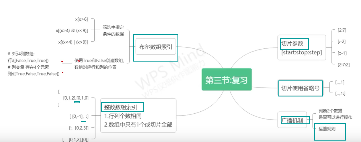
# 2.1 整数索引
整数索引是 NumPy 数组中索引元素的最简单方法。它允许您使用整数来访问数组中的特定元素或子数组。
### 2.1.1 单个元素索引
单个元素索引使用一个整数来访问数组中的单个元素。语法为:
```python
array[index]
```
其中:
* `array` 是要索引的 NumPy 数组。
* `index` 是要访问的元素的索引。
例如:
```python
import
javaboolean类型怎么使用
Java中的boolean类型表示真或假,只有两个可能的值。在Java中,boolean类型的变量可以被初始化为false或true。可以使用以下语法来声明和初始化一个boolean类型的变量:
```
boolean myBoolean = true;
```
在Java中,boolean类型的变量通常用于控制流程和条件测试,例如:
```
if (myBoolean) {
// do something if myBoolean is true
} else {
// do something if myBoolean is false
}
```
除了if语句之外
c++校园超市商品信息管理系统课程设计说明书(含源代码) (2).pdf
校园超市商品信息管理系统课程设计旨在帮助学生深入理解程序设计的基础知识,同时锻炼他们的实际操作能力。通过设计和实现一个校园超市商品信息管理系统,学生掌握了如何利用计算机科学与技术知识解决实际问题的能力。在课程设计过程中,学生需要对超市商品和销售员的关系进行有效管理,使系统功能更全面、实用,从而提高用户体验和便利性。
学生在课程设计过程中展现了积极的学习态度和纪律,没有缺勤情况,演示过程流畅且作品具有很强的使用价值。设计报告完整详细,展现了对问题的深入思考和解决能力。在答辩环节中,学生能够自信地回答问题,展示出扎实的专业知识和逻辑思维能力。教师对学生的表现予以肯定,认为学生在课程设计中表现出色,值得称赞。
整个课程设计过程包括平时成绩、报告成绩和演示与答辩成绩三个部分,其中平时表现占比20%,报告成绩占比40%,演示与答辩成绩占比40%。通过这三个部分的综合评定,最终为学生总成绩提供参考。总评分以百分制计算,全面评估学生在课程设计中的各项表现,最终为学生提供综合评价和反馈意见。
通过校园超市商品信息管理系统课程设计,学生不仅提升了对程序设计基础知识的理解与应用能力,同时也增强了团队协作和沟通能力。这一过程旨在培养学生综合运用技术解决问题的能力,为其未来的专业发展打下坚实基础。学生在进行校园超市商品信息管理系统课程设计过程中,不仅获得了理论知识的提升,同时也锻炼了实践能力和创新思维,为其未来的职业发展奠定了坚实基础。
校园超市商品信息管理系统课程设计的目的在于促进学生对程序设计基础知识的深入理解与掌握,同时培养学生解决实际问题的能力。通过对系统功能和用户需求的全面考量,学生设计了一个实用、高效的校园超市商品信息管理系统,为用户提供了更便捷、更高效的管理和使用体验。
综上所述,校园超市商品信息管理系统课程设计是一项旨在提升学生综合能力和实践技能的重要教学活动。通过此次设计,学生不仅深化了对程序设计基础知识的理解,还培养了解决实际问题的能力和团队合作精神。这一过程将为学生未来的专业发展提供坚实基础,使其在实际工作中能够胜任更多挑战。