Qt StyleSheet Detailed Explanation of Size and Dimensions: Control Size, Minimum and Maximum Sizes
发布时间: 2024-09-15 14:44:35 阅读量: 65 订阅数: 34 
# Chapter 1: Introduction to Qt Style Sheets
Qt Style Sheets are a powerful tool for beautifying and adjusting the appearance of interfaces. With style sheets, developers can modify the style, size, and dimensions of widgets, as well as define appearances in different states. This chapter will introduce the basic concepts and usage of Qt Style Sheets, especially in terms of widget size and dimensions.
### 1.1 Getting Started with Qt Style Sheets
Before we begin, we need to understand how to use Qt Style Sheets. First, within a Qt project, styles can be applied by setting the style sheet property of a QApplication or QWidget object.
```python
# Python example code
app = QApplication(sys.argv)
widget = QWidget()
stylesheet = """
QPushButton {
background-color: red;
color: white;
border-radius: 5px;
padding: 10px 20px;
}
widget.setStyleSheet(stylesheet)
widget.show()
sys.exit(app.exec_())
```
```java
// Java example code
QApplication app = new QApplication(args);
QWidget widget = new QWidget();
String stylesheet = ""
+ "QPushButton {"
+ " background-color: red;"
+ " color: white;"
+ " border-radius: 5px;"
+ " padding: 10px 20px;"
+ "}";
widget.setStyleSheet(stylesheet);
widget.show();
QApplication.exec();
```
In the above example code, we create a QPushButton widget and set the button's background color, text color, border radius, and padding through the style sheet. By calling the `widget.setStyleSheet(stylesheet)` method, the style sheet is applied to the QWidget object.
### 1.2 The Impact of Style Sheets on Widget Size and Dimensions
In addition to modifying the appearance of widgets, style sheets can also affect the size and dimensions of widgets. When using style sheets, we can achieve different layout effects by setting fixed sizes or dynamically adjusting the size of widgets.
The following chapters will delve into the settings for widget size, the application of maximum and minimum dimensions, and techniques for maintaining consistency in widget size and dimensions across different platforms. We will also discuss units and numeric adjustments within style sheets, as well as some advanced techniques and practical application cases.
[Next Chapter: Widget Size Settings](#chapter-2-widget-size-settings)
# Chapter 2: Widget Size Settings
In Qt style sheets, we can change the size of widgets by setting styles. The size of a widget can affect the layout and display effect, so it is important to master the method of setting widget size.
### 2.1 Using Style Sheets to Set Fixed Widget Size
Style sheets can conveniently set a fixed size for widgets by setting the `width` and `height` properties.
```python
QPushButton {
width: 100px;
height: 50px;
}
```
The above code sets the width of the QPushButton widget to 100 pixels and the height to 50 pixels.
### 2.2 Dynamically Adjusting Widget Size
In addition to fixed sizes, ***mon methods include setting the `minimumWidth`, `minimumHeight`, `maximumWidth`, and `maximumHeight` properties.
```python
QLabel {
minimumWidth: 100px;
minimumHeight: 30px;
maximumWidth: 200px;
maximumHeight: 100px;
}
```
The above code sets the minimum width of the QLabel widget to 100 pixels, the minimum height to 30 pixels, the maximum width to 200 pixels, and the maximum height to 100 pixels.
When dynamically adjusting widget sizes, we can set minimum and maximum dimensions based on actual needs to achieve the best display effect.
Summary: This chapter introduced methods for setting widget size using style sheets. By setting fixed sizes or dynamically adjusting sizes, we can flexibly control the display effect of widgets. Mastering these methods can help us better design and layout Qt interfaces.
# Chapter 3: Application of Maximum and Minimum Dimensions
When customizing widgets with Qt style sheets, setting the maximum and minimum dimensions of widgets is a crucial part. This chapter will introduce how to use style sheets to set the maximum and minimum dimensions of widgets and provide tips for applying these settings in different situations.
#### 3.1 Setting Maximum and Minimum Dimensions of Widgets
In Qt, style sheets can be used to set the maximum and minimum dimensions of widgets. By using properties such as `max-width`, `max-height`, `min-width`, and `min-height`, the size range of widgets can be limited. The following example demonstrates how to set the maximum height and minimum width of a button using a style sheet:
```cpp
QPushButton {
max-height: 100px;
min-width: 80px;
}
```
With the above style sheet settings, the button's height will not exceed 100 pixels, and the width will not be less than 80 pixels.
#### 3.2 Tips for Applying Maximum and Minimum Dimensions in Different Situations
In actual development, we often need to dynamically adjust the size range of widgets based on different situations. In such cases, we can combine Qt's signal and slot mechanism to dynamically modify the properties of the style sheet to achieve flexible settings for maximum and minimum dimensions. For example, when the window size changes, we can capture the `resizeEvent` signal and, in the signal handling function, dynamically adjust the maximum and minimum dimensions of widgets based on the window size.
```cpp
void MainWindow::resizeEvent(QResizeEvent *event)
{
int maxWidth = this->width() - 50; // Window width minus 50 as the maximum width
int maxHeight = this->height() - 50; // Window height minus 50 as the maximum height
QString styleSheet = QString("QPushButton { max-width: %1px; max-height: %2px; }")
.arg(maxWidth)
.arg(maxHeight);
ui->pushButton->setStyleSheet(styleSheet);
}
```
In the above example, when the window size changes, the button's maximum width and height are dynamically set, achieving an effect where the widget size is dynamically adjusted with the window size.
With these techniques, we can flexibly apply style sheet settings for the maximum and minimum dimensions of widgets and dynamically adjust the size range based on specific situations, enhancing the adaptability and flexibility of the user interface.
# Chapter 4: Adaptation for Different Platforms
In cross-platform development, there may be differences in interface dimensions and widget sizes across different operating systems and devices. To maintain a good user experience, we need to make corresponding adaptations in our style sheets.
### 4.1 Handling Consistency of Widget Size and Dimensions Across Different Platforms
Qt style sheets provide some built-in platform-specific properties that can be used to adjust widget size and dimensions based on the current running platform. Here are some commonly used platform-specific properties:
- `Macintosh` - Applicable to Mac OS X systems
- `Windows` - Applicable to Windows systems
- `Fusion` - Applicable to most systems
We can selectively apply different style sheet properties based on the current platform to maintain consistent widget size and dimensions across different platforms.
### 4.2 Using Style Sheets for Cross-Platform Widget Size and Dimension Settings
The following is an example code demonstrating how to use style sheets for cross-platform widget size and dimension settings:
```python
import sys
from PyQt5.QtWidgets import QApplication, QPushButton
app = QApplication(sys.argv)
# Create a button
button = QPushButton("Click me")
# Selectively apply style sheets based on the current platform
if sys.platform == "darwin":
button.setStyleSheet("""
QPushButton {
font-size: 16px;
min-width: 100px;
min-height: 40px;
}
""")
elif sys.platform == "win32":
button.setStyleSheet("""
QPushButton {
font-size: 12px;
min-width: 80px;
min-height: 30px;
}
""")
else:
button.setStyleSheet("""
QPushButton {
font-size: 14px;
min-width: 90px;
min-height: 35px;
}
""")
button.show()
sys.exit(app.exec_())
```
In the above code, we determine the current running platform using `sys.platform` and apply different style sheets accordingly. By setting different font sizes, minimum widths, and minimum heights, we can unify the size and dimensions of widgets across different platforms.
In this way, when running the code, the size of the button will be adapted based on the style sheet of the current platform, maintaining a consistent appearance across different operating systems.
With this approach, we can easily adapt the size and dimensions of widgets across different platforms, providing a consistent user experience.
# Chapter 5: Units and Values in Style Sheets
Units and values in style sheets are important factors in controlling widget size and dimensions. In this chapter, we will introduce common units and values and explain how they are used in style sheets.
### 5.1 Meaning and Usage of Units Such as em, px, %
- `em`: Relative to the font size of the parent element. For example, setting `width: 2em` means the control width is twice the font size of the parent element.
Example code:
```css
QPushButton {
width: 2em;
}
```
- `px`: Pixel units. Pixel units are fixed and not affected by the parent element.
Example code:
```css
QPushButton {
width: 100px;
}
```
- `%`: Relative to the parent element in percentage. For example, setting `width: 50%` means the control width is half of the parent element's width.
Example code:
```css
QPushButton {
width: 50%;
}
```
### 5.2 Adjustment and Calculation of Values in Style Sheets
In style sheets, we can perform some numerical adjustments and calculations to achieve more precise control over widget size and dimensions.
- Addition and subtraction: Use `+` and `-` to perform addition and subtraction operations. For example, setting `width: 100px + 20px` means a width of 120 pixels.
Example code:
```css
QPushButton {
width: 100px + 20px;
}
```
- Multiplication and division: Use `*` and `/` to perform multiplication and division operations. For example, setting `width: 100px * 2` means a width of 200 pixels.
Example code:
```css
QPushButton {
width: 100px * 2;
}
```
- Remainder: Use `%` to perform the remainder operation. For example, setting `width: 100px % 3` means the remainder of 100 pixels divided by 3.
Example code:
```css
QPushButton {
width: 100px % 3;
}
```
By reasonably using units and values, as well as numerical adjustments and calculations, we can flexibly control the size and dimensions of widgets, achieving various effects.
## Code Summary
This chapter introduced common units and values in style sheets, including `em`, `px`, `%`, etc. It also covered methods for numerical adjustment and calculation in style sheets. By flexibly applying units and values, we can achieve a variety of widget size and dimension effects.
The next chapter will discuss advanced techniques for utilizing style sheets to achieve custom widget size and dimensions.
## Explanation of Results
The example code in this chapter demonstrated the usage of units and values in style sheets, and readers can adjust and apply them based on actual needs. Mastering the meaning and usage of units and values will enable more flexible control over widget size and dimensions, achieving a wide range of effects.
# Chapter 6: Advanced Techniques and Practical Applications
In the previous chapters, we have discussed how to use Qt style sheets to set the size and dimensions of widgets, as well as how to apply maximum and minimum dimensions to control the size range of widgets. In this chapter, we will introduce some advanced techniques and practical applications to help you better use Qt style sheets to handle the size and dimensions of widgets.
#### 6.1 Using Style Sheets to Achieve Custom Widget Size and Dimensions
When using Qt style sheets, sometimes you may need to implement custom adjustments for widget size and dimensions. The following is an example demonstrating how to use style sheets to achieve the size and dimensions of a custom button.
```python
QPushButton#customButton {
min-width: 100px;
min-height: 30px;
max-width: 200px;
max-height: 60px;
border-radius: 5px;
background-color: blue;
color: white;
}
```
```java
QPushButton customButton = new QPushButton("Custom Button");
customButton.setObjectName("customButton");
```
In the above example, we defined a button named `customButton` and set its minimum width to 100 pixels, minimum height to 30 pixels, maximum width to 200 pixels, and maximum height to 60 pixels. In addition, we set the button to have rounded borders, a blue background color, and white text color.
With such style sheet settings, we can achieve a custom button with specific size and dimension effects. You can adjust the button's size and dimensions based on actual needs.
#### 6.2 Solving Compatibility Issues of Widget Size and Dimensions in Style Sheets
When using Qt style sheets, there may sometimes be compatibility issues with widget size and dimensions on different platforms or with different screen resolutions. To solve these problems, we can use a flexible combination of units and values to achieve consistent widget size and dimensions across different environments.
The following is an example demonstrating how to use relative units and percentage values to adjust the size and dimensions of widgets to adapt to different platforms and screen resolutions.
```python
QPushButton#adaptiveButton {
min-width: 10em;
min-height: 3em;
max-width: 20em;
max-height: 6em;
font-size: 1.2em;
}
```
```java
QPushButton adaptiveButton = new QPushButton("Adaptive Button");
adaptiveButton.setObjectName("adaptiveButton");
```
In the above example, we defined a button named `adaptiveButton` and set its minimum width to 10 em units, minimum height to 3 em units, maximum width to 20 em units, and maximum height to 6 em units. In addition, we set the font size of the button to 1.2 em units.
By using relative units and percentage values, we can adjust the button's size and dimensions according to changes in screen resolution, ensuring consistent display effects across different environments.
The above are advanced techniques and practical applications for handling widget size and dimensions in Qt style sheets. We hope they can help and guide you with the issues of widget dimensions you encounter during Qt development. Please combine the above techniques and examples with actual needs to handle widget size and dimensions, achieving better user experience and interface adaptation effects.

 百万级
高质量VIP文章无限畅学
百万级
高质量VIP文章无限畅学
 千万级
优质资源任意下载
千万级
优质资源任意下载
 C知道
免费提问 ( 生成式Al产品 )
C知道
免费提问 ( 生成式Al产品 )
0
0
相关推荐

专栏目录
最低0.47元/天 解锁专栏
买1年送3月
百万级
高质量VIP文章无限畅学
千万级
优质资源任意下载
C知道
免费提问 ( 生成式Al产品 )
最新推荐
优化SM2258XT固件性能:性能调优的5大实战技巧
# 摘要
本文旨在探讨SM2258XT固件的性能优化方法和理论基础,涵盖固件架构理解、性能优化原理、实战优化技巧以及性能评估与改进策略。通过对SM2258XT控制器的硬件特性和工作模式的深入分析,揭示了其性能瓶颈和优化点。本文详细介绍了性能优化中关键的技术手段,如缓存优化、并行处理、多线程技术、预取和预测算法,并提供了实际应用中的优化技巧,包括固件更新、内核参数调整、存储器优化和文件系统调整
校园小商品交易系统:数据库备份与恢复策略分析
# 摘要
数据库的备份与恢复是保障信息系统稳定运行和数据安全的关键技术。本文首先概述了数据库备份与恢复的重要性,探讨了不同备份类型和策略,以及理论模型和实施步骤。随后,详细分析了备份的频率、时间窗口以及校园小商品交易系统的备份实践,包括实施步骤、性能分析及优化策略。接着,本文阐述了数据库恢复的概念、原理、策略以及具体操作,并对恢复实践进行案例分析和评估。最后,展望了数据库备份与恢复技术的
SCADA与IoT的完美融合:探索物联网在SCADA系统中的8种应用模式
# 摘要
随着工业自动化和信息技术的发展,SCADA(Supervisory Control And Data Acquisition)系统与IoT(Internet of Things)的融合已成为现代化工业系统的关键趋势。本文详细探讨了SCADA系统中IoT传感器、网关、平台的应用模式,并深入分析了其在数据采集、处理、实时监控、远程控制以及网络优化等方面的作用。同时,本文也讨论了融合实践中的安全性和隐私保护问题,以及云集成与多系统集成的策略。通过实践案例的分析,本文展望了SCADA与IoT融合的未来趋势,并针对技术挑战提出了相应的应对策略。
# 关键字
SCADA系统;IoT应用模式;数
DDTW算法的并行化实现:如何加快大规模数据处理的5大策略

# 摘要
本文综述了DTW(Dynamic Time Warping)算法并行化的理论与实践,首先介绍了DDTW(Derivative Dynamic Time Warping)算法的重要性和并行化计算的基础理论,包括并行计算的概述、
【张量分析:控制死区宽度的实战手册】
# 摘要
张量分析的基础理论为理解复杂的数学结构提供了关键工具,特别是在控制死区宽度方面具有重要意义。本文深入探讨了死区宽度的概念、计算方法以及优化策略,并通过实战演练展示了在张量分析中控制死区宽度的技术与方法。通过对案例研究的分析,本文揭示了死区宽度控制在工业自动化、数据中心能源优化和高精度信号处理中的应用效果和效率影响。最后,本文展望了张量分析与死区宽度控制未来的发展趋势,包括与深度学习的结合、技术进步带来的新挑战和新机遇。
# 关键字
张量分析;死区宽度;数据处理;优化策略;自动化解决方案;深度学习
参考资源链接:[SIMATIC S7 PID控制:死区宽度与精准调节](https:
权威解析:zlib压缩算法背后的秘密及其优化技巧

# 摘要
本文全面介绍了zlib压缩算法,阐述了其原理、核心功能和实际应用。首先概述了zlib算法的基本概念和压缩原理,包括数据压缩与编码的区别以及压缩算法的发展历程。接着详细分析了zlib库的关键功能,如压缩级别和Deflate算法,以及压缩流程的具体实施步骤。文章还探讨了zlib在不同编程语
【前端开发者必备】:从Web到桌面应用的无缝跳转 - electron-builder与electron-updater入门指南

# 摘要
本文系统介绍了Electron框架,这是一种使开发者能够使用Web技术构建跨平台桌面应用的工具。文章首先介绍了Electron的基本概念和如何搭建开发环境,
【步进电机全解】:揭秘步进电机选择与优化的终极指南
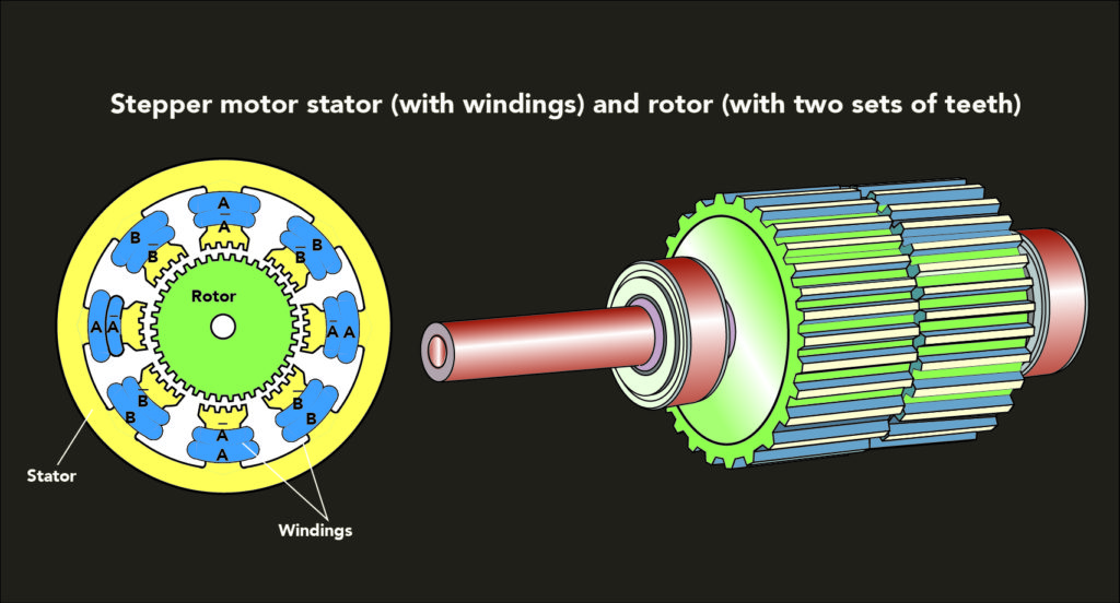
# 摘要
本文全面介绍了步进电机的工作原理、性能参数、控制技术、优化策略以及应用案例和未来趋势。首先,阐述了步进电机的分类和基本工作原理。随后,详细解释了步进电机的性能参数,包括步距角、扭矩和电气特性等,并提供了选择步进电机时应考虑的因素。接着,探讨了多种步进电机控制方式和策略,以及如何进行系统集成。此外,本文还分析了提升步进电机性能的优化方案和故障排除方法
无线通信新篇章:MDDI协议与蓝牙技术在移动设备中的应用对比

# 摘要
本论文旨在对比分析MDDI与蓝牙这两种无线通信技术的理论基础、实践应用及性能表现。通过详尽的理论探讨与实际测试,本文深入研究了MDDI协议的定义、功能、通信流程以及其在移动设备中的实现和性能评估。同样地,蓝牙技术的定义、演进、核心特点以及在移动设备中的应用和性能评估也得到了全面的阐述。在此基础上,论文进一步对比了MDDI与蓝牙在数据传输速率、电池寿命、功
工业机器人编程实战:打造高效简单机器人程序的全攻略
# 摘要
工业机器人编程是自动化领域不可或缺的一部分,涵盖了从基础概念到高级应用的多个方面。本文全面梳理了工业机器人编程的基础知识,探讨了编程语言与工具的选用以及开发环境的搭建。同时,文章深入分析了机器人程序的结构化开发,包括模块化设计、工作流程管理、异常处理等关键技
资源上传下载、课程学习等过程中有任何疑问或建议,欢迎提出宝贵意见哦~我们会及时处理!
点击此处反馈


专栏目录
最低0.47元/天 解锁专栏
买1年送3月
百万级
高质量VIP文章无限畅学
千万级
优质资源任意下载
C知道
免费提问 ( 生成式Al产品 )