Designing for Windows 8
15
at the vast landscape of applications available for Windows 7 and earlier ver-
sions, one can see what happens when there is not a strong sense of design
guidance. Traditionally, Windows has not been a place where users of various
applications have been able to have a sense of consistency from one applica-
tion to the next. Sure, within some application suites, such as Adobe Creative
Suite or Microsoft Office, there is some level of consistency. However, com-
paring even those two suites against each other reveals myriad differences in
how to design key user functionality. It’s not just functionality, however, that
suffers from this lack of consistency: the whole design aesthetic suffers as well.
From application to application, there is simply no sense of a common per-
sonality on Windows 7 and previous versions of Windows. This isn’t really a
fault of developers or designers. Users simply weren’t provided strong enough
guidance for newer applications, and older applications with even older design
ideas continue to run alongside them. This all changes with Windows 8 and
the Microsoft design language.
It’s time to care about the details. And not merely care about them, but truly
sweat them. There are very strong design guidelines for Windows 8 applica-
tions that have been designed to ensure a higher level of platform consistency
from application to application. For example, the page header for each appli-
cation should have a left margin of 120 pixels and a baseline 100 pixels from
the top. When you switch from application to application, you can see that
the headers consistently align in this location. If you did not pay attention to
even this one detail in the design guidance, your application would stick out
like a sore thumb. Users will become accustomed to the consistency in the
platform, and if you don’t sweat every detail in your application design, you
may find your application unappealing. Microsoft has provided you with a very
good set of design guidelines for your applications to follow, and it is in your
best interests to make sure your designs adhere to them.
Sweat the Details in Running Total
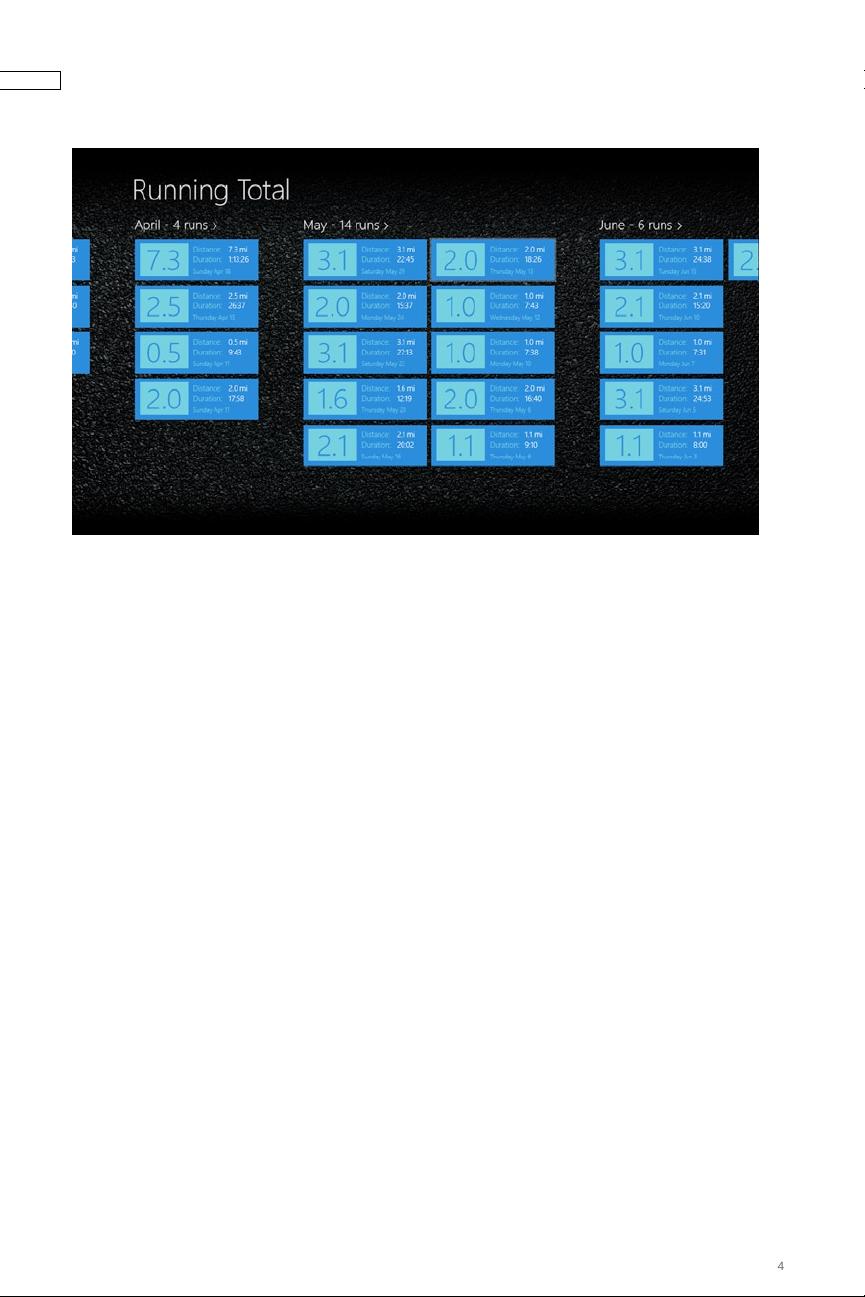
Taking a look at the Running Total application, one can quickly get the feeling
that the designers spent a lot of time on the details. Many of the colors chosen
for the design come directly from the large image that takes up a big portion
of the initial screen. The running theme of the application has been reinforced
not only by this image but also in the background of the pages (see Figure 2-1).
Great care has been taken to ensure that the fonts used in the application are
within the set of fonts defined for Windows 8. The designers, both interaction
designers and information architects, also thought about what type of data
was relevant on each screen and showed only what was most appropriate for
each level of the application hierarchy. This type of attention to detail is very
important when building Windows 8 applications.


