用python生成环形饼图,显示不同区域中的房源数量
时间: 2024-03-04 22:50:56 浏览: 77
生成环形饼图可以使用Matplotlib库中的 `pie()` 函数。下面是一个示例代码,展示不同区域中的房源数量:
```python
import matplotlib.pyplot as plt
# 区域名称和房源数量
labels = ['东城', '西城', '朝阳', '海淀', '其他']
sizes = [100, 80, 120, 150, 50]
# 环形饼图的内外径
radii = [0.6, 1.0]
# 颜色
colors = ['#ff9999', '#66b3ff', '#99ff99', '#ffcc99', '#ebebeb']
# 绘制饼图
fig, ax = plt.subplots()
ax.pie(sizes, radius=1, colors=colors, labels=labels, autopct='%1.1f%%', startangle=90, counterclock=False)
ax.pie([1], radius=0.6, colors=['w'])
# 添加标题
ax.set_title('不同区域中的房源数量')
# 显示图像
plt.show()
```
这段代码会生成一个环形饼图,其中 `labels` 和 `sizes` 分别表示区域名称和房源数量,`radii` 表示内外径,`colors` 表示颜色,`autopct` 表示显示百分比,`startangle` 表示起始角度,`counterclock` 表示是否逆时针绘制。最后再绘制一个白色的小圆,就可以将饼图变成环形饼图了。
相关问题
python openpyxl 生成饼图
Python openpyxl库可以用来生成饼图。下面是一个简单的例子:
```python
from openpyxl import Workbook
from openpyxl.chart import PieChart, Reference
# 创建工作表
wb = Workbook()
ws = wb.active
# 添加数据
data = [
['Flavor', 'Sold'],
['Vanilla', 1500],
['Chocolate', 2500],
['Strawberry', 1000],
['Mint', 500]
]
for row in data:
ws.append(row)
# 创建饼图
pie = PieChart()
labels = Reference(ws, min_col=1, min_row=2, max_row=5)
data = Reference(ws, min_col=2, min_row=1, max_row=5)
pie.add_data(data, titles_from_data=True)
pie.set_categories(labels)
pie.title = "Ice Cream Sales by Flavor"
# 将饼图插入到工作表中
ws.add_chart(pie, "A7")
# 保存工作表
wb.save("pie_chart.xlsx")
```
运行上述代码后,将生成一个包含饼图的Excel文件。在这个例子中,我们创建了一个包含四种口味冰淇淋销售数据的工作表,并使用openpyxl的PieChart类创建了一个饼图。然后将这个饼图插入到工作表中,并保存到一个Excel文件中。
python可视化环形饼图
以下是使用Python和Matplotlib库绘制环形饼图的示例代码:
```python
import matplotlib.pyplot as plt
# 数据
labels = ['A', 'B', 'C', 'D']
sizes = [15, 30, 45, 10]
# 环形饼图参数
colors = ['lightblue', 'lightgreen', 'pink', 'yellow']
inner_radius = 0.6
# 绘制环形饼图
fig, ax = plt.subplots()
ax.pie(sizes, labels=labels, colors=colors, radius=1, wedgeprops=dict(width=0.3, edgecolor='w'))
ax.pie([100], radius=inner_radius, colors='w')
ax.set(aspect='equal')
plt.show()
```
运行代码,将得到一个环形饼图,其中'A'、'B'、'C'、'D'表示标签,15、30、45、10表示对应标签的占比。
可以根据需要修改标签、占比、颜色等参数,以满足不同的数据可视化需求。
阅读全文
相关推荐
大家在看
最新推荐
在Vue中使用highCharts绘制3d饼图的方法
"使用HighCharts绘制3D饼图在Vue中的实现方法" 在Vue中使用HighCharts绘制3D饼图是一种常见的数据可视化方式。HighCharts是一款基于JavaScript的图表库,具有强大的数据可视化功能。下面是使用HighCharts绘制3D饼图...
基于Python制作美观动态圆环图、饼图
在本篇文章中,我们将深入探讨如何使用Python的PyEcharts库来创建美观且动态的圆环图和饼图。PyEcharts是一个强大的图表库,它提供了丰富的图表类型和高度定制化的选项。 首先,确保你的Python环境支持PyEcharts的...
python 用 xlwings 库 生成图表的操作方法
在Python中,使用xlwings库生成图表是一种高效的方式,特别是在处理Excel数据和自动化报告时。xlwings库允许我们直接在Excel工作簿中创建、编辑和格式化图表,而无需打开Excel应用程序。以下是关于使用xlwings生成...
纯Java动态生成SVG饼图与JFreeChart超强功能生成SVG图表
在本文中,我们将探讨如何使用 Java 生成 SVG 饼图,并使用 JFreeChart 生成 SVG 图表。我们还将讨论 JFreeChart 的一些缺陷和解决方案。 一、Java 生成 SVG 饼图 首先,让我们看看如何使用 Java 生成 SVG 饼图。...
海康无插件摄像头WEB开发包(20200616-20201102163221)
资源摘要信息:"海康无插件开发包"
知识点一:海康品牌简介
海康威视是全球知名的安防监控设备生产与服务提供商,总部位于中国杭州,其产品广泛应用于公共安全、智能交通、智能家居等多个领域。海康的产品以先进的技术、稳定可靠的性能和良好的用户体验著称,在全球监控设备市场占有重要地位。
知识点二:无插件技术
无插件技术指的是在用户访问网页时,无需额外安装或运行浏览器插件即可实现网页内的功能,如播放视频、音频、动画等。这种方式可以提升用户体验,减少安装插件的繁琐过程,同时由于避免了插件可能存在的安全漏洞,也提高了系统的安全性。无插件技术通常依赖HTML5、JavaScript、WebGL等现代网页技术实现。
知识点三:网络视频监控
网络视频监控是指通过IP网络将监控摄像机连接起来,实现实时远程监控的技术。与传统的模拟监控相比,网络视频监控具备传输距离远、布线简单、可远程监控和智能分析等特点。无插件网络视频监控开发包允许开发者在不依赖浏览器插件的情况下,集成视频监控功能到网页中,方便了用户查看和管理。
知识点四:摄像头技术
摄像头是将光学图像转换成电子信号的装置,广泛应用于图像采集、视频通讯、安全监控等领域。现代摄像头技术包括CCD和CMOS传感器技术,以及图像处理、编码压缩等技术。海康作为行业内的领军企业,其摄像头产品线覆盖了从高清到4K甚至更高分辨率的摄像机,同时在图像处理、智能分析等技术上不断创新。
知识点五:WEB开发包的应用
WEB开发包通常包含了实现特定功能所需的脚本、接口文档、API以及示例代码等资源。开发者可以利用这些资源快速地将特定功能集成到自己的网页应用中。对于“海康web无插件开发包.zip”,它可能包含了实现海康摄像头无插件网络视频监控功能的前端代码和API接口等,让开发者能够在不安装任何插件的情况下实现视频流的展示、控制和其他相关功能。
知识点六:技术兼容性与标准化
无插件技术的实现通常需要遵循一定的技术标准和协议,比如支持主流的Web标准和兼容多种浏览器。此外,无插件技术也需要考虑到不同操作系统和浏览器间的兼容性问题,以确保功能的正常使用和用户体验的一致性。
知识点七:安全性能
无插件技术相较于传统插件技术在安全性上具有明显优势。由于减少了外部插件的使用,因此降低了潜在的攻击面和漏洞风险。在涉及监控等安全敏感的领域中,这种技术尤其受到青睐。
知识点八:开发包的更新与维护
从文件名“WEB无插件开发包_20200616_20201102163221”可以推断,该开发包具有版本信息和时间戳,表明它是一个经过时间更新和维护的工具包。在使用此类工具包时,开发者需要关注官方发布的版本更新信息和补丁,及时升级以获得最新的功能和安全修正。
综上所述,海康提供的无插件开发包是针对其摄像头产品的网络视频监控解决方案,这一方案通过现代的无插件网络技术,为开发者提供了方便、安全且标准化的集成方式,以实现便捷的网络视频监控功能。
PCNM空间分析新手必读:R语言实现从入门到精通

# 摘要
本文旨在介绍PCNM空间分析方法及其在R语言中的实践应用。首先,文章通过介绍PCNM的理论基础和分析步骤,提供了对空间自相关性和PCNM数学原理的深入理解。随后,详细阐述了R语言在空间数据分析中的基础知识和准备工作,以及如何在R语言环境下进行PCNM分析和结果解
生成一个自动打怪的脚本
创建一个自动打怪的游戏脚本通常是针对游戏客户端或特定类型的自动化工具如Roblox Studio、Unity等的定制操作。这类脚本通常是利用游戏内部的逻辑漏洞或API来控制角色的动作,模拟玩家的行为,如移动、攻击怪物。然而,这种行为需要对游戏机制有深入理解,而且很多游戏会有反作弊机制,自动打怪可能会被视为作弊而被封禁。
以下是一个非常基础的Python脚本例子,假设我们是在使用类似PyAutoGUI库模拟键盘输入来控制游戏角色:
```python
import pyautogui
# 角色位置和怪物位置
player_pos = (0, 0) # 这里是你的角色当前位置
monster
CarMarker-Animation: 地图标记动画及转向库
资源摘要信息:"CarMarker-Animation是一个开源库,旨在帮助开发者在谷歌地图上实现平滑的标记动画效果。通过该库,开发者可以实现标记沿路线移动,并在移动过程中根据道路曲线实现平滑转弯。这不仅提升了用户体验,也增强了地图应用的交互性。
在详细的技术实现上,CarMarker-Animation库可能会涉及到以下几个方面的知识点:
1. 地图API集成:该库可能基于谷歌地图的API进行开发,因此开发者需要有谷歌地图API的使用经验,并了解如何在项目中集成谷歌地图。
2. 动画效果实现:为了实现平滑的动画效果,开发者需要掌握CSS动画或者JavaScript动画的实现方法,包括关键帧动画、过渡动画等。
3. 地图路径计算:标记在地图上的移动需要基于实际的道路网络,因此开发者可能需要使用路径规划算法,如Dijkstra算法或者A*搜索算法,来计算出最合适的路线。
4. 路径平滑处理:仅仅计算出路线是不够的,还需要对路径进行平滑处理,以使标记在转弯时更加自然。这可能涉及到曲线拟合算法,如贝塞尔曲线拟合。
5. 地图交互设计:为了与用户的交互更为友好,开发者需要了解用户界面和用户体验设计原则,并将这些原则应用到动画效果的开发中。
6. 性能优化:在实现复杂的动画效果时,需要考虑程序的性能。开发者需要知道如何优化动画性能,减少卡顿,确保流畅的用户体验。
7. 开源协议遵守:由于CarMarker-Animation是一个开源库,开发者在使用该库时,需要遵守其开源协议,合理使用代码并遵守贡献指南。
此库的文件名'CarMarker-Animation-master'表明这是一个主分支的项目,可能包含源代码文件、示例项目、文档说明等资源。开发者可以通过下载解压缩后获得这些资源,并根据提供的文档来了解如何安装和使用该库。在使用过程中,建议仔细阅读开源项目的贡献指南和使用说明,以确保库的正确集成和使用,同时也可以参与开源社区,与其他开发者共同维护和改进这一项目。"
5G核心网元性能瓶颈揭秘
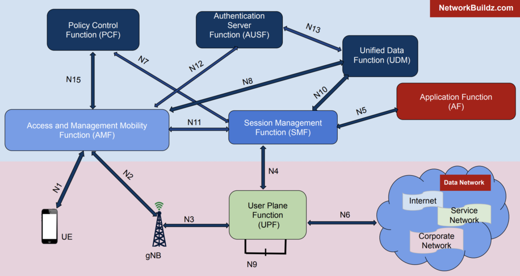
# 摘要
随着5G技术的发展和应用,其核心网的性能优化成为了行业关注的焦点。本文首先概述了5G核心网的架构,并对性能瓶颈进行深入分析,识别了关键的性能指标和瓶颈识别方法。通过案例分析,展示了核心网元常见的性能问题及其诊断和解决过程。随后,文章提出了多项性能优化策略,包括网络设计、系统配置调整以及新技术的应用。此外,本文探讨了安全挑战如何影响核心网的性能,
stm32连接红外传感器并将gsm900a短信收发实现报警
在STM32上连接红外传感器并通过GSM900A模块实现短信报警功能,可以按照以下步骤进行:
### 硬件连接
1. **红外传感器连接**:
- 将红外传感器的VCC连接到STM32的3.3V或5V电源(根据传感器规格)。
- 将GND连接到STM32的地线。
- 将GSM900A的VCC连接到外部电源(通常需要2A电流,3.4V-4.4V)。
- 将GND连接到STM32的地线。
- 将TXD引脚连接到STM32的一个UART RX引脚(例如PA10)。
- 将RXD引脚连接到STM32的一个UART TX引脚(例如PA9)。
- 如果需要,可