掌握CSS布局的艺术:提升网页美观度的大揭秘
发布时间: 2024-07-19 19:44:05 阅读量: 35 订阅数: 39 

变幻之美Div+CSS网页布局揭秘:案例实战篇
 4星 · 用户满意度95%
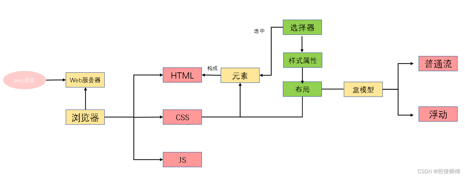
# 1. CSS布局基础**
CSS布局是网页设计中至关重要的一环,它决定了网页元素在浏览器中的排列方式。本章将介绍CSS布局的基础知识,包括:
* **CSS布局模型:**了解不同的布局模型,如块级元素、内联元素和浮动元素。
* **盒模型:**掌握盒模型的概念,包括内容、内边距、边框和外边距。
* **定位:**了解如何使用定位属性(如`position`、`top`、`left`)来控制元素在页面中的位置。
# 2. CSS布局技术
### 2.1 弹性布局
**2.1.1 flexbox的原理和语法**
flexbox布局是一种一维布局模型,它允许元素沿主轴和交叉轴排列。主轴是元素排列的方向,而交叉轴是垂直于主轴的方向。
flexbox布局的语法如下:
```css
display: flex;
flex-direction: row | row-reverse | column | column-reverse;
justify-content: flex-start | flex-end | center | space-between | space-around;
align-items: flex-start | flex-end | center | baseline | stretch;
```
**2.1.2 flexbox的属性和值**
| 属性 | 值 | 描述 |
|---|---|---|
| `flex-direction` | `row` | 元素沿水平方向排列 |
| `flex-direction` | `row-reverse` | 元素沿水平方向排列,但顺序相反 |
| `flex-direction` | `column` | 元素沿垂直方向排列 |
| `flex-direction` | `column-reverse` | 元素沿垂直方向排列,但顺序相反 |
| `justify-content` | `flex-start` | 元素沿主轴起始位置对齐 |
| `justify-content` | `flex-end` | 元素沿主轴末尾位置对齐 |
| `justify-content` | `center` | 元素沿主轴居中对齐 |
| `justify-content` | `space-between` | 元素沿主轴均匀分布,两端留有空白 |
| `justify-content` | `space-around` | 元素沿主轴均匀分布,元素之间留有空白 |
| `align-items` | `flex-start` | 元素沿交叉轴起始位置对齐 |
| `align-items` | `flex-end` | 元素沿交叉轴末尾位置对齐 |
| `align-items` | `center` | 元素沿交叉轴居中对齐 |
| `align-items` | `baseline` | 元素沿交叉轴基线对齐 |
| `align-items` | `stretch` | 元素沿交叉轴拉伸,填满可用空间 |
### 2.2 网格布局
**2.2.1 grid的原理和语法**
网格布局是一种二维布局模型,它允许元素在网格中排列。网格由行和列组成,元素可以跨越多个行或列。
网格布局的语法如下:
```css
display: grid;
grid-template-columns: repeat(n, auto) | <length>+ | <percentage>+;
grid-template-rows: repeat(n, auto) | <length>+ | <percentage>+;
grid-gap: <length> <length>;
```
**2.2.2 grid的属性和值**
| 属性 | 值 | 描述 |
|---|---|---|
| `grid-template-columns` | `repeat(n, auto)` | 创建n列,每列宽度自动调整 |
| `grid-template-columns` | `<length>+` | 创建固定宽度的列 |
| `grid-template-columns` | `<percentage>+` | 创建基于百分比宽度的列 |
| `grid-template-rows` | `repeat(n, auto)` | 创建n行,每行高度自动调整 |
| `grid-template-rows` | `<length>+` | 创建固定高度的行 |
| `grid-template-rows` | `<percentage>+` | 创建基于百分比高度的行 |
| `grid-gap` | `<length> <length>` | 设置网格元素之间的水平和垂直间距 |
### 2.3 浮动布局
**2.3.1 浮动的原理和语法**
浮动布局是一种基于元素浮动的布局模型。当一个元素浮动时,它会脱离正常文档流,并沿其浮动方向移动。
浮动布局的语法如下:
```css
float: left | right | none;
clear: left | right | both;
```
**2.3.2 浮动的属性和值**
| 属性 | 值 | 描述 |
|---|---|---|
| `float` | `left` | 元素向左浮动 |
| `float` | `right` | 元素向右浮动 |
| `float` | `none` | 元素不浮动 |
| `clear` | `left` | 清除左浮动元素 |
| `clear` | `right` | 清除右浮动元素 |
| `clear` | `both` | 清除左右浮动元素 |
# 3. CSS布局实践
### 3.1 响应式布局
#### 3.1.1 响应式布局的概念和实现
响应式布局是一种网页设计技术,它允许网页在不同的设备和屏幕尺寸上自适应显示。它通过使用媒体查询来检测设备的屏幕尺寸,并根据不同的屏幕尺寸应用不同的CSS样式。
#### 3.1.2 响应式布局的媒体查询
媒体查询是一种CSS规则,用于根据设备的屏幕尺寸、方向或其他特性来应用不同的样式。媒体查询的语法如下:
```css
@media (media-type and (media-feature: value)) {
/* CSS样式 */
}
```
其中:
* `media-type` 指定媒体类型,例如 `screen` 或 `print`。
* `media-feature` 指定媒体特性,例如 `width` 或 `orientation`。
* `value` 指定媒体特性的值,例如 `max-width: 600px`。
例如,以下媒体查询将为屏幕宽度小于或等于 600px 的设备应用不同的CSS样式:
```css
@media screen and (max-width: 600px) {
body {
font-size: 14px;
}
}
```
### 3.2 垂直居中布局
#### 3.2.1 垂直居中的原理和方法
垂直居中布局是指将元素在垂直方向上居中对齐。有几种方法可以实现垂直居中,包括:
* **使用flexbox:** flexbox是一个CSS布局模块,它允许元素在容器内水平或垂直对齐。要垂直居中元素,可以使用 `align-items: center` 属性。
* **使用grid:** grid也是一个CSS布局模块,它允许元素在容器内创建网格布局。要垂直居中元素,可以使用 `justify-content: center` 属性。
* **使用绝对定位:** 绝对定位元素相对于其父元素定位。要垂直居中元素,可以设置 `top` 和 `bottom` 属性,并将其值设置为 `50%`。
#### 3.2.2 垂直居中的代码示例
```html
<div class="container">
<div class="item">垂直居中元素</div>
</div>
```
```css
.container {
display: flex;
align-items: center;
justify-content: center;
height: 100vh;
}
.item {
padding: 10px;
background-color: #ccc;
}
```
### 3.3 水平居中布局
#### 3.3.1 水平居中的原理和方法
水平居中布局是指将元素在水平方向上居中对齐。有几种方法可以实现水平居中,包括:
* **使用flexbox:** flexbox允许元素在容器内水平或垂直对齐。要水平居中元素,可以使用 `justify-content: center` 属性。
* **使用grid:** grid允许元素在容器内创建网格布局。要水平居中元素,可以使用 `align-items: center` 属性。
* **使用文本对齐:** 文本对齐属性可以将文本在元素内水平对齐。要水平居中文本,可以使用 `text-align: center` 属性。
#### 3.3.2 水平居中的代码示例
```html
<div class="container">
<div class="item">水平居中元素</div>
</div>
```
```css
.container {
display: flex;
justify-content: center;
width: 100vw;
}
.item {
padding: 10px;
background-color: #ccc;
}
```
# 4.1 CSS预处理器
### 4.1.1 CSS预处理器的概念和优势
CSS预处理器是一种工具,它允许开发者使用更强大的语法和功能来编写CSS代码。这些预处理器可以扩展CSS的功能,使其更具可维护性、可扩展性和可重用性。
CSS预处理器的主要优势包括:
- **变量和混合器:**允许定义变量和混合器,以简化代码并提高可维护性。
- **嵌套规则:**支持嵌套CSS规则,使代码更易于阅读和组织。
- **函数和运算:**提供函数和运算,以执行复杂的操作,例如颜色混合和数学计算。
- **代码复用:**允许创建可重用的代码块,以便在多个地方使用。
### 4.1.2 常见的CSS预处理器
有许多流行的CSS预处理器,包括:
- **Sass:**一种功能强大的预处理器,提供广泛的功能,包括变量、混合器、嵌套规则和函数。
- **Less:**一种简洁的预处理器,专注于基本功能,如变量和混合器。
- **Stylus:**一种灵活的预处理器,提供类似于Sass的语法,但具有额外的功能,如条件语句和循环。
**代码示例:**
```scss
// Sass代码
$primary-color: #007bff;
.button {
color: $primary-color;
background-color: lighten($primary-color, 10%);
}
```
```less
// Less代码
@primary-color: #007bff;
.button {
color: @primary-color;
background-color: lighten(@primary-color, 10%);
}
```
```stylus
// Stylus代码
primary-color = #007bff
.button
color primary-color
background-color lighten(primary-color, 10%)
```
**逻辑分析:**
上述代码示例演示了如何使用Sass、Less和Stylus预处理器来定义变量和使用函数。这些预处理器允许开发者编写更简洁、更可维护的CSS代码。
# 5. CSS布局优化
### 5.1 性能优化
#### 5.1.1 减少CSS文件大小
- **合并CSS文件:**将多个CSS文件合并成一个文件,减少HTTP请求次数。
- **压缩CSS代码:**使用CSS压缩工具(如cssnano)去除不必要的空格、注释和换行符。
- **使用CDN托管CSS文件:**将CSS文件托管在CDN上,缩短加载时间。
#### 5.1.2 避免使用不必要的选择器
- **使用类名和ID选择器:**避免使用通配符(*)和元素选择器(p、div)。
- **使用后代选择器:**将选择器链限制在特定的元素范围内,避免不必要的搜索。
- **避免使用嵌套选择器:**嵌套选择器会增加选择器的复杂度,降低性能。
### 5.2 可访问性优化
#### 5.2.1 确保布局的可访问性
- **使用语义化HTML:**使用`<header>`、`<main>`、`<footer>`等语义化元素标记页面结构。
- **提供替代文本:**为图像和图标提供`<alt>`属性,以便屏幕阅读器可以读取。
- **确保对比度:**文本和背景之间的对比度应足够高,以便所有用户都可以轻松阅读。
#### 5.2.2 使用语义化HTML
- **使用标题元素:**使用`<h1>`、`<h2>`等标题元素标记页面的标题和子标题。
- **使用列表元素:**使用`<ul>`、`<ol>`等列表元素标记列表。
- **使用表格元素:**使用`<table>`、`<tr>`、`<td>`等表格元素标记表格数据。

 百万级
高质量VIP文章无限畅学
百万级
高质量VIP文章无限畅学
 千万级
优质资源任意下载
千万级
优质资源任意下载
 C知道
免费提问 ( 生成式Al产品 )
C知道
免费提问 ( 生成式Al产品 )
0
0
相关推荐

专栏简介
欢迎来到我们的专栏,深入探讨 HTML5 和 CSS3 的强大功能,它们是现代网页制作的基石。从响应式网页设计到跨浏览器兼容性,再到多媒体应用和动画特效,我们将揭开这些技术在各种行业中的秘密。
我们将指导您掌握 CSS 布局的艺术,提升网页的美观度,并探索 HTML5 与 CSS3 在移动端、电子商务、社交媒体、游戏开发、教育、医疗保健、制造业和娱乐产业中的应用。通过我们的深入文章,您将获得打造响应式、美观、交互性和沉浸式网页所需的知识和技能,让您的在线体验更上一层楼。
专栏目录
最低0.47元/天 解锁专栏
买1年送3月
百万级
高质量VIP文章无限畅学
千万级
优质资源任意下载
C知道
免费提问 ( 生成式Al产品 )
最新推荐
【HDMI全版本特性对比】:哪个版本最适合你的设备?

# 摘要
随着数字多媒体技术的快速发展,HDMI技术已成为家庭娱乐和专业显示设备中不可或缺的标准接口。本文首先概述了HDMI技术的发展历程及其在不同设备上的应用情况。随后,详细分析了HDMI从早期版本到最新2.1版本的特性及其性能进步,特别是对高刷新率、高分辨率支持和新增的动态HDR及eARC功能进行了探讨。同时,本文提供了针对不同设备需求的HDMI版本选择指南,以便用户根据设备支持和使用场景做出
电路设计精英特训:AD7490数据手册精读与信号完整性

# 摘要
本文详细探讨了AD7490数据手册的技术细节,并深入分析了其电气特性,包括输入输出特性、电源和电流要求以及精度和噪声性能。同时,
SAP采购订单自动化外发秘籍:4个最佳实践加速流程优化

# 摘要
本文全面概述了SAP采购订单自动化的过程,从基础的采购订单工作原理和关键组件的理解,到自动化工具与技术的选型,再到实施自动化采购流程的最佳实践案例分析。文章深入探讨了如何通过自动化提升审批流程效率、管理供应商和物料数据,以及与第三方系统的集成。此外,本文还强调了自动化部署与维护的重要性,并探讨了未来利用人工智能
【ZYNQ_MPSoc启动稳定性提升秘方】:驱动优化实践与维护策略

# 摘要
本文综合探讨了ZYNQ MPSoC的启动过程、启动稳定性及驱动优化实践,并提出了相应的维护策略和最佳实践。首先,概述了ZYNQ MPSoC的架构特点及其启动序列,分析了影响启动稳定性的关键因素,包括硬件故障和软件错误,并提出了诊断和解决方法。随后,文章重点讨论了驱动优化的各个方面,如环境搭建、功能测试、加载顺序调整以及内存和性能优化。此外,本文还探讨
STEP7 MicroWIN SMART V2.8 常见问题一站式解决指南:安装配置不再难
# 摘要
本文详细介绍了西门子STEP7 MicroWIN SMART V2.8软件的安装、配置、优化及常见问题诊断与解决方法。通过对软件概述的阐述,引导读者了解软件界面布局与操作流程。章节中提供了安装环境和系统要求的详细说明,包括硬件配置和操作系统兼容性,并深入到安装过程的每一步骤,同时对于卸载与重新安装提供了策略性建议。软件的配置与优化部分,涵盖了项目创建与管理的最佳实践,及性能提升的实用策略。针对实际应用,本文提供了一系列实践应用案例,并通过案例研究与分析,展示了如何在自动化控制系统构建中应用软件,并解决实际问题。最后,本文还探讨了进阶功能探索,包括编程技巧、集成外部硬件与系统的策略,以
信号完整性分析实战:理论与实践相结合的7步流程
# 摘要
本文综述了信号完整性(SI)的基本概念、问题分类、理论模型、分析工具与方法,并通过实战演练,展示了SI分析在高速电路设计中的应用和优化策略。文章首先概述了SI的基础知识,然后深入探讨了信号时序、串扰和反射等问题的理论基础,并介绍了相应的理论模型及其数学分析方法。第三章详细介绍了当前的信号完整性仿真工具、测试方法及诊断技巧。第四章通过两个实战案例分析了信号完
计算机体系结构中的并发控制:理论与实践
# 摘要
并发控制是计算机科学中确保多个计算过程正确运行的重要机制,对于保障数据一致性和系统性能具有关键作用。本文系统性地探讨了并发控制的基本概念、理论基础、技术实现以及优化策略,并通过实践案例分析,深入理解并发控制在数据库、分布式系统以及现代编程语言中的应用。同时,文章也展望了并发控制的未来发展趋势,特别是在新兴技术如量子计算和人工智能领域的影响,以及跨学科研究和开源社区的潜在贡献。通过对并发控制全面的分析和讨论,本文旨在为相关领
FA-M3 PLC项目管理秘籍:高效规划与执行的关键

# 摘要
本文以FA-M3 PLC项目为研究对象,系统地阐述了项目管理的理论基础及其在PLC项目中的具体应用。文中首先概述了项目管理的核心原则,包括项目范围、时间和成本的管理,随后详细讨论了组织结构和角色职责的安排,以及风险管理策略的制定。在此基础上,本文进一步深入
探索Saleae 16 的多通道同步功能:实现复杂系统的调试
# 摘要
本文详细介绍了Saleae 16的同步功能及其在复杂系统调试中的应用。文章首先概述了Saleae 16的基本信息和同步功能,随后深入探讨了同步机制的理论基础和实际操作。文中详细分析了同步过程中的必要性、多通道同步原理、数据处理、以及设备连接和配置方法。第三章通过实际操作案例,讲解了同步捕获与数据解析的过程以及高级应用。第四章着重探讨了Saleae 16在复杂系统调试中的实际应用场景,包括系统级调试
【数据库性能提升大揭秘】:索引优化到查询调整的完整攻略
# 摘要
数据库性能问题是一个多维度的复杂问题,本论文从多个角度进行了深入分析,并提出了对应的优化策略。首先,文章分析了索引优化的核心理论与实践,探讨了索引的工作原理、类型选择、设计技巧以及维护监控。接着,对SQL查询语句进行了深度剖析与优化,包括查询计划解析、编写技巧和预处理语句应用。第四章详述了数据库参数调整与配置优化,以及高级配置选项。第五章讨论了数据模型与架构的性能优化,重点分析了
资源上传下载、课程学习等过程中有任何疑问或建议,欢迎提出宝贵意见哦~我们会及时处理!
点击此处反馈


专栏目录
最低0.47元/天 解锁专栏
买1年送3月
百万级
高质量VIP文章无限畅学
千万级
优质资源任意下载
C知道
免费提问 ( 生成式Al产品 )