没有合适的资源?快使用搜索试试~ 我知道了~
首页CRC手册:概率与统计标准表格与公式全览
CRC手册:概率与统计标准表格与公式全览
5星 · 超过95%的资源 需积分: 17 32 下载量 177 浏览量
更新于2024-07-19
2
收藏 4.03MB PDF 举报
"《CRC标准概率与统计表与公式手册》是一本专为IT专业人士精心编纂的权威参考书籍,由Chapman & Hall/CRC在2000年出版。本书以其全面详尽的内容涵盖了概率与统计的基本理论、概念、定理和公式,适合于统计学家以及对相关领域感兴趣的读者。手册的特点在于其结构清晰,包括目录式的PDF书签,方便查阅。 书中包含了大量的概率和统计表格,每个表格都配有详尽的文字描述,并通过实例加以解释,使抽象的概念变得具体易懂。例如,它可能包括概率分布表、假设检验统计量表、置信区间计算公式等,这些都是进行数据分析和决策的重要工具。此外,书中还探讨了许多高级统计话题,如贝叶斯统计、非参数统计、时间序列分析等,体现了现代统计学的深度和广度。 对于学习者而言,本书不仅提供了扎实的基础知识,而且通过大量的实例和步骤解析,帮助读者理解并掌握统计方法的实际应用。即使是经验丰富的统计学家,也能从中找到新的视角和解决问题的新途径。欧洲数学学会在2001年的通讯中称赞这本书为鼓舞人心的统计问题指南,对统计工作者来说非常实用。 然而,值得注意的是,尽管书中信息丰富,但并非所有内容都保证绝对准确,因此在使用过程中,读者需要根据实际需求和当前研究环境判断材料的有效性。版权方面,该书要求在复制或传播任何形式的内容时必须事先获得CRC Press LLC的书面许可,以尊重作者和出版商的权益。 《CRC标准概率与统计表与公式手册》是IT行业中必备的一部参考文献,无论是学术研究还是实践应用,都能为读者提供强有力的支持和深入的理解。"
资源详情
资源推荐
CHAPTER 2
Summarizing Data
Contents
2.1Tabularandgraphicalprocedures
2.1.1Stem-and-leafplot
2.1.2Frequencydistribution
2.1.3Histogram
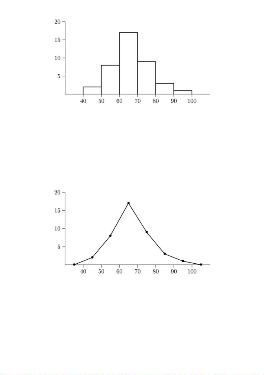
2.1.4Frequencypolygons
2.1.5Chernofffaces
2.2Numericalsummarymeasures
2.2.1(Arithmetic)mean
2.2.2Weighted(arithmetic)mean
2.2.3Geometricmean
2.2.4Harmonicmean
2.2.5Mode
2.2.6Median
2.2.7p%trimmedmean
2.2.8Quartiles
2.2.9Deciles
2.2.10Percentiles
2.2.11Meandeviation
2.2.12Variance
2.2.13Standarddeviation
2.2.14Standarderrors
2.2.15Rootmeansquare
2.2.16Range
2.2.17Interquartilerange
2.2.18Quartiledeviation
2.2.19Boxplots
2.2.20Coefficientofvariation
2.2.21Coefficientofquartilevariation
2.2.22Zscore
2.2.23Moments
2.2.24Measuresofskewness
c
2000 by Chapman & Hall/CRC
2.2.25Measuresofkurtosis
2.2.26Datatransformations
2.2.27Sheppard’scorrectionsforgrouping
Numerical descriptive statistics and graphical techniques may be used to sum-
marize information about central tendency and/or variability.
2.1 TABULAR AND GRAPHICAL PROCEDURES
2.1.1 Stem-and-leaf plot
A stem-and-leaf plot is a a graphical summary used to describe a set of ob-
servations (as symmetric, skewed, etc.). Each observation is displayed on the
graph and should have at least two digits. Split each observation (at the same
point) into a stem (one or more of the leading digit(s)) and a leaf (remaining
digits). Select the split point so that there are 5–20 total stems. List the
stems in a column to the left, and write each leaf in the corresponding stem
row.
Example 2.1 :
Construct a stem-and-leaf plot for the Ticket Data (page 2).
Solution:
Stem Leaf
4 39
5
11555689
6
02334445556777889
7
122344558
8
349
9
2
Stem = 10, Leaf = 1
Figure 2.1: Stem–and–leaf plot for Ticket Data.
2.1.2 Frequency distribution
A frequency distribution is a tabular method for summarizing continuous or
discrete numerical data or categorical data.
(1) Partition the measurement axis into 5–20 (usually equal) reasonable
subintervals called classes, or class intervals. Thus, each observation
falls into exactly one class.
(2) Record, or tally, the number of observations in each class, called the
frequency of each class.
(3) Compute the proportion of observations in each class, called the relative
frequency.
(4) Compute the proportion of observations in each class and all preceding
classes, called the cumulative relative frequency.
c
2000 by Chapman & Hall/CRC
Example 2.2 : Construct a frequency distribution for the Ticket Data (page 2).
Solution:
(S1) Determine the classes. It seems reasonable to use 40 to less than 50, 50 to less
than 60, ..., 90 to less than 100.
Note: For continuous data, one end of each class must be open. This ensures
that each observation will fall into only one class. The open end of each class
may be either the left or right, but should be consistent.
(S2) Record the number of observations in each class.
(S3) Compute the relative frequency and cumulative relative frequency for each class.
(S4)TheresultingfrequencydistributionisinFigure2.2.
Cumulative
Relative relative
Class Frequency frequency frequency
[40, 50) 2 0.050 0.050
[50, 60) 8 0.200 0.250
[60, 70) 17 0.425 0.625
[70, 80) 9 0.225 0.900
[80, 90) 3 0.075 0.975
[90, 100) 1 0.025 1.000
Figure 2.2: Frequency distribution for Ticket Data.
2.1.3 Histogram
A histogram is a graphical representation of a frequency distribution. A (rela-
tive) frequency histogram is a plot of (relative) frequency versus class interval.
Rectangles are constructed over each class with height proportional (usually
equal) to the class (relative) frequency. A frequency and relative frequency
histogram have the same shape, but different scales on the vertical axis.
Example 2.3 :
Construct a frequency histogram for the Ticket Data (page 2).
Solution:
(S1)UsingthefrequencydistributioninFigure2.2,constructrectanglesaboveeach
class, with height equal to class frequency.
(S2)TheresultinghistogramisinFigure2.3.
Note: A probability histogram is constructed so that the area of each rectangle
equals the relative frequency. If the class widths are unequal, this histogram
presents a more accurate description of the distribution.
2.1.4 Frequency polygons
A frequency polygon is a line plot of points with x coordinate being class
midpoint and y coordinate being class frequency. Often the graph extends to
c
2000 by Chapman & Hall/CRC
Figure 2.3: Frequency histogram for Ticket Data.
an additional empty class on both ends. The relative frequency may be used
in place of frequency.
Example 2.4 :
Construct a frequency polygon for the Ticket Data (page 2).
Solution:
(S1)UsingthefrequencydistributioninFigure2.2,ploteachpointandconnectthe
graph.
(S2)TheresultingfrequencypolygonisinFigure2.4.
Figure 2.4: Frequency polygon for Ticket Data.
An ogive,orcumulative frequency polygon, is a plot of cumulative fre-
quencyversustheupperclasslimit.Figure2.5isanogivefortheTicketData
(page 2).
Another type of frequency polygon is a more-than cumulative frequency poly-
gon. For each class this plots the number of observations in that class and
every class above versus the lower class limit.
c
2000 by Chapman & Hall/CRC
Figure 2.5: Ogive for Ticket Data.
A bar chart is often used to graphically summarize discrete or categorical
data. A rectangle is drawn over each bin with height proportional to frequency.
The chart may be drawn with horizontal rectangles, in three dimensions, and
maybeusedtocomparetwoormoresetsofobservations.Figure2.6isabar
chart for the Soda Pop Data (page 2).
Figure 2.6: Bar chart for Soda Pop Data.
A pie chart is used to illustrate parts of the total. A circle is divided into
slicesproportionaltothebinfrequency.Figure2.7isapiechartfortheSoda
Pop Data (page 2).
2.1.5 Chernoff faces
Chernoff faces are used to illustrate trends in multidimensional data. They
are effective because people are used to differentiating between facial features.
Chernoff faces have been used for cluster, discriminant, and time-series anal-
yses. Facial features that might be controllable by the data include:
(a) ear: level, radius
(b) eyebrow: height, slope, length
(c) eyes: height, size, separation, eccentricity, pupil position or size
c
2000 by Chapman & Hall/CRC
剩余538页未读,继续阅读
当年老王
- 粉丝: 128
- 资源: 29
上传资源 快速赚钱
- 我的内容管理 展开
- 我的资源 快来上传第一个资源
- 我的收益 登录查看自己的收益
- 我的积分 登录查看自己的积分
- 我的C币 登录后查看C币余额
- 我的收藏
- 我的下载
- 下载帮助
最新资源
- 最优条件下三次B样条小波边缘检测算子研究
- 深入解析:wav文件格式结构
- JIRA系统配置指南:代理与SSL设置
- 入门必备:电阻电容识别全解析
- U盘制作启动盘:详细教程解决无光驱装系统难题
- Eclipse快捷键大全:提升开发效率的必备秘籍
- C++ Primer Plus中文版:深入学习C++编程必备
- Eclipse常用快捷键汇总与操作指南
- JavaScript作用域解析与面向对象基础
- 软通动力Java笔试题解析
- 自定义标签配置与使用指南
- Android Intent深度解析:组件通信与广播机制
- 增强MyEclipse代码提示功能设置教程
- x86下VMware环境中Openwrt编译与LuCI集成指南
- S3C2440A嵌入式终端电源管理系统设计探讨
- Intel DTCP-IP技术在数字家庭中的内容保护
资源上传下载、课程学习等过程中有任何疑问或建议,欢迎提出宝贵意见哦~我们会及时处理!
点击此处反馈
安全验证
文档复制为VIP权益,开通VIP直接复制
信息提交成功