
Python绘图绘图Matplotlib之坐标轴及刻度总结之坐标轴及刻度总结
学习https://matplotlib.org/gallery/index.html 记录,描述不一定准确,具体请参考官网
Matplotlib使用总结图
import matplotlib.pyplot as plt
plt.rcParams['font.sans-serif']=['SimHei'] # 用来正常显示中文标签
plt.rcParams['axes.unicode_minus']=False # 用来正常显示负号
import pandas as pd
import numpy as np
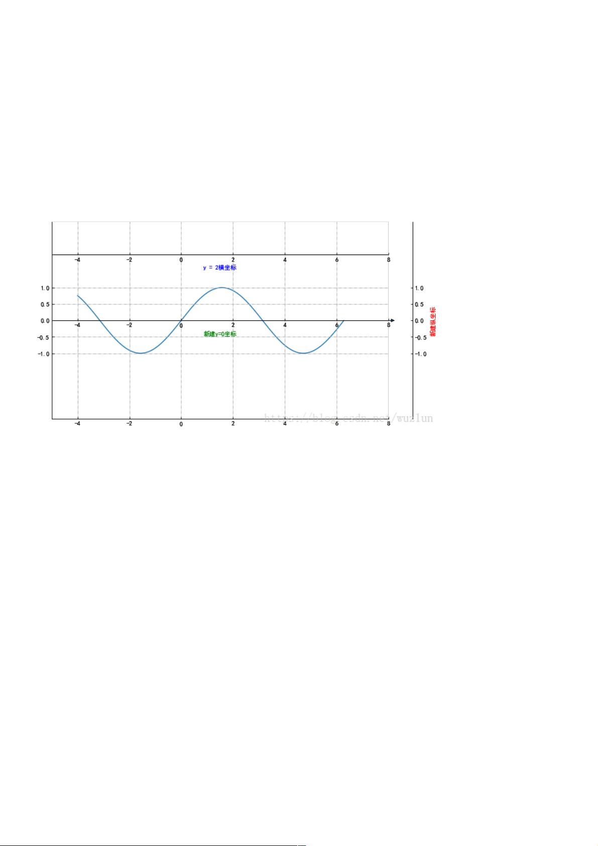
新建隐藏坐标轴新建隐藏坐标轴
from mpl_toolkits.axisartist.axislines import SubplotZero
import numpy as np
fig = plt.figure(1, (10, 6))
ax = SubplotZero(fig, 1, 1, 1)
fig.add_subplot(ax)
"""新建坐标轴"""
ax.axis["xzero"].set_visible(True)
ax.axis["xzero"].label.set_text("新建y=0坐标")
ax.axis["xzero"].label.set_color('green')
# ax.axis['yzero'].set_visible(True)
# ax.axis["yzero"].label.set_text("新建x=0坐标")
# 新建一条y=2横坐标轴
ax.axis["新建1"] = ax.new_floating_axis(nth_coord=0, value=2,axis_direction="bottom")
ax.axis["新建1"].toggle(all=True)
ax.axis["新建1"].label.set_text("y = 2横坐标")
ax.axis["新建1"].label.set_color('blue')
"""坐标箭头"""
ax.axis["xzero"].set_axisline_style("-|>")
"""隐藏坐标轴"""
# 方法一:隐藏上边及右边
# ax.axis["right"].set_visible(False)
# ax.axis["top"].set_visible(False)
#方法二:可以一起写
ax.axis["top",'right'].set_visible(False)
# 方法三:利用 for in
# for n in ["bottom", "top", "right"]:
# ax.axis[n].set_visible(False)
"""设置刻度"""
ax.set_ylim(-3, 3)
ax.set_yticks([-1,-0.5,0,0.5,1])
ax.set_xlim([-5, 8])
# ax.set_xticks([-5,5,1])
剩余15页未读,继续阅读

weixin_38576811
- 粉丝: 6
- 资源: 890
 我的内容管理
收起
我的内容管理
收起
- 我的资源
快来上传第一个资源
 我的收益 登录查看自己的收益
 我的积分
登录查看自己的积分
我的积分
登录查看自己的积分
 我的C币
登录后查看C币余额
我的C币
登录后查看C币余额
 我的收藏
我的收藏  我的下载
我的下载  下载帮助
下载帮助

会员权益专享


最新资源
- 基于单片机的瓦斯监控系统硬件设计.doc
- 基于单片机的流量检测系统的设计_机电一体化毕业设计.doc
- 基于单片机的继电器设计.doc
- 基于单片机的湿度计设计.doc
- 基于单片机的流量控制系统设计.doc
- 基于单片机的火灾自动报警系统毕业设计.docx
- 基于单片机的铁路道口报警系统设计毕业设计.doc
- 基于单片机的铁路道口报警研究与设计.doc
- 基于单片机的流水灯设计.doc
- 基于单片机的时钟系统设计.doc
- 基于单片机的录音器的设计.doc
- 基于单片机的万能铣床设计设计.doc
- 基于单片机的简易安防声光报警器设计.doc
- 基于单片机的脉搏测量器设计.doc
- 基于单片机的家用防盗报警系统设计.doc
- 基于单片机的简易电子钟设计.doc
资源上传下载、课程学习等过程中有任何疑问或建议,欢迎提出宝贵意见哦~我们会及时处理!
点击此处反馈


