import { Box, Typography } from "@mui/material"; import { GamingBox, GamingSwitch } from "@widgets/index"; export const UiSystemToolsSmallBox = (props: any) => { return <Box className='flex' flexDirection="column" alignItems="center"> <GamingBox id={props.obj.title + 'icon'} className="h-[50px] w-[50px] " bgcolor="rgba(255,255,255,.2)" borderRadius={7}> </GamingBox> <Typography noWrap my={2}>{props.obj.title}</Typography> { props.obj.switch ? (<GamingSwitch id={props.obj.title + 'button'} />) : null } { props.obj.textState ? (<Typography color="#999" >{props.obj.textState}</Typography>) : null } </Box> }
时间: 2024-04-11 22:32:57 浏览: 113
这段代码看起来是一个 React 组件,名为 `UiSystemToolsSmallBox`。根据代码的结构,它接受一个 `props` 对象作为参数,并以该对象的属性来渲染一个 UI 小工具的盒子。
在这个组件中,`Box` 和 `Typography` 是从 `@mui/material` 中导入的组件,`GamingBox` 和 `GamingSwitch` 是从 `@widgets/index` 中导入的组件。
在组件的渲染过程中,它首先渲染一个具有特定样式的 `GamingBox` 组件。然后,它渲染一个 `Typography` 组件来显示 `props.obj.title` 的文本内容,并使用 `noWrap` 属性使文本内容不换行。
接下来,根据 `props.obj.switch` 的值,它会条件渲染一个 `GamingSwitch` 组件。如果 `props.obj.switch` 为真,则渲染 `GamingSwitch` 组件,否则不渲染。
最后,根据 `props.obj.textState` 的值,它会条件渲染一个带有文本内容的 `Typography` 组件。如果 `props.obj.textState` 存在,则渲染带有该文本内容的 `Typography` 组件,否则不渲染。
这个组件的目的是根据传入的 `props` 对象来渲染一个 UI 小工具的盒子,并可以根据需要显示开关和文本状态。
相关问题
import { ChangeEvent, useState } from "react"; import { RuleType } from "async-validator"; import { Avatar, Box, Container, FormHelperText, Link, Paper, Typography, Hidden, Button } from "@mui/material"; import { makeStyles } from "@mui/styles"; import { ValidatedForm, ValidatedTextField } from "@/components/Validated"; import useAsyncFunc from "@/utils/useAsyncFunc"; import { FetchUser, login, sendVerify } from "@/api"; import { LoadingButton } from "@mui/lab"; import { useForm } from "../Validated/context"; import { useSnackbar } from "notistack"; import { useConfirm } from "material-ui-confirm"; import { useTranslation } from "react-i18next"; const { t } = useTranslation(); const rules = { username1: { type: "string" as RuleType, required: true, message: "User Name is required" }, password1: { type: "string" as RuleType, required: true, message: "Password is required" }, code: { type: "string" as RuleType, required: true, message: "Verify code is required" } }; const withoutRules = { username1: { type: "string" as RuleType, required: true, message: "User Name is required" }, password1: { type: "string" as RuleType, required: true, message: "Password is required" } }; function Copyright() { const { t } = useTranslation(); return ( <Typography variant="body2" color="textSecondary" align="center"> {t("Copyright") + " © " + new Date().getFullYear()}{" "} <Link color="inherit" href="."> ZBeats, Inc. </Link>{" "} {t("All rights reserved.")} </Typography> ); } 那么 const { t } = useTranslation(); 应如何声明
`const { t } = useTranslation();` 应该被声明在函数组件的顶层,以便在组件内的任何地方都可以使用 `t` 函数获取翻译字符串。例如:
```
import React from "react";
import { useTranslation } from "react-i18next";
const MyComponent = () => {
const { t } = useTranslation();
return (
<div>
<h1>{t("Welcome")}</h1>
<p>{t("This is a localized string.")}</p>
</div>
);
};
export default MyComponent;
```
在这个例子中,`useTranslation()` hook 被调用并返回一个对象,其中包含 `t` 函数和其他一些有用的属性和方法。`{ t }` 这一行将 `t` 函数从该对象中解构出来,以便在组件中使用。
解释一下这段代码:<template> <div class="user-login login-bg"> <div class="user-login--content"> <!-- <img :src="logo" alt=""> --> <a-typography-title :level="3"> 新特能源还原炉群控平台 </a-typography-title> <a-form class="form mt-16" ref="formRef" :model="formState" :rules="rules" v-bind="layout"> <a-form-item class="form-item" has-feedback name="username"> <a-input class="input" v-model:value="formState.username" type="text" @keyup.enter="onSubmit()" placeholder="请输入用户名" autocomplete="off" allow-clear /> </a-form-item> <a-form-item class="form-item" has-feedback name="password"> <a-input class="input" v-model:value="formState.password" type="password" @keyup.enter="onSubmit()" placeholder="请输入登录密码" autocomplete="off" allow-clear /> </a-form-item> <a-button class="login-button mt-24" type="primary" size="large" block @click="onSubmit()">登录</a-button> </a-form> </div> <p class="records">@2021-2023 中科时代(北京)科技有限公司 版权所有 <a href="https://beian.miit.gov.cn/" target="_blank">京ICP备2021032638号-4</a></p> </div> </template>
这段代码是一个 Vue.js 的组件模板,它描述了一个用户登录界面的表单。下面是各个部分的解释:
- `<div class="user-login login-bg">`:这是一个包含登录表单的 div 元素,使用了 class 属性来设置样式。
- `<div class="user-login--content">`:这是一个包含表单内容的 div 元素,同样使用了 class 属性来设置样式。
- `<a-typography-title :level="3">`:这是一个使用了 Ant Design Vue 组件库的标题组件,用于显示页面标题。
- `<a-form class="form mt-16" ref="formRef" :model="formState" :rules="rules" v-bind="layout">`:这是一个使用了 Ant Design Vue 组件库的表单组件,它包含了两个表单项和一个登录按钮,还使用了一些属性来绑定数据和设置样式。
- `<a-form-item class="form-item" has-feedback name="username">`:这是一个使用了 Ant Design Vue 组件库的表单项组件,它包含了一个用户名输入框。
- `<a-input class="input" v-model:value="formState.username" type="text" @keyup.enter="onSubmit()" placeholder="请输入用户名" autocomplete="off" allow-clear />`:这是一个使用了 Ant Design Vue 组件库的输入框组件,它用于输入用户名。
- `<a-form-item class="form-item" has-feedback name="password">`:这是一个使用了 Ant Design Vue 组件库的表单项组件,它包含了一个密码输入框。
- `<a-input class="input" v-model:value="formState.password" type="password" @keyup.enter="onSubmit()" placeholder="请输入登录密码" autocomplete="off" allow-clear />`:这是一个使用了 Ant Design Vue 组件库的输入框组件,它用于输入密码。
- `<a-button class="login-button mt-24" type="primary" size="large" block @click="onSubmit()">登录</a-button>`:这是一个使用了 Ant Design Vue 组件库的按钮组件,用于提交表单。
- `<p class="records">@2021-2023 中科时代(北京)科技有限公司 版权所有 <a href="https://beian.miit.gov.cn/" target="_blank">京ICP备2021032638号-4</a></p>`:这是一个包含版权信息的段落元素,使用了 class 属性来设置样式。
阅读全文
相关推荐
最新推荐
【java毕业设计】网页时装购物系统源码(springboot+vue+mysql+说明文档+LW).zip
管理员:首页、个人中心、用户管理、商品分类管理、颜色管理、商品信息管理、商品评价管理、系统管理、订单管理。
用户:首页、个人中心、商品评价管理、我的收藏管理、订单管理。
前台首页:首页、商品信息、商品资讯、个人中心、后台管理、购物车、客服等功能。
项目包含完整前后端源码和数据库文件
环境说明:
开发语言:Java
框架:springboot,mybatis
JDK版本:JDK1.8
数据库:mysql 5.7
数据库工具:Navicat11
开发软件:eclipse/idea
Maven包:Maven3.3
Kylin10 + GDAL2.4 + OSG3.6.4 + OsgEarth2.10.1
基于麒麟V10的osgearth2.10编译库
计算机系统维护技术.xps
计算机系统维护技术.xps
Angular实现MarcHayek简历展示应用教程
资源摘要信息:"MarcHayek-CV:我的简历的Angular应用"
Angular 应用是一个基于Angular框架开发的前端应用程序。Angular是一个由谷歌(Google)维护和开发的开源前端框架,它使用TypeScript作为主要编程语言,并且是单页面应用程序(SPA)的优秀解决方案。该应用不仅展示了Marc Hayek的个人简历,而且还介绍了如何在本地环境中设置和配置该Angular项目。
知识点详细说明:
1. Angular 应用程序设置:
- Angular 应用程序通常依赖于Node.js运行环境,因此首先需要全局安装Node.js包管理器npm。
- 在本案例中,通过npm安装了两个开发工具:bower和gulp。bower是一个前端包管理器,用于管理项目依赖,而gulp则是一个自动化构建工具,用于处理如压缩、编译、单元测试等任务。
2. 本地环境安装步骤:
- 安装命令`npm install -g bower`和`npm install --global gulp`用来全局安装这两个工具。
- 使用git命令克隆远程仓库到本地服务器。支持使用SSH方式(`***:marc-hayek/MarcHayek-CV.git`)和HTTPS方式(需要替换为具体用户名,如`git clone ***`)。
3. 配置流程:
- 在server文件夹中的config.json文件里,需要添加用户的电子邮件和密码,以便该应用能够通过内置的联系功能发送信息给Marc Hayek。
- 如果想要在本地服务器上运行该应用程序,则需要根据不同的环境配置(开发环境或生产环境)修改config.json文件中的“baseURL”选项。具体而言,开发环境下通常设置为“../build”,生产环境下设置为“../bin”。
4. 使用的技术栈:
- JavaScript:虽然没有直接提到,但是由于Angular框架主要是用JavaScript来编写的,因此这是必须理解的核心技术之一。
- TypeScript:Angular使用TypeScript作为开发语言,它是JavaScript的一个超集,添加了静态类型检查等功能。
- Node.js和npm:用于运行JavaScript代码以及管理JavaScript项目的依赖。
- Git:版本控制系统,用于代码的版本管理及协作开发。
5. 关于项目结构:
- 该应用的项目文件夹结构可能遵循Angular CLI的典型结构,包含了如下目录:app(存放应用组件)、assets(存放静态资源如图片、样式表等)、environments(存放环境配置文件)、server(存放服务器配置文件如上文的config.json)等。
6. 开发和构建流程:
- 开发时,可能会使用Angular CLI来快速生成组件、服务等,并利用热重载等特性进行实时开发。
- 构建应用时,通过gulp等构建工具可以进行代码压缩、ES6转译、单元测试等自动化任务,以确保代码的质量和性能优化。
7. 部署:
- 项目最终需要部署到服务器上,配置文件中的“baseURL”选项指明了服务器上的资源基础路径。
8. 关于Git仓库:
- 压缩包子文件的名称为MarcHayek-CV-master,表明这是一个使用Git版本控制的仓库,且存在一个名为master的分支,这通常是项目的主分支。
以上知识点围绕Angular应用“MarcHayek-CV:我的简历”的创建、配置、开发、构建及部署流程进行了详细说明,涉及了前端开发中常见的工具、技术及工作流。
管理建模和仿真的文件
管理Boualem Benatallah引用此版本:布阿利姆·贝纳塔拉。管理建模和仿真。约瑟夫-傅立叶大学-格勒诺布尔第一大学,1996年。法语。NNT:电话:00345357HAL ID:电话:00345357https://theses.hal.science/tel-003453572008年12月9日提交HAL是一个多学科的开放存取档案馆,用于存放和传播科学研究论文,无论它们是否被公开。论文可以来自法国或国外的教学和研究机构,也可以来自公共或私人研究中心。L’archive ouverte pluridisciplinaire
深入剖析:内存溢出背后的原因、预防及应急策略(专家版)
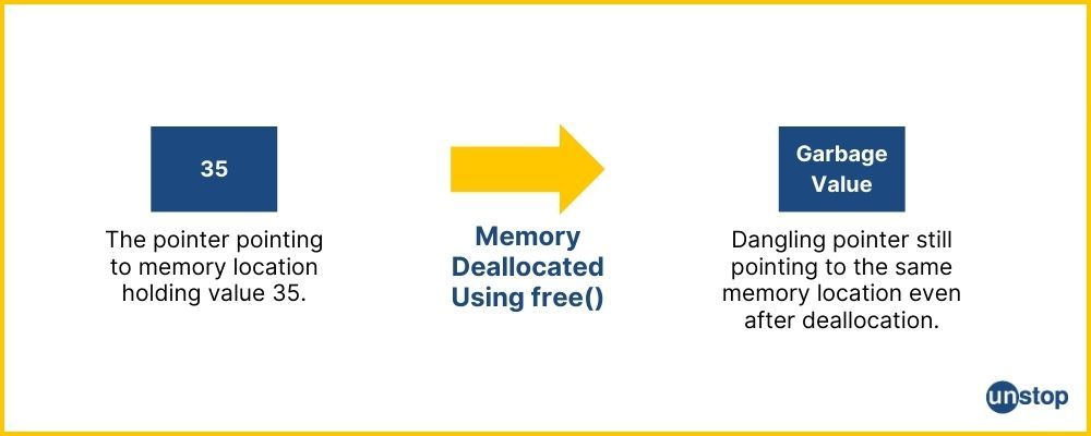
参考资源链接:[Net 内存溢出(System.OutOfMemoryException)的常见情况和处理方式总结](https://wenku.csdn.net/doc/6412b784be7fbd1778d4a95f?spm=1055.2635.3001.10343)
# 1. 内存溢出的概念及影响
内存溢出,又称
Java中如何对年月日时分秒的日期字符串作如下处理:如何日期分钟介于两个相连的半点之间,就将分钟数调整为前半点
在Java中,你可以使用`java.time`包中的类来处理日期和时间,包括格式化和调整。下面是一个示例,展示了如何根据给定的日期字符串(假设格式为"yyyy-MM-dd HH:mm:ss")进行这样的处理:
```java
import java.text.SimpleDateFormat;
import java.time.LocalDateTime;
import java.time.ZoneId;
import java.time.ZonedDateTime;
public class Main {
public static void main(String[] args
Crossbow Spot最新更新 - 获取Chrome扩展新闻
资源摘要信息:"Crossbow Spot - Latest News Update-crx插件"
该信息是关于一款特定的Google Chrome浏览器扩展程序,名为"Crossbow Spot - Latest News Update"。此插件的目的是帮助用户第一时间获取最新的Crossbow Spot相关信息,它作为一个RSS阅读器,自动聚合并展示Crossbow Spot的最新新闻内容。
从描述中可以提取以下关键知识点:
1. 功能概述:
- 扩展程序能让用户领先一步了解Crossbow Spot的最新消息,提供实时更新。
- 它支持自动更新功能,用户不必手动点击即可刷新获取最新资讯。
- 用户界面设计灵活,具有美观的新闻小部件,使得信息的展现既实用又吸引人。
2. 用户体验:
- 桌面通知功能,通过Chrome的新通知中心托盘进行实时推送,确保用户不会错过任何重要新闻。
- 提供一个便捷的方式来保持与Crossbow Spot最新动态的同步。
3. 语言支持:
- 该插件目前仅支持英语,但开发者已经计划在未来的版本中添加对其他语言的支持。
4. 技术实现:
- 此扩展程序是基于RSS Feed实现的,即从Crossbow Spot的RSS源中提取最新新闻。
- 扩展程序利用了Chrome的通知API,以及RSS Feed处理机制来实现新闻的即时推送和展示。
5. 版权与免责声明:
- 所有的新闻内容都是通过RSS Feed聚合而来,扩展程序本身不提供原创内容。
- 用户在使用插件时应遵守相关的版权和隐私政策。
6. 安装与使用:
- 用户需要从Chrome网上应用店下载.crx格式的插件文件,即Crossbow_Spot_-_Latest_News_Update.crx。
- 安装后,插件会自动运行,并且用户可以对其进行配置以满足个人偏好。
从以上信息可以看出,该扩展程序为那些对Crossbow Spot感兴趣或需要密切跟进其更新的用户提供了一个便捷的解决方案,通过集成RSS源和Chrome通知机制,使得信息获取变得更加高效和及时。这对于需要实时更新信息的用户而言,具有一定的实用价值。同时,插件的未来发展计划中包括了多语言支持,这将使得更多的用户能够使用并从中受益。
"互动学习:行动中的多样性与论文攻读经历"
多样性她- 事实上SCI NCES你的时间表ECOLEDO C Tora SC和NCESPOUR l’Ingén学习互动,互动学习以行动为中心的强化学习学会互动,互动学习,以行动为中心的强化学习计算机科学博士论文于2021年9月28日在Villeneuve d'Asq公开支持马修·瑟林评审团主席法布里斯·勒菲弗尔阿维尼翁大学教授论文指导奥利维尔·皮耶昆谷歌研究教授:智囊团论文联合主任菲利普·普雷教授,大学。里尔/CRISTAL/因里亚报告员奥利维耶·西格德索邦大学报告员卢多维奇·德诺耶教授,Facebook /索邦大学审查员越南圣迈IMT Atlantic高级讲师邀请弗洛里安·斯特鲁布博士,Deepmind对于那些及时看到自己错误的人...3谢谢你首先,我要感谢我的两位博士生导师Olivier和Philippe。奥利维尔,"站在巨人的肩膀上"这句话对你来说完全有意义了。从科学上讲,你知道在这篇论文的(许多)错误中,你是我可以依
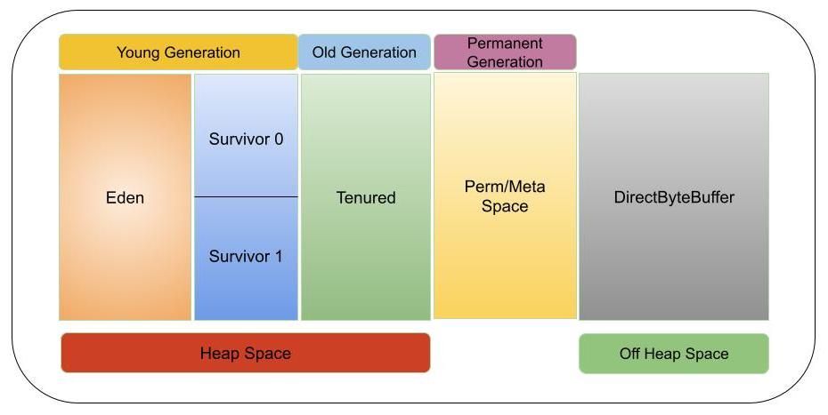
【Java内存管理终极指南】:一次性解决内存溢出、泄漏和性能瓶颈
参考资源链接:[Net 内存溢出(System.OutOfMemoryException)的常见情况和处理方式总结](https://wenku.csdn.net/doc/6412b784be7fbd1778d4a95f?spm=1055.2635.3001.10343)
# 1. Java内存模型