【Matplotlib子图绘制秘籍】:揭秘专业子图绘制技巧
发布时间: 2024-07-12 08:09:02 阅读量: 60 订阅数: 28 

Matplotlib 绘图
# 1. Matplotlib子图概述**
Matplotlib子图是一种强大的工具,它允许您在单个图形中绘制多个子图。子图可以用来显示不同的数据透视图,比较不同的数据集,或创建交互式可视化。
子图的创建和管理非常简单。您可以使用`plt.subplot()`函数创建子图,并使用`plt.subplots()`函数创建多个子图。子图的布局和调整可以通过`plt.subplots_adjust()`函数进行控制。
# 2. Matplotlib子图绘制基础
### 2.1 子图的创建和管理
#### 2.1.1 子图的创建方法
Matplotlib提供了多种创建子图的方法:
- `subplot()`:创建单个子图,指定行数、列数和子图位置。
- `subplots()`:创建多个子图,返回一个包含子图对象的元组。
- `add_subplot()`:在现有图形中添加子图。
```python
# 使用 subplot() 创建单个子图
import matplotlib.pyplot as plt
fig, ax = plt.subplots()
ax.plot([1, 2, 3], [4, 5, 6])
plt.show()
# 使用 subplots() 创建多个子图
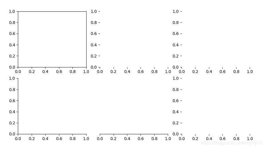
fig, axs = plt.subplots(2, 2)
axs[0, 0].plot([1, 2, 3], [4, 5, 6])
axs[0, 1].plot([7, 8, 9], [10, 11, 12])
axs[1, 0].plot([13, 14, 15], [16, 17, 18])
axs[1, 1].plot([19, 20, 21], [22, 23, 24])
plt.show()
```
#### 2.1.2 子图的布局和调整
子图的布局和调整可以通过以下方法进行:
- `set_position()`:设置子图在图形中的位置。
- `set_aspect()`:设置子图的宽高比。
- `tight_layout()`:自动调整子图之间的间距。
```python
# 设置子图位置
fig, ax = plt.subplots()
ax.set_position([0.2, 0.2, 0.6, 0.6])
plt.show()
# 设置子图宽高比
fig, ax = plt.subplots()
ax.set_aspect(2)
plt.show()
# 自动调整子图间距
fig, axs = plt.subplots(2, 2)
axs[0, 0].plot([1, 2, 3], [4, 5, 6])
axs[0, 1].plot([7, 8, 9], [10, 11, 12])
axs[1, 0].plot([13, 14, 15], [16, 17, 18])
axs[1, 1].plot([19, 20, 21], [22, 23, 24])
plt.tight_layout()
plt.show()
```
### 2.2 子图的属性设置
#### 2.2.1 标题、标签和刻度的设置
子图的标题、标签和刻度可以通过以下方法进行设置:
- `set_title()`:设置子图标题。
- `set_xlabel()`、`set_ylabel()`:设置 x 轴和 y 轴标签。
- `set_xticks()`、`set_yticks()`:设置 x 轴和 y 轴刻度。
```python
# 设置子图标题
fig, ax = plt.subplots()
ax.set_title("Matplotlib Subplot Example")
plt.show()
# 设置轴标签
fig, ax = plt.subplots()
ax.set_xlabel("X-axis")
ax.set_ylabel("Y-axis")
plt.show()
# 设置刻度
fig, ax = plt.subplots()
ax.set_xticks([1, 2, 3, 4, 5])
ax.set_yticks([10, 20, 30, 40, 50])
plt.show()
```
#### 2.2.2 图形区域的设置
图形区域的设置可以通过以下方法进行:
- `set_xlim()`、`set_ylim()`:设置 x 轴和 y 轴的范围。
- `set_facecolor()`:设置图形区域的背景颜色。
- `grid()`:显示网格线。
```python
# 设置轴范围
fig, ax = plt.subplots()
ax.set_xlim(0, 10)
ax.set_ylim(0, 100)
plt.show()
# 设置背景颜色
fig, ax = plt.subplots()
ax.set_facecolor("lightblue")
plt.show()
# 显示网格线
fig, ax = plt.subplots()
ax.grid()
plt.show()
```
#### 2.2.3 图例的设置
图例可以通过以下方法进行设置:
- `legend()`:创建图例。
- `set_title()`:设置图例标题。
- `set_loc()`:设置图例位置。
```python
# 创建图例
fig, ax = plt.subplots()
ax.plot([1, 2, 3], [4, 5, 6], label="Line 1")
ax.plot([7, 8, 9], [10, 11, 12], label="Line 2")
ax.legend()
plt.show()
# 设置图例标题
fig, ax = plt.subplots()
ax.plot([1, 2, 3], [4, 5, 6], label="Line 1")
ax.plot([7, 8, 9], [10, 11, 12], label="Line 2")
ax.legend(title="Legend
# 3. Matplotlib子图高级绘制技巧
### 3.1 多轴子图
#### 3.1.1 创建和管理多轴子图
多轴子图允许在一个绘图区域中绘制多个子图,每个子图具有自己的坐标轴和数据。要创建多轴子图,可以使用`matplotlib.pyplot.subplot2grid`函数。该函数需要三个参数:
- `shape`:一个元组,指定子图的网格形状,例如`(2, 2)`表示一个2行2列的网格。
- `location`:一个整数,指定子图在网格中的位置,从左上角开始从1开始编号。
- `rowspan`和`colspan`:可选参数,指定子图跨越的行数和列数。
```python
import matplotlib.pyplot as plt
# 创建一个2行2列的多轴子图
fig, axes = plt.subplots(2, 2)
# 在第一个子图中绘制折线图
axes[0, 0].plot([1, 2, 3], [4, 5, 6])
# 在第二个子图中绘制柱状图
axes[0, 1].bar([1, 2, 3], [4, 5, 6])
# 在第三个子图中绘制散点图
axes[1, 0].scatter([1, 2, 3], [4, 5, 6])
# 在第四个子图中绘制饼图
axes[1, 1].pie([1, 2, 3])
plt.show()
```
#### 3.1.2 共享轴和独立轴
在多轴子图中,可以共享轴或设置独立轴。默认情况下,所有子图共享相同的x轴和y轴。要共享轴,可以使用`sharex`和`sharey`参数。
```python
# 创建一个2行2列的多轴子图,共享x轴和y轴
fig, axes = plt.subplots(2, 2, sharex=True, sharey=True)
```
要设置独立轴,可以使用`independent_axes`参数。
```python
# 创建一个2行2列的多轴子图,具有独立轴
fig, axes = plt.subplots(2, 2, independent_axes=True)
```
### 3.2 极坐标子图
#### 3.2.1 极坐标子图的创建
极坐标子图用于绘制极坐标数据。要创建极坐标子图,可以使用`matplotlib.pyplot.polar`函数。
```python
import matplotlib.pyplot as plt
# 创建一个极坐标子图
fig, ax = plt.subplots(subplot_kw={'projection': 'polar'})
# 绘制极坐标数据
ax.plot([0, np.pi/2, np.pi, 3*np.pi/2, 2*np.pi], [1, 2, 3, 4, 5])
plt.show()
```
#### 3.2.2 极坐标数据的绘制
在极坐标子图中,可以使用`plot`函数绘制极坐标数据。`plot`函数需要两个参数:
- `r`:径向坐标值。
- `theta`:角度坐标值。
```python
# 绘制一个极坐标散点图
ax.scatter(theta, r)
```
### 3.3 3D子图
#### 3.3.1 3D子图的创建
3D子图用于绘制三维数据。要创建3D子图,可以使用`matplotlib.pyplot.figure`函数并指定`projection`参数为`'3d'`。
```python
import matplotlib.pyplot as plt
from mpl_toolkits.mplot3d import Axes3D
# 创建一个3D子图
fig = plt.figure()
ax = fig.add_subplot(111, projection='3d')
```
#### 3.3.2 3D数据的绘制
在3D子图中,可以使用`plot3D`函数绘制3D数据。`plot3D`函数需要三个参数:
- `x`:x坐标值。
- `y`:y坐标值。
- `z`:z坐标值。
```python
# 绘制一个3D线框图
ax.plot3D(x, y, z)
```
# 4. Matplotlib子图交互操作
### 4.1 子图的交互式操作
Matplotlib提供了交互式操作子图的功能,允许用户与图形进行交互,以进行探索和分析。
#### 4.1.1 缩放和平移
* **缩放:**
* 使用鼠标滚轮或按住`Ctrl`键并拖动鼠标进行缩放。
* `matplotlib.pyplot.zoom()`函数可用于编程缩放。
* **平移:**
* 按住`Alt`键并拖动鼠标进行平移。
* `matplotlib.pyplot.pan()`函数可用于编程平移。
#### 4.1.2 数据点的选择和操作
* **数据点选择:**
* 使用鼠标单击或按住`Shift`键并拖动鼠标选择数据点。
* `matplotlib.pyplot.ginput()`函数可用于编程选择数据点。
* **数据点操作:**
* 选择数据点后,可以通过以下方式进行操作:
* 移动:按住鼠标并拖动。
* 删除:按`Delete`键。
* 编辑:双击数据点打开编辑对话框。
### 4.2 子图的保存和导出
#### 4.2.1 图像格式的选择
Matplotlib支持多种图像格式,包括:
| 格式 | 描述 |
|---|---|
| PNG | 便携式网络图形,适用于网络和屏幕显示。 |
| JPEG | 联合图像专家组,适用于照片和图像。 |
| SVG | 可缩放矢量图形,适用于可缩放和编辑的图形。 |
| PDF | 便携式文档格式,适用于高质量打印和文档。 |
#### 4.2.2 图像的保存和导出
* **保存图像:**
* `matplotlib.pyplot.savefig()`函数可用于将图像保存到文件中。
* 参数:
* `filename`:保存的文件名。
* `format`:图像格式(例如`'png'`、`'jpeg'`)。
* **导出图像:**
* `matplotlib.pyplot.show()`函数可用于显示交互式图形。
* `matplotlib.pyplot.close()`函数可用于关闭交互式图形。
* `matplotlib.pyplot.figure`对象还提供了`savefig()`和`show()`方法。
```python
# 保存图像为 PNG 格式
import matplotlib.pyplot as plt
plt.savefig('my_plot.png', format='png')
# 显示交互式图形
plt.show()
# 关闭交互式图形
plt.close()
```
# 5. Matplotlib子图实战应用
### 5.1 数据可视化
#### 5.1.1 折线图、柱状图和散点图
折线图、柱状图和散点图是数据可视化的基本类型。Matplotlib提供了丰富的API来绘制这些图表。
```python
import matplotlib.pyplot as plt
# 折线图
plt.plot([1, 2, 3, 4], [5, 6, 7, 8])
plt.xlabel("X轴")
plt.ylabel("Y轴")
plt.title("折线图")
plt.show()
# 柱状图
plt.bar([1, 2, 3, 4], [5, 6, 7, 8])
plt.xlabel("X轴")
plt.ylabel("Y轴")
plt.title("柱状图")
plt.show()
# 散点图
plt.scatter([1, 2, 3, 4], [5, 6, 7, 8])
plt.xlabel("X轴")
plt.ylabel("Y轴")
plt.title("散点图")
plt.show()
```
#### 5.1.2 饼图和雷达图
饼图和雷达图可以用来表示比例数据或多维数据。
```python
# 饼图
plt.pie([10, 20, 30, 40], labels=["A", "B", "C", "D"])
plt.title("饼图")
plt.show()
# 雷达图
plt.radar([10, 20, 30, 40], labels=["A", "B", "C", "D"])
plt.title("雷达图")
plt.show()
```
### 5.2 图像处理
#### 5.2.1 图像的读取和显示
Matplotlib可以读取和显示图像文件。
```python
from matplotlib import image
# 读取图像
img = image.imread("image.png")
# 显示图像
plt.imshow(img)
plt.title("图像")
plt.show()
```
#### 5.2.2 图像的处理和增强
Matplotlib提供了丰富的图像处理和增强功能。
```python
# 灰度化
img_gray = image.rgb2gray(img)
# 锐化
img_sharp = image.sharpen(img)
# 旋转
img_rotate = image.rotate(img, 45)
# 显示处理后的图像
plt.subplot(131)
plt.imshow(img_gray, cmap="gray")
plt.title("灰度化")
plt.subplot(132)
plt.imshow(img_sharp)
plt.title("锐化")
plt.subplot(133)
plt.imshow(img_rotate)
plt.title("旋转")
plt.show()
```

 百万级
高质量VIP文章无限畅学
百万级
高质量VIP文章无限畅学
 千万级
优质资源任意下载
千万级
优质资源任意下载
 C知道
免费提问 ( 生成式Al产品 )
C知道
免费提问 ( 生成式Al产品 )
0
0
相关推荐

专栏简介
本专栏深入探讨了 Matplotlib 子图的方方面面,提供全面的指南,帮助您创建专业级可视化效果。从子图绘制的基础知识到高级技巧,如交互式和动态子图,再到优化布局和添加注释,本专栏涵盖了所有内容。您将学习如何绘制极坐标图、3D 图形和动画,并了解如何保存和导出图形。此外,本专栏还提供了常见问题解答、性能优化技巧和可视化最佳实践,帮助您解决挑战并创建清晰、简洁且有效的图形。无论您是数据科学家、机器学习工程师还是任何需要可视化数据的专业人士,本专栏都是您掌握 Matplotlib 子图的宝贵资源。
专栏目录
最低0.47元/天 解锁专栏
买1年送3月
百万级
高质量VIP文章无限畅学
千万级
优质资源任意下载
C知道
免费提问 ( 生成式Al产品 )
最新推荐
【技术教程五要素】:高效学习路径构建的5大策略
# 摘要
技术学习的本质与价值在于其能够提升个人和组织的能力,以应对快速变化的技术环境。本文探讨了学习理论的构建与应用,包括认知心理学和教育心理学在技术学习中的运用,以及学习模式从传统教学到在线学习的演变。此外,本文还关注实践技能的培养与提升,强调技术项目管理的重要性以及技术工具与资源的利用。在高效学习方法的探索与实践中,本文提出多样化的学习方法、时间管理与持续学习策略。最后,文章展望了未来技术学习面临的挑战与趋势,包括技术快速发展的挑战和人工智能在技术教育中的应用前景。
【KEBA机器人维护秘籍】:专家教你如何延长设备使用寿命
# 摘要
本文系统地探讨了KEBA机器人的维护与优化策略,涵盖了从基础维护知识到系统配置最佳实践的全面内容。通过分析硬件诊断、软件维护、系统优化、操作人员培训以及实际案例研究,本文强调了对KEBA机器人进行系统维护的重要性,并为操作人员提供了一系列技能提升和故障排除的方法。文章还展望了未来维护技术的发展趋势,特别是预测性维护和智能化技术在提升机器人性能和可靠性方面的应用前景。
# 关键字
KEBA机器人;硬件诊断;
【信号完整性优化】:Cadence SigXplorer高级使用案例分析
# 摘要
信号完整性是高速电子系统设计中的关键因素,影响着电路的性能与可靠性。本文首先介绍了信号完整性的基础概念,为理解后续内容奠定了基础。接着详细阐述了Cadence SigXplorer工具的界面和功能,以及如何使用它来分析和解决信号完整性问题。文中深入讨论了信号完整性问题的常见类型,如反射、串扰和时序问题,并提供了通过仿真模拟与实
【IRIG 106-19安全规定:数据传输的守护神】:保障您的数据安全无忧
# 摘要
本文全面概述了IRIG 106-19安全规定,并对其技术基础和实践应用进行了深入分析。通过对数据传输原理、安全威胁与防护措施的探讨,本文揭示了IRIG 106-19所确立的技术框架和参数,并详细阐述了关键技术的实现和应用。在此基础上,本文进一步探讨了数据传输的安全防护措施,包括加密技术、访问控制和权限管理,并通过实践案例
【Python数据处理实战】:轻松搞定Python数据处理,成为数据分析师!
# 摘要
随着数据科学的蓬勃发展,Python语言因其强大的数据处理能力而备受推崇。本文旨在全面概述Python在数据处理中的应用,从基础语法和数据结构讲起,到必备工具的深入讲解,再到实践技巧的详细介绍。通过结合NumPy、Pandas和Matplotlib等库,本文详细介绍了如何高效导入、清洗、分析以及可视化数据,确保读者能掌握数据处理的核心概念和技能。最后,通过一个项目实战章
Easylast3D_3.0高级建模技巧大公开:专家级建模不为人知的秘密
# 摘要
Easylast3D_3.0是一款先进的三维建模软件,广泛应用于工程、游戏设计和教育领域。本文系统介绍了Easylast3D_3.0的基础概念、界面布局、基本操作技巧以及高级建模功能。详细阐述了如何通过自定义工作空间、视图布局、基本建模工具、材质与贴图应用、非破坏性建模技术、高级表面处理、渲染技术等来提升建模效率和质量。同时,文章还探讨了脚本与自动化在建模流
PHP脚本执行系统命令的艺术:安全与最佳实践全解析

# 摘要
PHP脚本执行系统命令的能力增加了其灵活性和功能性,但同时也引入了安全风险。本文介绍了PHP脚本执行系统命令的基本概念,分析了PHP中执行系统命令
PCB设计技术新视角:FET1.1在QFP48 MTT上的布局挑战解析
# 摘要
本文详细探讨了FET1.1技术在PCB设计中的应用,特别强调了QFP48 MTT封装布局的重要性。通过对QFP48 MTT的物理特性和电气参数进行深入分析,文章进一步阐述了信号完整性和热管理在布局设计中的关键作用。文中还介绍了FET1.1在QFP48 MTT上的布局实践,从准备、执行到验证和调试的全过程。最后,通过案例研究,本文展示了FET1.1布局技术在实际应用中可能遇到的问题及解决策略,并展望了未来布
【Sentaurus仿真速成课】:5个步骤带你成为半导体分析专家

# 摘要
本文全面介绍了Sentaurus仿真软件的基础知识、理论基础、实际应用和进阶技巧。首先,讲述了Sentaurus仿真的基本概念和理论,包括半导体物理基础、数值模拟原理及材料参数的处理。然后,本文详细阐述了Sentaurus仿真
台达触摸屏宏编程初学者必备:基础指令与实用案例分析

# 摘要
本文旨在全面介绍台达触摸屏宏编程的基础知识和实践技巧。首先,概述了宏编程的核心概念与理论基础,详细解释了宏编程指令体系及数据处理方法,并探讨了条件判断与循环控制。其次,通过实用案例实践,展现了如何在台达触摸屏上实现基础交互功能、设备通讯与数据交换以及系统与环境的集成。第三部分讲述了宏编程的进阶技巧,包括高级编程技术、性能优化与调试以及特定领域的应用。最后,分析了宏编程的未来趋势,包括智能化、自动化的新趋势,开源社区与生态的贡献,以及宏编程教育与培训的现状和未来发展。
资源上传下载、课程学习等过程中有任何疑问或建议,欢迎提出宝贵意见哦~我们会及时处理!
点击此处反馈


专栏目录
最低0.47元/天 解锁专栏
买1年送3月
百万级
高质量VIP文章无限畅学
千万级
优质资源任意下载
C知道
免费提问 ( 生成式Al产品 )