如何在matplotlib中绘制带有误差条的图表
发布时间: 2023-12-16 15:08:27 阅读量: 10 订阅数: 15 
# 一、介绍
## 1.1 关于matplotlib和误差条
## 1.2 为什么需要在图表中添加误差条
## 二、准备工作
### 2.1 安装matplotlib库
在开始绘制图表之前,我们需要确保已经安装了matplotlib库。可以通过以下命令在Python环境中安装matplotlib库:
```
pip install matplotlib
```
### 2.2 数据准备
在本文中,我们将以绘制带有误差条的柱状图和折线图为例进行说明。为了方便演示,在这里我们准备了一些示例数据:
```python
import numpy as np
# 柱状图数据
bar_data = [23, 30, 15, 45, 60]
bar_err = [2, 3, 1, 4, 5]
# 折线图数据
line_data_x = np.linspace(0, 10, 100)
line_data_y = np.sin(line_data_x)
line_err = np.random.rand(100) * 0.2
```
### 2.3 制定绘制图表的计划
在开始绘制图表之前,我们应该对所需的图表进行计划。在本文中,我们将绘制带有误差条的柱状图和折线图,以展示数据的变化范围和可靠性。
对于柱状图,我们将绘制每个柱子的高度,并在柱子上方添加误差条,以展示数据的方差。
对于折线图,我们将绘制数据点的连线,并在每个数据点周围添加误差条,以展示数据的波动范围。
### 三、绘制基本图表
#### 3.1 使用matplotlib绘制基本图表
在开始绘制带有误差条的图表之前,我们首先需要使用matplotlib库绘制基本的柱状图或者折线图。这可以通过以下步骤完成:
```python
import matplotlib.pyplot as plt
# 创建数据
x = [1, 2, 3, 4, 5]
y = [10, 15, 7, 10, 5]
# 绘制柱状图
plt.bar(x, y)
plt.show()
# 绘制折线图
plt.plot(x, y)
plt.show()
```
#### 3.2 添加误差条的方法简介
在matplotlib中,我们可以使用`errorbar`函数来为图表添加误差条。该函数的基本用法可以通过以下代码展示:
```python
# 创建误差值
y_error = [1, 2, 1.5, 2, 1]
# 绘制带有误差条的柱状图
plt.bar(x, y, yerr=y_error, capsize=5)
plt.show()
# 绘制带有误差条的折线图
plt.errorbar(x, y, yerr=y_error, fmt='-o')
plt.show()
```
在上述代码中,`yerr`参数用于
 最低0.47元/天 解锁专栏
 买1年送3个月
 百万级
高质量VIP文章无限畅学
百万级
高质量VIP文章无限畅学
 千万级
优质资源任意下载
千万级
优质资源任意下载
 C知道
免费提问 ( 生成式Al产品 )
C知道
免费提问 ( 生成式Al产品 )
0
0
相关推荐

专栏简介
本专栏主要介绍了Python中常用的数据可视化工具matplotlib的使用方法和技巧。专栏以入门指南开始,详细讲解了如何使用matplotlib创建简单的折线图和散点图。然后,通过使用matplotlib创建饼图、柱状图和堆叠区域图,教你如何展示数据的比例关系和变化趋势。在进阶教程中,专栏介绍了如何在matplotlib中添加图例、标签和误差条的技巧,以及如何绘制多个子图展示不同数据维度和数据处理流程。此外,还介绍了绘制箱线图、等高线图、热力图、流程图、极坐标图、相对图和标量场图等高级技巧和探索性数据分析的方法。通过专栏的学习,读者将深入了解matplotlib的绘图原理和数据可视化的定制化方法,能够灵活运用matplotlib对数据进行可视化分析。
专栏目录
最低0.47元/天 解锁专栏
买1年送3个月
百万级
高质量VIP文章无限畅学
千万级
优质资源任意下载
C知道
免费提问 ( 生成式Al产品 )
最新推荐
遗传算法未来发展趋势展望与展示

# 1.1 遗传算法简介
遗传算法(GA)是一种受进化论启发的优化算法,它模拟自然选择和遗传过程,以解决复杂优化问题。GA 的基本原理包括:
* **种群:**一组候选解决方案,称为染色体。
* **适应度函数:**评估每个染色体的质量的函数。
* **选择:**根据适应度选择较好的染色体进行繁殖。
* **交叉:**将两个染色体的一部分交换,产生新的染色体。
* **变异:**随机改变染色体,引入多样性。
Selenium与人工智能结合:图像识别自动化测试
# 1. Selenium简介**
Selenium是一个用于Web应用程序自动化的开源测试框架。它支持多种编程语言,包括Java、Python、C#和Ruby。Selenium通过模拟用户交互来工作,例如单击按钮、输入文本和验证元素的存在。
Selenium提供了一系列功能,包括:
* **浏览器支持:**支持所有主要浏览器,包括Chrome、Firefox、Edge和Safari。
* **语言绑定:**支持多种编程语言,使开发人员可以轻松集成Selenium到他们的项目中。
* **元素定位:**提供多种元素定位策略,包括ID、名称、CSS选择器和XPath。
* **断言:**允
Spring WebSockets实现实时通信的技术解决方案
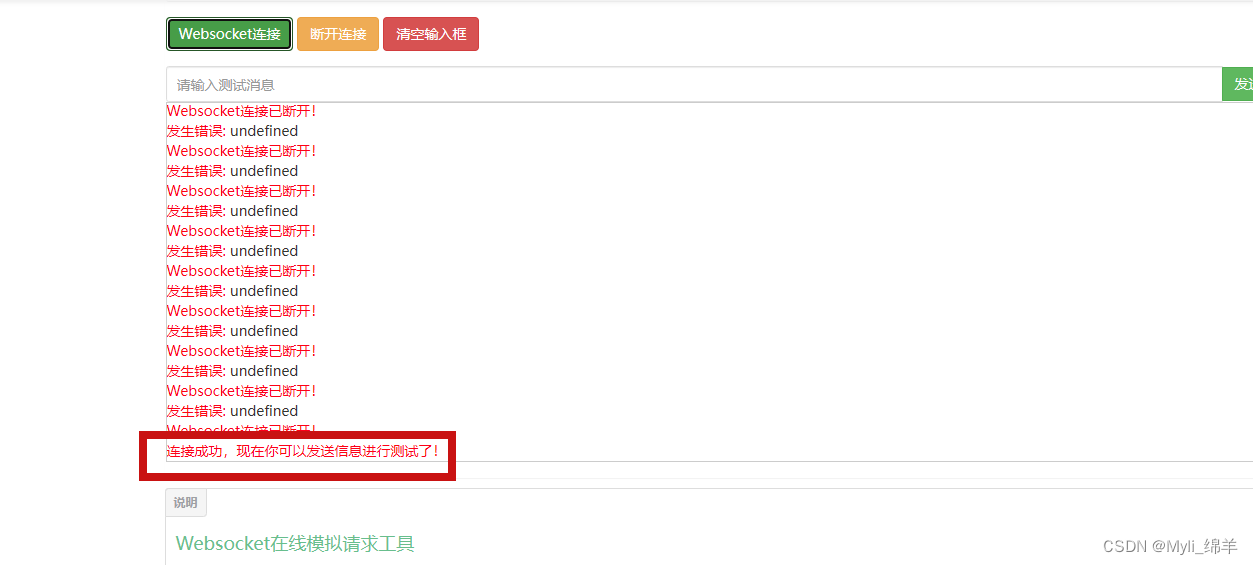
# 1. 实时通信技术概述**
实时通信技术是一种允许应用程序在用户之间进行即时双向通信的技术。它通过在客户端和服务器之间建立持久连接来实现,从而允许实时交换消息、数据和事件。实时通信技术广泛应用于各种场景,如即时消息、在线游戏、协作工具和金融交易。
# 2. Spring WebSockets基础
### 2.1 Spring WebSockets框架简介
Spring WebSocke
numpy中数据安全与隐私保护探索
# 1. Numpy数据安全概述**
数据安全是保护数据免受未经授权的访问、使用、披露、破坏、修改或销毁的关键。对于像Numpy这样的科学计算库来说,数据安全至关重要,因为它处理着大量的敏感数据,例如医疗记录、财务信息和研究数据。
本章概述了Numpy数据安全的概念和重要性,包括数据安全威胁、数据安全目标和Numpy数据安全最佳实践的概述。通过了解这些基础知识,我们可以为后续章节中更深入的讨论奠定基础。
TensorFlow 时间序列分析实践:预测与模式识别任务
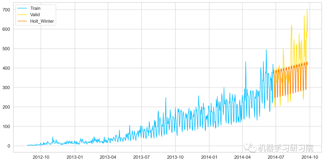
# 2.1 时间序列数据特性
时间序列数据是按时间顺序排列的数据点序列,具有以下特性:
- **平稳性:** 时间序列数据的均值和方差在一段时间内保持相对稳定。
- **自相关性:** 时间序列中的数据点之间存在相关性,相邻数据点之间的相关性通常较高。
# 2. 时间序列预测基础
### 2.1 时间序列数据特性
时间序列数据是指在时间轴上按时间顺序排列的数据。它具
adb命令实战:备份与还原应用设置及数据

# 1. adb命令简介和安装
### 1.1 adb命令简介
adb(Android Debug Bridge)是一个命令行工具,用于与连接到计算机的Android设备进行通信。它允许开发者调试、
高级正则表达式技巧在日志分析与过滤中的运用

# 1. 高级正则表达式概述**
高级正则表达式是正则表达式标准中更高级的功能,它提供了强大的模式匹配和文本处理能力。这些功能包括分组、捕获、贪婪和懒惰匹配、回溯和性能优化。通过掌握这些高
TensorFlow 在大规模数据处理中的优化方案

# 1. TensorFlow简介**
TensorFlow是一个开源机器学习库,由谷歌开发。它提供了一系列工具和API,用于构建和训练深度学习模型。TensorFlow以其高性能、可扩展性和灵活性而闻名,使其成为大规模数据处理的理想选择。
TensorFlow使用数据流图来表示计算,其中节点表示操作,边表示数据流。这种图表示使TensorFlow能够有效地优化计算,并支持分布式
ffmpeg优化与性能调优的实用技巧
# 1. ffmpeg概述
ffmpeg是一个强大的多媒体框架,用于视频和音频处理。它提供了一系列命令行工具,用于转码、流式传输、编辑和分析多媒体文件。ffmpe
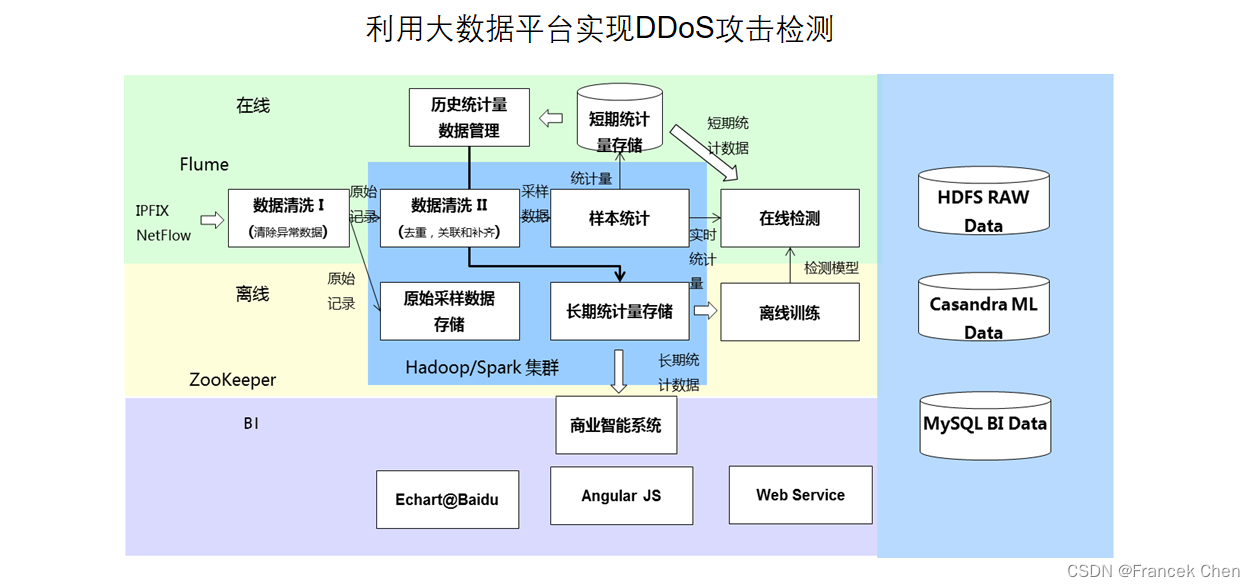
实现实时机器学习系统:Kafka与TensorFlow集成
# 1. 机器学习系统概述**
机器学习系统是一种能够从数据中学习并做出预测的计算机系统。它利用算法和统计模型来识别模式、做出决策并预测未来事件。机器学习系统广泛应用于各种领域,包括计算机视觉、自然语言处理和预测分析。
机器学习系统通常包括以下组件:
* **数据采集和预处理:**收集和准备数据以用于训练和推理。
* **模型训练:**使用数据训练机器学习模型,使其能够识别模式和做出预测。
*
资源上传下载、课程学习等过程中有任何疑问或建议,欢迎提出宝贵意见哦~我们会及时处理!
点击此处反馈


专栏目录
最低0.47元/天 解锁专栏
买1年送3个月
百万级
高质量VIP文章无限畅学
千万级
优质资源任意下载
C知道
免费提问 ( 生成式Al产品 )