【代码到可视化的桥梁】
发布时间: 2024-09-01 05:59:45 阅读量: 454 订阅数: 140 
# 1. 代码可视化的基本原理和价值
代码可视化是将编程代码转换为图形化表示的艺术与科学,旨在简化复杂逻辑的理解与沟通。其基本原理依赖于将代码元素如变量、函数、类和它们之间的关系,映射到视觉元素如节点和连线。这不仅帮助开发者快速把握程序的架构和流程,也提升了团队协作的效率。
## 1.1 代码可视化的价值
可视化有助于:
- **提升理解速度**:将抽象代码转换为直观图形,快速识别代码结构和逻辑关系。
- **加强协作沟通**:为非技术团队成员提供一个容易理解的交流平台。
- **优化系统设计**:直观展示系统架构,便于发现设计上的缺陷和性能瓶颈。
## 1.2 实现代码可视化的基础
要实现代码可视化,必须理解以下基础:
- **图论**:理解节点、边等基础图形元素及其属性。
- **数据结构**:使用恰当的数据结构存储代码元素和关系。
- **图形学**:运用图形学原理合理安排节点布局和渲染图形元素。
代码可视化工具通常提供直观的界面和丰富的交互功能,使得开发者无需深入了解底层实现,即可通过图形化界面理解和分析代码。
# 2. 数据可视化工具和库的选择
### 2.1 数据可视化工具的对比分析
数据可视化工具在展示数据和提供洞察力方面发挥着重要作用。在选择合适的数据可视化工具时,首先需要了解各种工具的功能和特点,然后根据实际的应用场景和性能考量进行权衡。
#### 2.1.1 不同工具的功能和特点
市面上有多种数据可视化工具,比如Tableau、Power BI、Google Data Studio等。这些工具各自有不同的特点:
- **Tableau**
- **功能**:提供了强大的数据连接性,支持多种数据源,以及复杂的数据分析功能。
- **特点**:用户界面直观,拖放功能简单易用,适合非技术背景的用户创建复杂的可视化。
- **Power BI**
- **功能**:Microsoft的BI工具,能与Excel等Microsoft产品无缝集成。
- **特点**:提供云服务和桌面版本,支持实时数据分析,适合需要快速洞察和报告的场景。
- **Google Data Studio**
- **功能**:可以创建交互式和动态的报告。
- **特点**:免费且易于使用,与Google生态系统集成良好,适合基于Web的数据分析。
#### 2.1.2 适用场景和性能考量
在选择工具时,我们需要评估预期的使用场景:
- **Tableau**:适合创建高度定制化的可视化和复杂的仪表板。
- **Power BI**:如果企业已经使用Microsoft产品,Power BI可以提供更多的集成优势。
- **Google Data Studio**:适用于快速报告和需要共享给非技术用户的场景。
性能方面,工具的响应时间和数据处理能力也是重要的考量因素,尤其是在处理大规模数据集时。例如,Power BI有相对较好的内存管理和优化性能,适合处理大型数据集。
### 2.2 数据可视化库的使用技巧
#### 2.2.1 常见的JavaScript库介绍
在Web应用开发中,数据可视化库能够帮助开发者快速创建各种图表和数据展示组件。以下是几个常用的JavaScript库:
- **D3.js**
- **介绍**:强大的数据驱动文档库,几乎可以创建任何类型的图表,但学习曲线较陡峭。
- **特点**:允许深入自定义图表的每一个细节,适合复杂的可视化需求。
- **Chart.js**
- **介绍**:轻量级的JavaScript库,容易上手,适合简单的图表创建。
- **特点**:提供多种图表类型,简单易用,但定制化程度较低。
- **Highcharts**
- **介绍**:商业库,提供丰富的图表类型和专业级的定制功能。
- **特点**:稳定可靠,适合商业项目,提供了良好的文档和社区支持。
#### 2.2.2 库的安装、配置和使用
安装和配置这些库通常很简单,许多现代前端构建工具(如Webpack、Rollup)提供了现成的模块打包解决方案。以下是使用Chart.js的一个基本示例:
```javascript
// 首先通过npm安装Chart.js
npm install chart.js
// 然后在你的JavaScript文件中引入Chart.js库
import { Chart } from 'chart.js';
// 创建一个简单的条形图
const ctx = document.getElementById('myChart').getContext('2d');
const myChart = new Chart(ctx, {
type: 'bar',
data: {
labels: ['Red', 'Blue', 'Yellow', 'Green', 'Purple', 'Orange'],
datasets: [{
label: '# of Votes',
data: [12, 19, 3, 5, 2, 3],
backgroundColor: [
'rgba(255, 99, 132, 0.2)',
'rgba(54, 162, 235, 0.2)',
'rgba(255, 206, 86, 0.2)',
'rgba(75, 192, 192, 0.2)',
'rgba(153, 102, 255, 0.2)',
'rgba(255, 159, 64, 0.2)'
],
borderColor: [
'rgba(255, 99, 132, 1)',
'rgba(54, 162, 235, 1)',
'rgba(255, 206, 86, 1)',
'rgba(75, 192, 192, 1)',
'rgba(153, 102, 255, 1)',
'rgba(255, 159, 64, 1)'
],
borderWidth: 1
}]
},
options: {
scales: {
y: {
beginAtZero: true
}
}
}
});
```
#### 2.2.3 高级功能和定制化开发
许多库提供了插件机制,允许开发者扩展其核心功能以满足特定需求。例如,D3.js有一个庞大的插件生态系统,可以实现如地图投影、数据导入导出等高级功能。通过了解和利用这些插件,开发者能够打造更加丰富和交互式的数据可视化作品。
```javascript
// 例如,使用D3.js插件实现地图投影
// 首先安装d3-geo-projection插件
npm install d3-geo-projection
// 在你的D3项目中使用投影插件
var projection = d3.geoMercator()
.scale(1)
.translate([0, 0]);
// 然后可以将地理数据转换为投影坐标,绘制在SVG上
var path = d3.geoPath()
.projection(projection);
svg.selectAll("path")
.data(json.features)
.enter().append("path")
.attr("d", path);
```
高级功能的使用和定制化开发涉及到对数据结构、图形学和计算机视觉的深入理解,这对于开发者而言是一个持续学习和实践的过程。
通过本章节的介绍,我们了解了如何选择和使用数据可视化工具和库,同时深入到了工具的安装、配置和高级应用。这些知识和技能对于任何希望提升数据表达能力的开发者而言都是必不可少的。
# 3. 代码逻辑到视觉元素的转换
在当今的数据驱动时代,代码可视化已经超越了仅仅是将代码结构呈现出来的基本目的,它涉及到如何将代码逻辑有效地转换成视觉元素,以增强信息的传递和用户的理解。本章将深入探讨代码逻辑分析与分解、视觉元素设计原则以及实现视觉元素与代码逻辑映射的方法。
## 3.1 代码逻辑的分析与分解
### 3.1.1 代码逻辑的关键元素提取
代码逻辑是程序执行过程中数据流动和处理的规则。将这些逻辑转换为视觉元素前,首要任务是识别和提取代码中的关键元素。这些元素通常包括变量、函数、条件语句、循环以及算法流程等。通过这些元素,我们能理解程序的执行流程,并设计出符合逻辑的视觉表示。
以一段简单的排序算法代码为例,关键元素包括数组、循环结构、比较操作和元素交换。提取这些元素后,可以将它们映射到可视化表示中,如使用节点和边来表示数组元素和循环过程。
### 3.1.2 分解逻辑以适应视觉表示
逻辑的分解是为了让复杂的代码结构变得清晰易懂。这通常涉及到将代码分解成更小、更易管理的部分。在可视化中,这可能意味着将大型函数或类分解为多个可单独呈现的模块,或者将复杂的条件语句转换成易于理解的决策树图。
例如,一个复杂的业务逻辑可能包含多个条件分支和嵌套循环。将其分解为单个决策点的集合,每个决策点通过视觉上的分支节点来表示,有助于观众理解程序的决策路径。
## 3.2 视觉元素的设计原则
### 3.2.1 色彩、形状和布局的基础
在设计视觉元素时,需要遵循一些基础原则以确保视觉效果既美观又实用。色彩、形状和布局是构建有效视觉表示的关键因素。
- 色彩:色彩不仅能够增强视觉吸引力,还可以用于传达不同的信息或状态。比如,使用绿色表示正常流程,红色表示错误或异常。

 百万级
高质量VIP文章无限畅学
百万级
高质量VIP文章无限畅学
 千万级
优质资源任意下载
千万级
优质资源任意下载
 C知道
免费提问 ( 生成式Al产品 )
C知道
免费提问 ( 生成式Al产品 )
0
0
相关推荐

专栏简介
本专栏汇集了有关 Python 算法可视化工具的全面信息,旨在帮助读者掌握算法和数据结构的可视化技术。从核心工具和技巧到深度解析、性能测试和进阶之路,专栏涵盖了广泛的主题。它还探讨了可视化在算法决策、教学、优化和扩展应用中的作用。此外,专栏深入研究了数据可视化、交互式可视化、案例研究和安全性分析,为读者提供了全面的理解和应用 Python 算法可视化工具所需的知识和见解。
专栏目录
最低0.47元/天 解锁专栏
买1年送3月
百万级
高质量VIP文章无限畅学
千万级
优质资源任意下载
C知道
免费提问 ( 生成式Al产品 )
最新推荐
ODU flex故障排查:G.7044标准下的终极诊断技巧

# 摘要
本文综述了ODU flex技术在故障排查方面的应用,重点介绍了G.7044标准的基础知识及其在ODU flex故障检测中的重要性。通过对G.7044协议理论基础的探讨,本论文阐述了该协议在故障诊断中的核心作用。同时,本文还探讨了故障检测的基本方法和高级技术,并结合实践案例分析,展示了如何综合应用各种故障检测技术解决实际问题。最后,本论文展望了故障排查技术的未来发展,强调了终
环形菜单案例分析

# 摘要
环形菜单作为用户界面设计的一种创新形式,提供了不同于传统线性菜单的交互体验。本文从理论基础出发,详细介绍了环形菜单的类型、特性和交互逻辑。在实现技术章节,文章探讨了基于Web技术、原生移动应用以及跨平台框架的不同实现方法。设计实践章节则聚焦于设计流程、工具选择和案例分析,以及设计优化对用户体验的影响。测试与评估章节覆盖了测试方法、性能安全评估和用户反馈的分析。最后,本文展望
【性能优化关键】:掌握PID参数调整技巧,控制系统性能飞跃
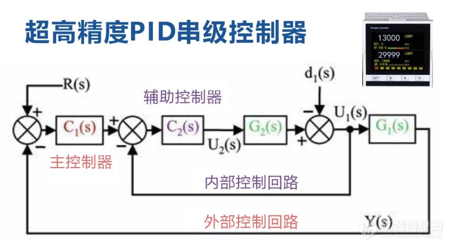
# 摘要
本文深入探讨了PID控制理论及其在工业控制系统中的应用。首先,本文回顾了PID控制的基础理论,阐明了比例(P)、积分(I)和微分(D)三个参数的作用及重要性。接着,详细分析了PID参数调整的方法,包括传统经验和计算机辅助优化算法,并探讨了自适应PID控制策略。针对PID控制系统的性能分析,本文讨论了系统稳定性、响应性能及鲁棒性,并提出相应的提升策略。在
系统稳定性提升秘籍:中控BS架构考勤系统负载均衡策略

# 摘要
本文旨在探讨中控BS架构考勤系统中负载均衡的应用与实践。首先,介绍了负载均衡的理论基础,包括定义、分类、技术以及算法原理,强调其在系统稳定性中的重要性。接着,深入分析了负载均衡策略的选取、实施与优化,并提供了基于Nginx和HAProxy的实际
【Delphi实践攻略】:百分比进度条数据绑定与同步的终极指南

# 摘要
本文针对百分比进度条的设计原理及其在Delphi环境中的数据绑定技术进行了深入研究。首先介绍了百分比进度条的基本设计原理和应用,接着详细探讨了Delphi中数据绑定的概念、实现方法及高级应用。文章还分析了进度条同步机制的理论基础,讨论了实现进度条与数据源同步的方法以及同步更新的优化策略。此外,本文提供了关于百分比进度条样式自定义与功能扩展的指导,并
【TongWeb7集群部署实战】:打造高可用性解决方案的五大关键步骤

# 摘要
本文深入探讨了高可用性解决方案的实施细节,首先对环境准备与配置进行了详细描述,涵盖硬件与网络配置、软件安装和集群节点配置。接着,重点介绍了TongWeb7集群核心组件的部署,包括集群服务配置、高可用性机制及监控与报警设置。在实际部署实践部分,本文提供了应用程序部署与测试、灾难恢复演练及持续集成与自动化部署
JY01A直流无刷IC全攻略:深入理解与高效应用
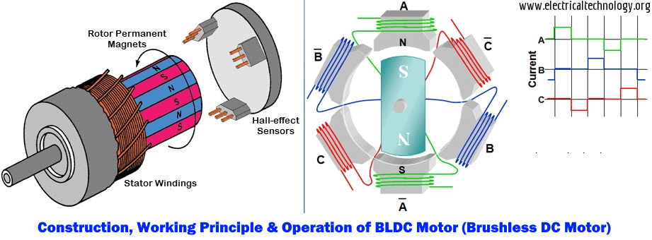
# 摘要
本文详细介绍了JY01A直流无刷IC的设计、功能和应用。文章首先概述了直流无刷电机的工作原理及其关键参数,随后探讨了JY01A IC的功能特点以及与电机集成的应用。在实践操作方面,本文讲解了JY01A IC的硬件连接、编程控制,并通过具体
先锋SC-LX59:多房间音频同步设置与优化

# 摘要
本文旨在介绍先锋SC-LX59音频系统的特点、多房间音频同步的理论基础及其在实际应用中的设置和优化。首先,文章概述了音频同步技术的重要性及工作原理,并分析了影响音频同步的网络、格式和设备性能因素。随后,针对先锋SC-LX59音频系统,详细介绍了初始配置、同步调整步骤和高级同步选项。文章进一步探讨了音频系统性能监测和质量提升策略,包括音频格式优化和环境噪音处理。最后,通过案例分析和实战演练,展示了同步技术在多品牌兼容性和创新应用
【S参数实用手册】:理论到实践的完整转换指南
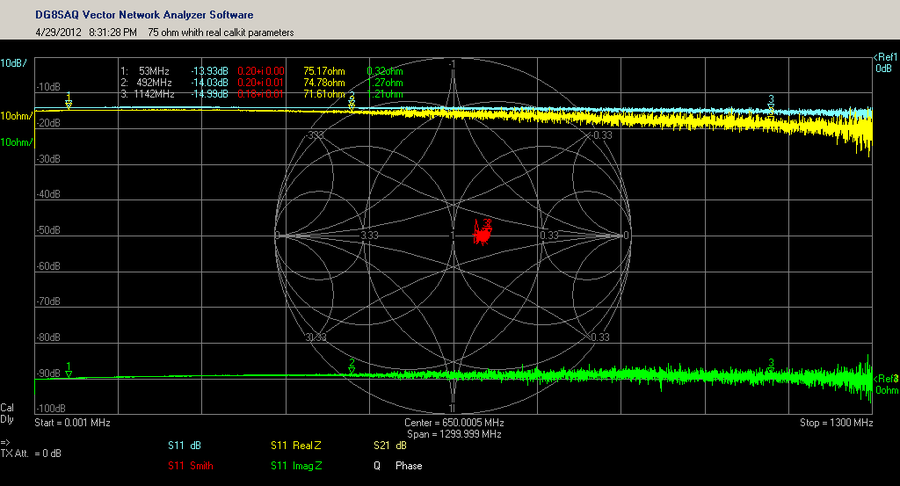
# 摘要
本文系统阐述了S参数的基础理论、测量技术、在射频电路中的应用、计算机辅助设计以及高级应用和未来发展趋势。第一章介绍了S参数的基本概念及其在射频工程中的重要性。第二章详细探讨了S参数测量的原理、实践操作以及数据处理方法。第三章分析了S参数在射频电路、滤波器和放大器设计中的具体应用。第四章进一步探讨了S参数在CAD软件中的集成应用、仿真优化以及数据管理。第五章介绍了
资源上传下载、课程学习等过程中有任何疑问或建议,欢迎提出宝贵意见哦~我们会及时处理!
点击此处反馈


专栏目录
最低0.47元/天 解锁专栏
买1年送3月
百万级
高质量VIP文章无限畅学
千万级
优质资源任意下载
C知道
免费提问 ( 生成式Al产品 )