Pandas数据可视化实战指南:用图表呈现数据,洞察一目了然
发布时间: 2024-07-20 22:03:25 阅读量: 23 订阅数: 31 
# 1. Pandas数据可视化概述
Pandas数据可视化是利用Pandas库强大的数据处理和分析功能,将数据以图形化的方式呈现。它使数据分析师和科学家能够快速轻松地探索、分析和传达数据洞察。Pandas提供了一系列直观易用的绘图函数,允许用户创建各种类型的图表,包括折线图、条形图、散点图和直方图。
通过数据可视化,用户可以识别数据中的模式、趋势和异常值,从而获得对数据的更深入理解。它有助于简化复杂数据的理解,并使数据分析和报告更加有效和引人注目。
# 2. Pandas数据可视化基础
### 2.1 Pandas数据框和绘图函数
Pandas提供了一个强大的数据框对象,它将数据组织成行和列的表格结构中。数据框包含各种方法,允许用户轻松地操作和可视化数据。
要创建数据框,可以使用`pd.DataFrame()`函数,它接受一个字典、列表或元组作为输入。例如:
```python
import pandas as pd
# 从字典创建数据框
data = {'name': ['John', 'Jane', 'Peter'], 'age': [20, 25, 30]}
df = pd.DataFrame(data)
# 从列表创建数据框
data = [['John', 20], ['Jane', 25], ['Peter', 30]]
df = pd.DataFrame(data, columns=['name', 'age'])
```
一旦创建了数据框,就可以使用Pandas的绘图函数对其进行可视化。这些函数位于`pandas.plotting`模块中,并提供各种图表类型,包括:
- 线图(`plot()`)
- 条形图(`bar()`)
- 直方图(`hist()`)
- 散点图(`scatter()`)
- 饼图(`pie()`)
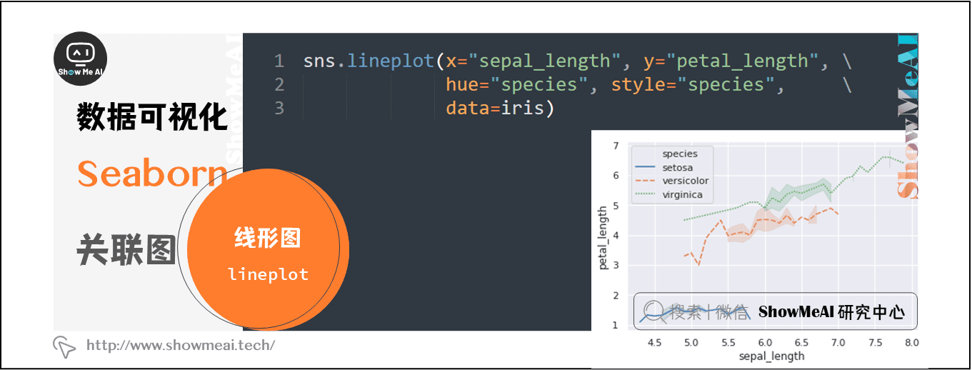
例如,要绘制一个线图,可以使用`plot()`函数:
```python
df.plot(x='name', y='age', kind='line')
```
### 2.2 常用图表类型和定制化
Pandas提供了一系列常用的图表类型,每种类型都有自己独特的用途。
**线图**用于显示数据随时间的变化情况。它们通常用于比较不同数据集或显示趋势。
**条形图**用于比较不同类别的值。它们可以是垂直的或水平的,并且可以堆叠以显示多个数据集。
**直方图**用于显示数据分布。它们将数据分成相等的间隔(称为箱),并显示每个箱中数据的数量。
**散点图**用于显示两个变量之间的关系。它们可以显示相关性、趋势和异常值。
**饼图**用于显示数据中不同部分的相对大小。它们通常用于显示比例或百分比。
除了这些基本图表类型之外,Pandas还允许用户定制图表的外观。这可以通过设置各种参数来实现,例如:
- 标题和标签
- 颜色和标记
- 网格线和刻度
- 图例和注释
例如,要更改线图的标题,可以使用`
 最低0.47元/天 解锁专栏
 送3个月
 百万级
高质量VIP文章无限畅学
百万级
高质量VIP文章无限畅学
 千万级
优质资源任意下载
千万级
优质资源任意下载
 C知道
免费提问 ( 生成式Al产品 )
C知道
免费提问 ( 生成式Al产品 )
0
0
相关推荐

专栏简介
《Pandas库入门宝典》专栏是数据处理领域的权威指南,涵盖了从基础知识到高级技巧的全面内容。专栏以循序渐进的方式介绍了Pandas库,从数据合并、分组分析、可视化到数据类型转换、内存管理和性能优化。通过深入浅出的讲解和丰富的实战案例,专栏帮助读者掌握Pandas库的精髓,提升数据处理能力。无论是数据分析新手还是经验丰富的从业者,本专栏都提供了宝贵的知识和实践指导,助力读者在数据处理领域取得成功。
专栏目录
最低0.47元/天 解锁专栏
送3个月
百万级
高质量VIP文章无限畅学
千万级
优质资源任意下载
C知道
免费提问 ( 生成式Al产品 )
最新推荐
PyCharm Python Version Management and Version Control: Integrated Strategies for Version Management and Control
# Overview of Version Management and Version Control
Version management and version control are crucial practices in software development, allowing developers to track code changes, collaborate, and maintain the integrity of the codebase. Version management systems (like Git and Mercurial) provide
[Frontier Developments]: GAN's Latest Breakthroughs in Deepfake Domain: Understanding Future AI Trends
# 1. Introduction to Deepfakes and GANs
## 1.1 Definition and History of Deepfakes
Deepfakes, a portmanteau of "deep learning" and "fake", are technologically-altered images, audio, and videos that are lifelike thanks to the power of deep learning, particularly Generative Adversarial Networks (GANs
Expert Tips and Secrets for Reading Excel Data in MATLAB: Boost Your Data Handling Skills
# MATLAB Reading Excel Data: Expert Tips and Tricks to Elevate Your Data Handling Skills
## 1. The Theoretical Foundations of MATLAB Reading Excel Data
MATLAB offers a variety of functions and methods to read Excel data, including readtable, importdata, and xlsread. These functions allow users to
Technical Guide to Building Enterprise-level Document Management System using kkfileview
# 1.1 kkfileview Technical Overview
kkfileview is a technology designed for file previewing and management, offering rapid and convenient document browsing capabilities. Its standout feature is the support for online previews of various file formats, such as Word, Excel, PDF, and more—allowing user
Analyzing Trends in Date Data from Excel Using MATLAB
# Introduction
## 1.1 Foreword
In the current era of information explosion, vast amounts of data are continuously generated and recorded. Date data, as a significant part of this, captures the changes in temporal information. By analyzing date data and performing trend analysis, we can better under
Python序列化与反序列化高级技巧:精通pickle模块用法

# 1. Python序列化与反序列化概述
在信息处理和数据交换日益频繁的今天,数据持久化成为了软件开发中不可或缺的一环。序列化(Serialization)和反序列化(Deserialization)是数据持久化的重要组成部分,它们能够将复杂的数据结构或对象状态转换为可存储或可传输的格式,以及还原成原始数据结构的过程。
序列化通常用于数据存储、
Pandas中的文本数据处理:字符串操作与正则表达式的高级应用
# 1. Pandas文本数据处理概览
Pandas库不仅在数据清洗、数据处理领域享有盛誉,而且在文本数据处理方面也有着独特的优势。在本章中,我们将介绍Pandas处理文本数据的核心概念和基础应用。通过Pandas,我们可以轻松地对数据集中的文本进行各种形式的操作,比如提取信息、转换格式、数据清洗等。
我们会从基础的字
Python print语句与标准输出重定向:掌握这些高级技巧
# 1. Python print语句的基础与原理
## 1.1 print语句的作用
Python中的`print`语句是一个基础而重要的功能,用于输出信息到控制台,帮助开发者调试程序或向用户提供反馈。理解它的基础使用方法是每位程序员必备的技能。
```python
print("Hello, World!")
```
在上面简单的例子中,`print`函数将字符串"Hello, World!
Parallelization Techniques for Matlab Autocorrelation Function: Enhancing Efficiency in Big Data Analysis
# 1. Introduction to Matlab Autocorrelation Function
The autocorrelation function is a vital analytical tool in time-domain signal processing, capable of measuring the similarity of a signal with itself at varying time lags. In Matlab, the autocorrelation function can be calculated using the `xcorr
Image Processing and Computer Vision Techniques in Jupyter Notebook
# Image Processing and Computer Vision Techniques in Jupyter Notebook
## Chapter 1: Introduction to Jupyter Notebook
### 2.1 What is Jupyter Notebook
Jupyter Notebook is an interactive computing environment that supports code execution, text writing, and image display. Its main features include:
-
资源上传下载、课程学习等过程中有任何疑问或建议,欢迎提出宝贵意见哦~我们会及时处理!
点击此处反馈


专栏目录
最低0.47元/天 解锁专栏
送3个月
百万级
高质量VIP文章无限畅学
千万级
优质资源任意下载
C知道
免费提问 ( 生成式Al产品 )