【MATLAB Curve Drawing Guide】: From Beginner to Expert, Creating Professional-Level Charts
发布时间: 2024-09-14 08:13:22 阅读量: 35 订阅数: 33 
# **MATLAB Curve Plotting Guide**: From Novice to Expert, Crafting Professional Charts
MATLAB is a powerful technical computing language widely used in the fields of science, engineering, and finance. Curve plotting is an essential function in MATLAB that visualizes data, aiding users in analyzing and understanding it.
This chapter introduces the basics of MATLAB curve plotting, including the syntax, functions, styles, and color settings for curve plotting in MATLAB, as well as the usage of legends and labels. With these basics, users can quickly get started with MATLAB curve plotting and create clear and aesthetically pleasing graphs.
# 2. Theory and Practice of Curve Plotting
### 2.1 Mathematical Principles of Curve Plotting
#### 2.1.1 Functions and Equations
A curve is a term in mathematics that denotes the graphical representation of a function. A function is a rule that maps an input (independent variable) to an output (dependent variable). Functions can be represented by algebraic equations, such as:
```
y = f(x)
```
Here, `y` is the dependent variable, `x` is the independent variable, and `f` is the function.
#### 2.1.2 Coordinate Systems and Transformations
Curve plotting is typically performed in the Cartesian coordinate system, which consists of two perpendicular axes (the x-axis and the y-axis). Each point is represented by its x and y coordinates.
Coor***mon coordinate transformations include translation, rotation, and scaling.
### 2.2 MATLAB Curve Plotting Syntax and Functions
#### 2.2.1 plot() and Related Functions
MATLAB offers various functions for plotting curves, with the most basic being the `plot()` function. The syntax for `plot()` is:
```
plot(x, y)
```
Here, `x` and `y` are vectors containing the x and y coordinates.
In addition to the `plot()` function, MATLAB also provides other functions for plotting special types of curves, such as:
- `stem()`: Plots a stem graph
- `bar()`: Plots a bar graph
- `scatter()`: Plots a scatter plot
#### 2.2.2 Style and Color Settings
MATLAB allows users to customize the style and color of curves. The following properties can be used to set the style and color:
- `LineStyle`: Sets the line style of the curve, such as solid, dashed, or dash-dot
- `LineWidth`: Sets the width of the curve
- `Color`: Sets the color of the curve
For example, the following code plots a red dashed line:
```
plot(x, y, 'r--')
```
#### 2.2.3 Legends and Labels
Legends and labels are crucial for explaining curves. MATLAB provides the following functions to add legends and labels:
- `legend()`: Adds a legend
- `xlabel()`: Sets the x-axis label
- `ylabel()`: Sets the y-axis label
- `title()`: Sets the graph's title
For example, the following code adds a legend and axis labels:
```
plot(x, y, 'r--')
legend('Curve 1')
xlabel('x')
ylabel('y')
title('Example of Curve Plotting')
```
# 3. Advanced Techniques for Curve Plotting
### 3.1 Data Processing and Preprocessing
#### 3.1.1 Data Import and Export
MATLAB offers various methods for importing and exporting data, including:
- The `load()` and `save()` functions: Used for importing and exporting data from files.
- The `importdata()` and `exportdata()` functions: Used for importing and exporting data from various file formats.
- The `readtable()` and `writetable()` functions: Used for importing and exporting data from tabular data formats.
**Code block:**
```matlab
% Import data from a CSV file
data = importdata('data.csv');
% Export data to a MAT file
save('data.mat', 'data');
% Import data from tabular data
data = readtable('data.xlsx');
% Export data to a text file
writetable(data, 'data.txt');
```
**Logical Analysis:**
- The `importdata()` function reads the specified file and returns a data structure containing the data.
- The `save()` function saves the specified variable to a MAT file.
- The `readtable()` function imports data from tabular data formats (such as Excel files) and returns a table object.
- The `writetable()` function exports a table object to a text file or other supported formats.
#### 3.1.2 Data Filtering and Interpolation
Data filtering and interpolation techniques are used to handle missing values, outliers, and irregularly sampled data.
***Data Filtering:**
- `movmean()` function: Used for smoothing data.
- `medfilt1()` function: Used for noise removal.
- `butter()` function: Used for designing and applying filters.
***Data Interpolation:**
- `interp1()` function: Used for linear interpolation.
- `interp2()` function: Used for two-dimensional interpolation.
- `griddata()` function: Used for interpolation based on grid data.
**Code block:**
```matlab
% Smooth data
smoothed_data = movmean(data, 5);
% Remove noise
filtered_data = medfilt1(data, 5);
% Linear interpolation
interpolated_data = interp1(x, y, new_x);
```
**Logical Analysis:**
- The `movmean()` function calculates the moving average within a specified window, smoothing the data.
- The `medfilt1()` function uses a median filter to remove noise while preserving the main features of the data.
- The `interp1()` function performs one-dimensional linear interpolation, generating new data points.
### 3.2 Multiple Curves and Subplots
#### 3.2.1 Multiple Curve Plotting
MATLAB allows plotting multiple curves on the same graph to compare different datasets or to show relationships between different variables.
* The `hold on` and `hold off` commands: Used for plotting multiple curves on the same graph.
* The `legend()` function: Used for adding legends to identify each curve.
**Code block:**
```matlab
% Plot multiple curves
figure;
hold on;
plot(x1, y1, 'r');
plot(x2, y2, 'b');
hold off;
% Add legends
legend('Curve 1', 'Curve 2');
```
**Logical Analysis:**
- The `hold on` command allows plotting multiple curves on the same graph.
- The `plot()` function draws each curve, specifying the color and line type.
- The `hold off` command disables the mode for plotting multiple curves.
- The `legend()` function adds a legend displaying the labels for each curve.
#### 3.2.2 Subplot Layout and Management
MATLAB provides functionality for creating subplot layouts, allowing multiple subplots to be displayed within a single figure window.
* The `subplot()` function: Used for creating subplots.
* The `title()` function: Used for setting the title of a subplot.
* The `xlabel()` and `ylabel()` functions: Used for setting the x and y-axis labels of a subplot.
**Code block:**
```matlab
% Create subplot layout
figure;
subplot(2, 1, 1);
plot(x, y1);
title('Subplot 1');
xlabel('x');
ylabel('y1');
subplot(2, 1, 2);
plot(x, y2);
title('Subplot 2');
xlabel('x');
ylabel('y2');
```
**Logical Analysis:**
- The `subplot(2, 1, 1)` command creates a layout with two subplots, with the first subplot at the top.
- The `plot()` function is used to draw the data.
- The `title()`, `xlabel()`, and `ylabel()` functions set the titles and axis labels for the subplots.
### 3.3 Interactive Curve Plotting
#### 3.3.1 Data Point Selection and Modification
MATLAB allows users to interactively select and modify data points.
* The `ginput()` function: Used for obtaining points selected by the user.
* The `datacursormode()` function: Used for enabling data cursor mode, which displays information about data points.
**Code block:**
```matlab
% Get points selected by the user
points = ginput(2);
% Modify data points
data(points(1, 1), points(1, 2)) = 10;
```
**Logical Analysis:**
- The `ginput()` function obtains points selected by the user and returns a matrix containing the x and y coordinates.
- Data points can be modified by directly indexing the data array.
#### 3.3.2 Graph Zooming and Rotation
MATLAB provides interactive zooming and rotating functionality for graphs.
* The `zoom()` function: Used for zooming in and out of a graph.
* The `rotate3d()` function: Used for rotating three-dimensional graphs.
**Code block:**
```matlab
% Zoom in on a graph
zoom on;
% Rotate a three-dimensional graph
rotate3d on;
```
**Logical Analysis:**
- `zoom on` enables zoom mode, allowing users to zoom in and out of a graph using a mouse.
- `rotate3d on` enables rotate mode, allowing users to rotate three-dimensional graphs using a mouse.
# 4. Applications of Curve Plotting
### 4.1 Scientific Data Visualization
#### 4.1.1 Experimental Data Analysis
Curve plotting is essential in scientific data visualization as it allows researchers to graphically represent and analyze experimental data. By plotting data points, trends, patterns, and outliers can be identified.
For example, in a physics experiment, curves can be used to plot the velocity or acceleration of an object over time. Analyzing these curves can determine the object's state of motion, such as constant velocity, acceleration, or deceleration.
```matlab
% Experimental data: time and speed
time = [0, 1, 2, 3, 4, 5];
speed = [0, 10, 20, 30, 40, 50];
% Plot the curve
plot(time, speed, 'b-o');
xlabel('Time (s)');
ylabel('Speed (m/s)');
title('Object Motion Speed vs. Time Curve');
grid on;
% Analyze the curve
% Speed increases linearly with time
disp('Curve analysis: Speed increases linearly with time.');
```
#### 4.1.2 Model Fitting and Prediction
Curve plotting is also used for model fitting and prediction. By fitting experimental data to a mathematical model, the underlying relationships can be inferred, and future behavior can be predicted.
For instance, in a chemical reaction, curves can be used to plot the concentration of reactants over time. By fitting the data to an exponential decay model, the reaction rate constant can be determined, and the time for the reaction to complete can be predicted.
```matlab
% Experimental data: time and reactant concentration
time = [0, 10, 20, 30, 40, 50];
concentration = [100, 80, 60, 40, 20, 10];
% Fit to an exponential decay model
model = fit(time', concentration', 'exp1');
% Plot the fitted curve
plot(time, concentration, 'b-o');
hold on;
plot(time, model(time), 'r--');
xlabel('Time (s)');
ylabel('Concentration (%)');
title('Reactant Concentration vs. Time Curve');
legend('Experimental Data', 'Fitted Curve');
grid on;
% Analyze the curve
% Reactant concentration decreases exponentially over time
disp('Curve analysis: Reactant concentration decreases exponentially over time.');
```
### 4.2 Engineering Design and Simulation
#### 4.2.1 Mechanics and Thermodynamics Curves
Curve plotting is widely used in engineering design and simulation to represent mechanical and thermodynamic behaviors. For example, in mechanical engineering, curves can be used to plot stress-strain curves to determine the strength and elasticity of materials.
```matlab
% Stress-strain curve data
stress = [0, 100, 200, 300, 400, 500];
strain = [0, 0.002, 0.004, 0.006, 0.008, 0.01];
% Plot the curve
plot(stress, strain, 'g-o');
xlabel('Stress (MPa)');
ylabel('Strain');
title('Stress-Strain Curve');
grid on;
% Analyze the curve
% In the elastic deformation phase, stress and strain are linearly related
disp('Curve analysis: In the elastic deformation phase, stress and strain are linearly related.');
```
#### 4.2.2 Signal Processing and Control Systems
In signal processing and control systems, curve plotting is used to represent signals and system behaviors. For example, in communication systems, curves can be used to plot the spectrum of a modulated signal.
```matlab
% Modulated signal data
t = linspace(0, 1, 1000);
carrier = 100 * cos(2 * pi * 1000 * t);
modulatedSignal = carrier .* sin(2 * pi * 100 * t);
% Plot the spectrum
Fs = 1000; % Sampling frequency
N = length(modulatedSignal); % Number of data points
Y = fft(modulatedSignal);
f = (0:N-1) * (Fs/N); % Frequency vector
figure;
plot(f, abs(Y), 'r-');
xlabel('Frequency (Hz)');
ylabel('Amplitude');
title('Modulated Signal Spectrum');
grid on;
% Analyze the curve
% The modulated signal has a distinct spectral peak at 100Hz
disp('Curve analysis: The modulated signal has a distinct spectral peak at 100Hz.');
```
### 4.3 Finance and Economic Analysis
#### 4.3.1 Stock Price Trends
Curve plotting is crucial in finance and economic analysis for representing stock price trends and other economic indicators. By analyzing curves, trends can be identified, future trends can be predicted, and investment decisions can be made.
```matlab
% Stock price data
date = {'2023-01-01', '2023-02-01', '2023-03-01', '2023-04-01', '2023-05-01'};
price = [100, 110, 120, 130, 140];
% Plot a line graph
figure;
plot(date, price, 'b-o');
xlabel('Date');
ylabel('Stock Price');
title('Stock Price Trend');
grid on;
% Analyze the curve
% The stock price shows a steady upward trend
disp('Curve analysis: The stock price shows a steady upward trend.');
```
#### 4.3.2 Economic Indicator Charts
Curve plotting is also used to represent economic indicators such as unemployment rates, inflation rates, and GDP. By analyzing these curves, the economic situation can be understood, and policy decisions can be made.
```matlab
% Economic indicator data
year = [2018, 2019, 2020, 2021, 2022];
unemploymentRate = [4.1, 3.5, 6.2, 5.4, 3.9];
inflationRate = [1.9, 2.3, 1.2, 2.9, 4.7];
gdpGrowth = [2.9, 2.3, -3.5, 5.7, 2.6];
% Plot line graphs
figure;
subplot(3, 1, 1);
plot(year, unemploymentRate, 'r-o');
xlabel('Year');
ylabel('Unemployment Rate (%)');
title('Unemployment Rate Trend');
grid on;
subplot(3, 1, 2);
plot(year, inflationRate, 'g-o');
xlabel('Year');
ylabel('Inflation Rate (%)');
title('Inflation Rate Trend');
grid on;
subplot(3, 1, 3);
plot(year, gdpGrowth, 'b-o');
xlabel('Year');
ylabel('GDP Growth Rate (%)');
title('GDP Growth Rate Trend');
grid on;
% Analyze the curves
% The unemployment rate spiked significantly in 2020 and then decreased
% The inflation rate spiked significantly in 2022
% The GDP growth rate dropped significantly in 2020 and then rebounded
disp('Curve analysis:');
disp(' - The unemployment rate spiked significantly in 2020 and then decreased.');
disp(' - The inflation rate spiked significantly in 2022.');
disp(' - The GDP growth rate dropped significantly in 2020 and then rebounded.');
```
# 5. Best Practices for MATLAB Curve Plotting**
**5.1 Code Optimization and Readability**
To ensure the efficiency and maintainability of MATLAB curve plotting code, it is essential to follow best practices.
**5.1.1 Use of Functions and Scripts**
Organizing code into functions and scripts can improve readability, reusability, and maintainability. Functions can encapsulate specific tasks, while scripts can contain a series of commands to perform more complex analyses. For example:
```matlab
% Define a function to plot a sine curve
function plot_sine(amplitude, frequency, phase)
t = linspace(0, 2*pi, 100);
y = amplitude * sin(frequency * t + phase);
plot(t, y);
end
% Call this function in a script
amplitude = 1;
frequency = 2;
phase = pi/2;
plot_sine(amplitude, frequency, phase);
```
**5.1.2 Comments and Documentation**
***ments explain the purpose and behavior of the code, while documentation provides more comprehensive information, such as the input and output parameters of a function.
```matlab
% Plot a sine curve
%
% Inputs:
% amplitude: The amplitude of the curve
% frequency: The frequency of the curve
% phase: The phase of the curve
%
% Outputs:
% None
function plot_sine(amplitude, frequency, phase)
% ...
end
```
**5.2 Principles of Graphic Design**
In addition to code optimization, following principles of graphic design is crucial for creating clear and effective charts.
**5.2.1 Color Selection and Contrast**
Choosing colors with high contrast improves the readability of a chart. Avoid using similar colors or light colors, as they may be difficult to distinguish.
**5.2.2 Graphic Layout and Clarity**
Carefully arranging chart elements, such as titles, labels, and legends, can improve the comprehensibility of the chart. Ensure that the chart has sufficient whitespace to avoid clutter and confusion.

 百万级
高质量VIP文章无限畅学
百万级
高质量VIP文章无限畅学
 千万级
优质资源任意下载
千万级
优质资源任意下载
 C知道
免费提问 ( 生成式Al产品 )
C知道
免费提问 ( 生成式Al产品 )
0
0
相关推荐

专栏目录
最低0.47元/天 解锁专栏
买1年送3月
百万级
高质量VIP文章无限畅学
千万级
优质资源任意下载
C知道
免费提问 ( 生成式Al产品 )
最新推荐
无线通信的黄金法则:CSMA_CA与CSMA_CD的比较及实战应用

# 摘要
本文系统地探讨了无线通信中两种重要的载波侦听与冲突解决机制:CSMA/CA(载波侦听多路访问/碰撞避免)和CSMA/CD(载波侦听多路访问/碰撞检测)。文中首先介绍了CSMA的基本原理及这两种协议的工作流程和优劣势,并通过对比分析,深入探讨了它们在不同网络类型中的适用性。文章进一步通
Go语言实战提升秘籍:Web开发入门到精通

# 摘要
Go语言因其简洁、高效以及强大的并发处理能力,在Web开发领域得到了广泛应用。本文从基础概念到高级技巧,全面介绍了Go语言Web开发的核心技术和实践方法。文章首先回顾了Go语言的基础知识,然后深入解析了Go语言的Web开发框架和并发模型。接下来,文章探讨了Go语言Web开发实践基础,包括RES
【监控与维护】:确保CentOS 7 NTP服务的时钟同步稳定性
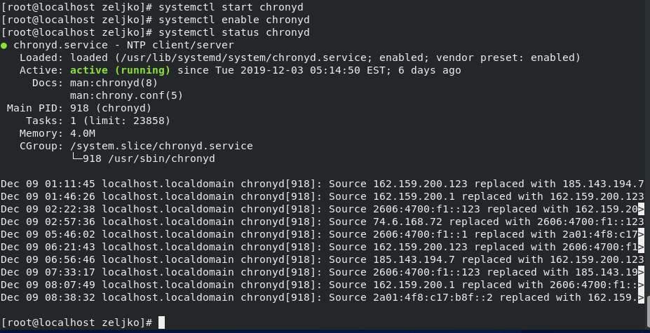
# 摘要
本文详细介绍了NTP(Network Time Protocol)服务的基本概念、作用以及在CentOS 7系统上的安装、配置和高级管理方法。文章首先概述了NTP服务的重要性及其对时间同步的作用,随后深入介绍了在CentOS 7上NTP服务的安装步骤、配置指南、启动验证,以及如何选择合适的时间服务器和进行性能优化。同时,本文还探讨了NTP服务在大规模环境中的应用,包括集
【5G网络故障诊断】:SCG辅站变更成功率优化案例全解析
# 摘要
随着5G网络的广泛应用,SCG辅站作为重要组成部分,其变更成功率直接影响网络性能和用户体验。本文首先概述了5G网络及SCG辅站的理论基础,探讨了SCG辅站变更的技术原理、触发条件、流程以及影响成功率的因素,包括无线环境、核心网设备性能、用户设备兼容性等。随后,文章着重分析了SCG辅站变更成功率优化实践,包括数据分析评估、策略制定实施以及效果验证。此外,本文还介绍了5
PWSCF环境变量设置秘籍:系统识别PWSCF的关键配置

# 摘要
本文全面阐述了PWSCF环境变量的基础概念、设置方法、高级配置技巧以及实践应用案例。首先介绍了PWSCF环境变量的基本作用和配置的重要性。随后,详细讲解了用户级与系统级环境变量的配置方法,包括命令行和配置文件的使用,以及环境变量的验证和故障排查。接着,探讨了环境变量的高级配
掌握STM32:JTAG与SWD调试接口深度对比与选择指南
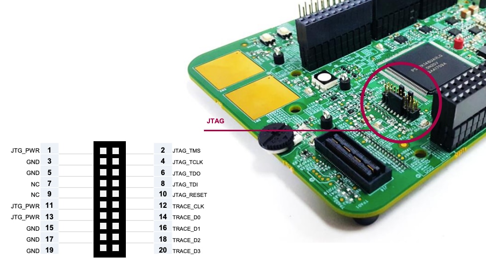
# 摘要
随着嵌入式系统的发展,调试接口作为硬件与软件沟通的重要桥梁,其重要性日益凸显。本文首先概述了调试接口的定义及其在开发过程中的关键作用。随后,分别详细分析了JTAG与SWD两种常见调试接口的工作原理、硬件实现以及软件调试流程。在此基础上,本文对比了JTAG与SWD接口在性能、硬件资源消耗和应用场景上的差异,并提出了针对STM32微控制器的调试接口选型建议。最后,本文探讨
ACARS社区交流:打造爱好者网络

# 摘要
ACARS社区作为一个专注于ACARS技术的交流平台,旨在促进相关技术的传播和应用。本文首先介绍了ACARS社区的概述与理念,阐述了其存在的意义和目标。随后,详细解析了ACARS的技术基础,包括系统架构、通信协议、消息格式、数据传输机制以及系统的安全性和认证流程。接着,本文具体说明了ACARS社区的搭
Paho MQTT消息传递机制详解:保证消息送达的关键因素
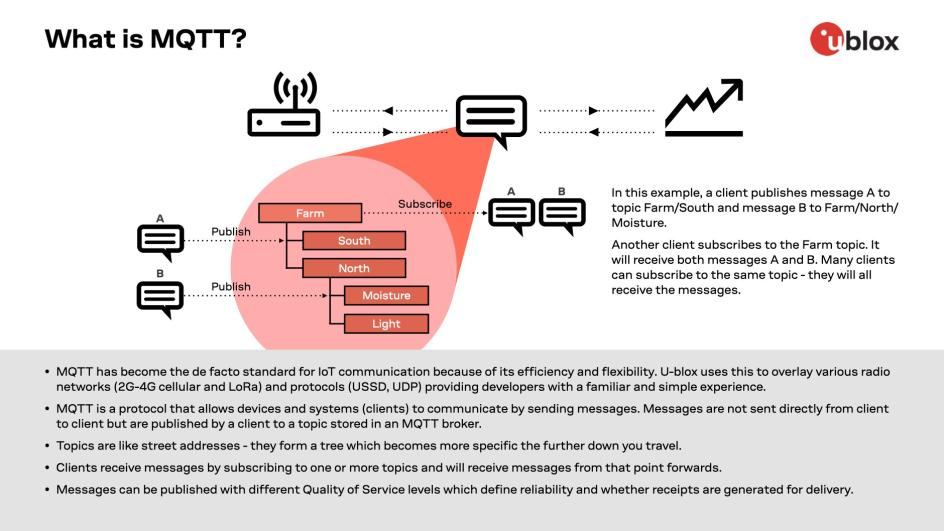
# 摘要
本文深入探讨了MQTT消息传递协议的核心概念、基础机制以及保证消息送达的关键因素。通过对MQTT的工作模式、QoS等级、连接和会话管理的解析,阐述了MQTT协议的高效消息传递能力。进一步分析了Paho MQTT客户端的性能优化、安全机制、故障排查和监控策略,并结合实践案例,如物联网应用和企业级集成,详细介绍了P
保护你的数据:揭秘微软文件共享协议的安全隐患及防护措施{安全篇

# 摘要
本文对微软文件共享协议进行了全面的探讨,从理论基础到安全漏洞,再到防御措施和实战演练,揭示了协议的工作原理、存在的安全威胁以及有效的防御技术。通过对安全漏洞实例的深入分析和对具体防御措施的讨论,本文提出了一个系统化的框架,旨在帮助IT专业人士理解和保护文件共享环境,确保网络数据的安全和完整性。最
资源上传下载、课程学习等过程中有任何疑问或建议,欢迎提出宝贵意见哦~我们会及时处理!
点击此处反馈


专栏目录
最低0.47元/天 解锁专栏
买1年送3月
百万级
高质量VIP文章无限畅学
千万级
优质资源任意下载
C知道
免费提问 ( 生成式Al产品 )